How to Choose the Best Fonts for Your Website
Without a doubt, typography can bring your new designs to a completely new level of quality and attractivity. And who doesn’t want their website to be beautiful and eye-catching? However, looking for website typefaces may turn out to be an exhausting adventure. There is a wide range of options available for any taste and need. Still, the right shot has to complement the domain’s graphic balance, enhancing its overall usability, readability, and even accessibility.
That’s why this decision-making is so important. To simplify the process, don’t hesitate to consider expert tips and recommendations to find the best fonts for web design in a couple of minutes, not ages. Onwards!
Contents
Rules to Pick Up Soulmate Good Looking Fonts
Apart from considering which meanings and senses are hidden behind numerous typefaces, it is essential to take into account some external criteria. According to statistics, the majority of online users (namely, around 94%) decide whether the website is worth checking just in less than a second, and the way its interface is presented is absolutely related to the final judgment. To avoid typical beginner mistakes on the way to find the best website fonts, just stick to the rules described below.
Brand identity
Before selecting the right font for your website, think a bit about what message your company’s products/services should convey. For instance, it will be a mistake to pick up playful and funny fonts for healthcare organizations — it will break your storytelling line.
Legibility
Decorative fonts for the body text will cause a lot of inconveniences for customers. To verify the readability degree is gorgeous, make sure your chosen font doesn’t decrease its quality in multiple sizes.
Keep the balance
It is not recommended to consider more than two-three fonts for your design. The same relates to the palette of colors and tones considered. If your branding uses some particular shades, it would be nice to implement them. However, while white and green (typical for Starbucks) won’t cause any issues, you have to be careful with combinations of bright tones (red and yellow, etc.). Don’t forget to ensure the contrast between the text and background of your page.

Ranking by importance
Selecting appropriate fonts for headers, body information, and accent points will help maintain a healthy hierarchy of your website and increase its accessibility.
Don’t rely on random
Accurate sizing is also crucial. Obviously, headings have to be bigger than other text phrases on your page, but how much? And what about the lining? The main body text will be great in 16 px with a line height of 150% of the typeface size.
What Are the Best Fonts for Advanced Web Design?
Online users don’t even think what this or that font means — this information is understood subconsciously. If you would like to add a more traditional and classic vibe to your message, then serif fonts will work. Display typefaces are super eye-catching, so their efficiency will make any heading a start of your page. Hand-written and sans serif styles comply with all the modern typography and lettering standards, which implement a lot of chic and strength to your layout.
But these categories are subdivided into various other groups, and there are unique fonts combining features of different types of fonts. If you are stuck and not sure which text design is appealing to you, then why not check out the champions in the ranking of the best fonts for websites? Just check them out.
Lato
This is a definitely beautiful kind that evokes a sense of warmth and strength. By manipulating the line thickness and lightness, you create different vibes from one and the same font. Its visual clarity is second to none, which enhances its readability dramatically.
Merriweather
It is a great sample of gentle and tender fonts, which simplifies perceiving data read on screens of any gadgets and devices.

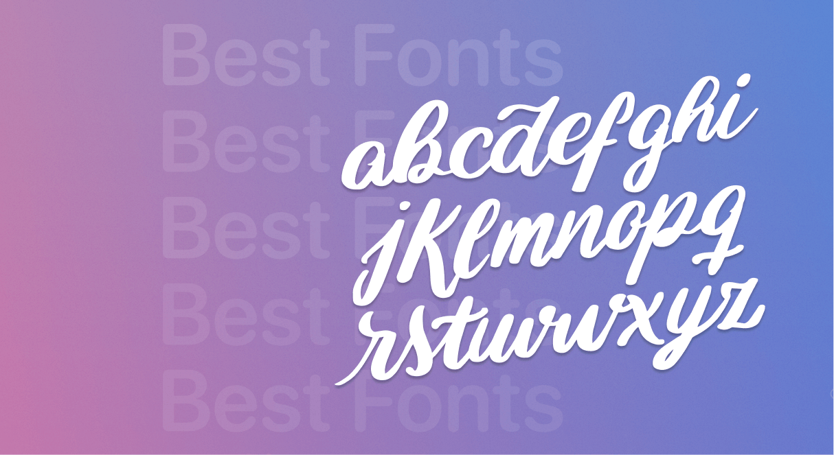
Dancing script
Although its glyphs won’t be suitable for the entire body, they will definitely help you make the right accents and attract customers’ attention to particular areas of your web design.

Amatic SC
Another sample of good website fonts, this style is excellent for headings. Its simplicity doesn’t compromise with the overall visual attractivity, so the degree of readability is also corresponding.
Montserrat
If you are fond of geometric patterns, this style has all the chances to become your number one. It is distinguished with strict and accurate lines, which results in a clean and fresh impression one can get from reading information presented in this font.

Wrap It Up
A lot depends on your attitude to the process of seeking good website fonts. The more you know about the field in general and simple tricks to match different typefaces and backgrounds, and other external criteria, the easier it would be to find the best font for the website of your dream on Weblium.
Create a website of your dreams