What are the Key Components of a Landing Page
A landing page is a page presenting a product or service. The main task of the landing page is to convince the user to take a certain action: call, subscribe to the newsletter, buy a product, or like a post. Such a site always has a goal and most often it aims at generating leads to the service. See the example below if you want to know what are the key components of a landing page.
Contents
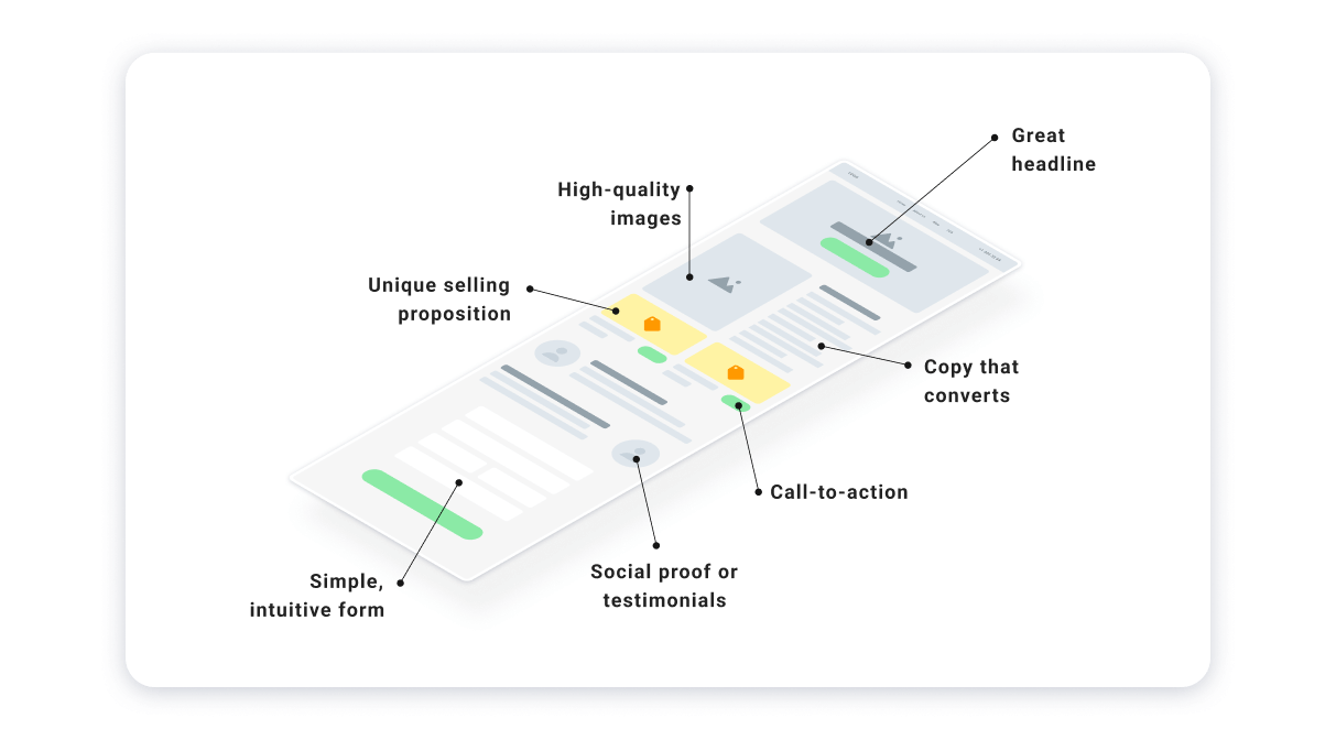
A great headline
The title and subtitle of the page are the first things we pay attention to upon visiting the site. The first screen of a quality landing page contains an offer (proposal), as well as a brief description of the client’s problem, which they can solve with the help of your product or service. The text here should be so simple that it can be understood at a glance.

Keep in mind: no headline, no sale. You should also not make an intriguing headline, because in this way you can scare away some of the visitors. Make the title as simple and clear as possible, reflecting the essence of the problem of the target audience. The subtitle should explain the title or answer the user’s question “What will I get?”
High-quality images
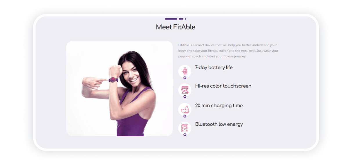
Images in high resolution are highly important landing page components. Almost half the success of a landing depends on the illustration that you place on the first screen. The landing page may have an ideal structure with all the marketing requirements met. However, its conversion may be at zero for the simple reason that the image does not reflect the essence of the product/service well.
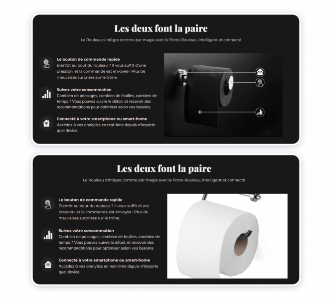
Compare the two images. One of them is stock and absolutely does not fit the landing page
If the pictures chosen are of poor quality, the whole platform will appear cheap. Conscious consumers will not invest in such services. The visual side of the site design plays a decisive role today, do not forget about it.
Copy that converts
If you know your lead, you need to know exactly what they want to hear. Let’s imagine an approximate chain of actions of a lead:
- A person launches an architectural studio, which is engaged in interior and exterior design.
- The company wants to show its work to future customers, receive feedback, and enter e-commerce in the future.
- Weblium, in its turn, is an online tool for creating a website without a designer and a programmer.
This means that although contact with leads can be difficult, it is very interesting. A cold lead (a person who does not yet know about the company, but needs its services) will need a company website whatever business they have. Thus, after you create a landing page, a copy will be one of its most strategically important elements.
However, you need to be careful even with ‘warm’ and ‘hot’ leads. Note that the main task of the support service is to help, and not to insert something paid at the first opportunity. So, let your text be friendly and engaging, without creating too much pressure on potential clients.
Unique selling proposition (USP)
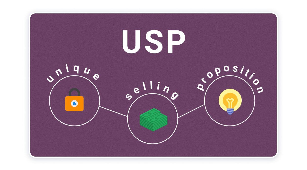
The essence of USP is the brief trade offer, which is one of the key elements of a landing page as well. It should talk about the benefits of the product and the reasons for buying it. Make your offer simple and understandable so that the client can understand the essence and value of the offer in a couple of seconds.
The focus can be on the quality, authenticity, or trendiness of your services. The other two popular criteria are speed and cost. Use any of them and explain it in the context of the offer. For instance:
- Quality: Sturdy Italian mahogany table.
- Speed: delivery of furniture within a day.
- Cost: 30% discount on the second item.
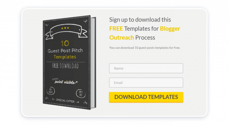
Offer some kind of free bonus for signing up or filling out a form on the landing page
A maximum of two benefits can be combined in one offer. It is not worth connecting three at once, because it looks intrusive and implausible.
Simple, intuitive forms
Forms are not only interactive, they perform a direct function — gathering the lead intention and transferring them for analysis. For instance, let’s take application forms. It is recommended that you put them in 3-4 places: on the first screen, in the middle, and at the end of the page. The target action that the user will take by filling out the form depends on the final goal of the landing page. If you’re promoting a conference, you’ll want users to register for it. If you are selling a product, then your goal is to get contact information.

Order form is another type of form you can integrate into your site. The more expensive the product, the more time the user needs to think. So, even if a potential client needs that luxurious car, they are unlikely to decide between buying it with lightning speed.
Thus, not all landing page elements should be placed on the first screen. If the product or service is simple enough, then an order form is appropriate. If most users definitely need time to consider a purchase, place a small ‘Contact Us’ button on the first screen.
Social proof or testimonials
The presence of reviews and real-life feedback on the site is one of the decisive factors that influence the decision of a person to apply to the company. Testimonials can increase conversions on sales pages by 34%. Here you can experiment and add links to posts with reviews in social networks or video reviews.
What should be on a landing page in terms of social proof? Telling about your reliable partner is optional for landing pages of small companies selling inexpensive goods, but if you have worked with large clients, it is worth showing.

Facts in numbers are a great option too. The numbers are eye-catching and easy to read. The user already has an idea of the amount of material they need, the sum of money they should invest, or the results they expect from your company. Thus, tell them about your conditions so that the lead compares them with the offers of competitors and makes a choice.
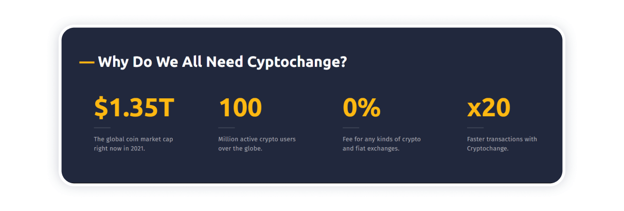
Remember: the numbers on the landing page are not there just to attract attention but to create more convenience for the client.
Call-to-actions
The call to action should be repeated several times on the landing page. It is important that it is always located near the ‘Contact’ button or next to the capture forms. Keep in mind: it is not enough to write ‘Call us’ or ‘Contact button.’ Such phrases do not encourage, so change the rhetoric and try to interest the potential client.
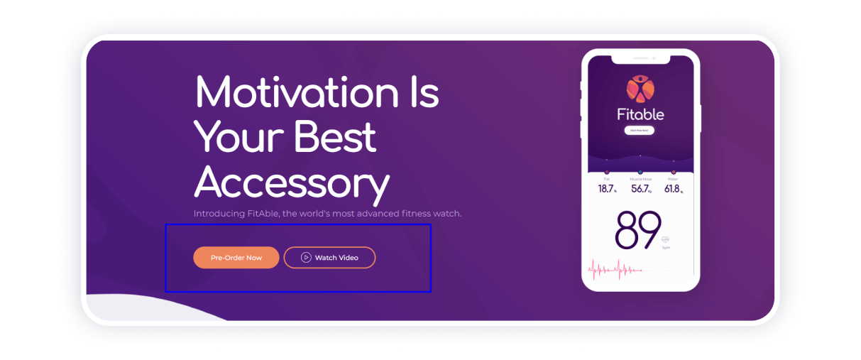
These elements of a good landing page are needed to motivate some users to immediately place an order. ‘Hot’ clients will not study the landing for a long time. They are more likely to call you when they see the phone number on the first screen or they will immediately send a request.
How to create a landing page fast & without technical skills?
Now that you know what are the key components of a landing page, you will focus on the right things when developing your product page. Weblium will come in handy in this matter! Start by choosing the template out of the free ones or pay for the Pro subscription for more options. Then, integrate website optimization elements, forms, and tools you will need to promote your services.
Weblium is a clear and intuitive website builder that enables you to create sites from scratch even if you have zero experience! We will be glad to help you on your business path.

