15 Amazing Church Website Examples For Your Inspiration
Can a church have a modern, attractive, and user-friendly website? Absolutely. As more people search online, a website becomes an essential tool for communicating with members and welcoming new visitors. A well-designed site can become a digital front door, a place where events, sermons, and important updates are always easy to find.
But how do you create a website that truly serves your community? In this article, I’ve gathered some of the most inspiring examples of church websites. They all stand out for a thoughtful design and practical functionality. Let’s explore what makes them effective and discover ideas you can use for your own church website.
Contents
Church
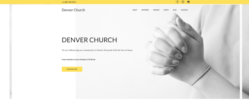
One of my favorite church website examples, this template features a discreet black-and-white design with a clean, modern feel. The yellow accent color highlights the buttons, making calls to action clear without overwhelming the page. The navigation is intuitive, and sections like Giving and Events make it easy to share important information with the community. It could also work perfectly as a template for a ministry website.
Radiant
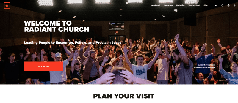
Radiant is one of those modern, well-structured examples of church websites that feel professional. I like the homepage slider. It features bright, high-quality photos that create a welcoming first impression. Right on the first screen, visitors are invited to explore the section with sermon recordings, which makes access to key content easy and welcoming.
Churchome

Churchome features a stylish black-and-white design with a strong focus on media content. The powerful tagline sets the tone for the entire experience. The site is easy to navigate, as visitors can quickly find locations, learn about the community, and explore upcoming events. The main call to action encourages users to download the app, which keeps the focus clear and consistent. Additional information and menu items are thoughtfully placed in the footer, helping maintain a consistent layout throughout the page.
Church of the City
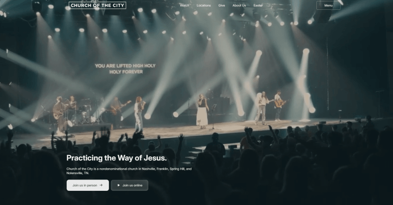
Church of the City takes an original approach with a single, impactful first screen featuring a beautiful photo and a welcoming tagline for newcomers. I like how this minimal structure keeps the focus clear and directly speaks to first-time visitors. At the top, a stylish main menu provides quick access to locations and key sections for the community. The easy-to-read font feels good for usability and a user-friendly experience.
Elevation
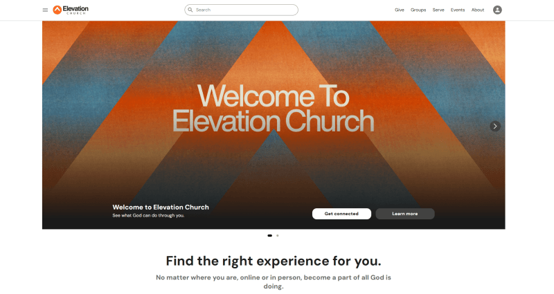
One of the strongest modern church website examples, Elevation feels bright, bold, and original. The design clearly speaks to a younger audience. The vibrant, high-quality photos of the community create an inviting atmosphere and make you feel part of something dynamic. When you open the hamburger menu, you’ll notice the rounded icons. A good design choice that adds personality and makes navigation engaging.
Sonship Bay Ridge

Sonship Bay Ridge has a stylish, minimalist design that feels calm and welcoming. The homepage opens with an inspiring drone video over the Brooklyn Bridge, which creates a strong emotional connection right from the start. Buttons are placed inside subtle translucent circles, keeping the layout clean. The event calendar is clearly marking all upcoming gatherings. I find it visually appealing and highly practical.
The Village
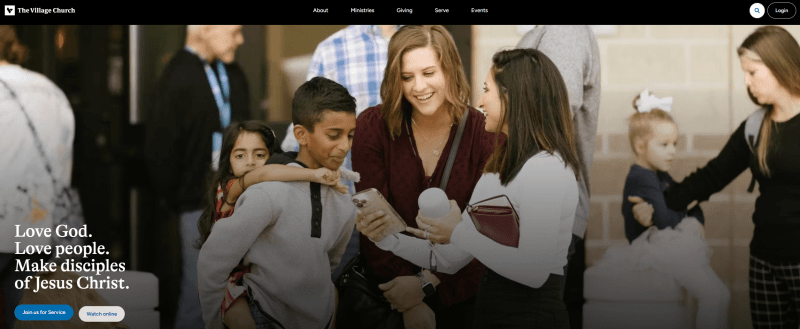
The Village uses a clean, modern design with simple lines, structured blocks, and an original zig-zag layout that adds visual interest. I like how this structure helps visitors focus on one message and one image at a time without distractions. From the first cover photo to the menu elements, everything follows a consistent style and calming blue color palette. This shade naturally evokes a sense of peace and confidence, reinforcing the welcoming atmosphere.
Church of the Good Shepherd
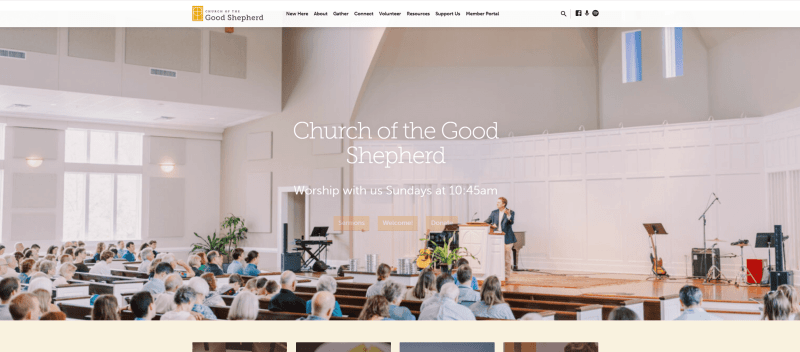
This is among the boldest examples of church websites with video placement right on the homepage. The powerful tagline gives a sense of authenticity and captures attention. I think the “What to Expect” button is especially well done, it directly addresses the needs of first-time visitors and makes the experience feel welcoming.
Hillsong
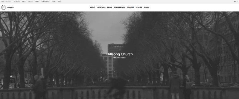
Hillsong’s website opens with a dynamic background with members of the community, which creates an energetic and welcoming atmosphere. I like how easy it is to navigate, thanks to a clear, user-friendly header and a well-structured footer. The newsroom section provides detailed announcements. And the dedicated music block includes links to platforms where users can listen to songs, making the site both engaging and resourceful.
Episcopal
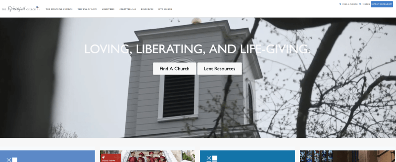
Another good church website example with a clear structure showcasing announcements and upcoming events. Visitors can quickly see dates and even register, which makes it very practical and user-friendly. The sermons page has concise descriptions for each service, keeping the focus on key information. Since the ministry revolves around serving people, this approach communicates effectively without overwhelming visitors, making it both thoughtful and functional.
Sandals
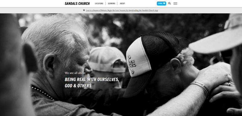
Sandals presents a clean, straightforward church website design with just three main pages, making navigation simple and intuitive. I like how the header includes a hamburger menu for users who want to explore additional information without cluttering the main layout. The About section is well-organized, providing only the essential details, which keeps the site optimized and easy to use.
Saddleback
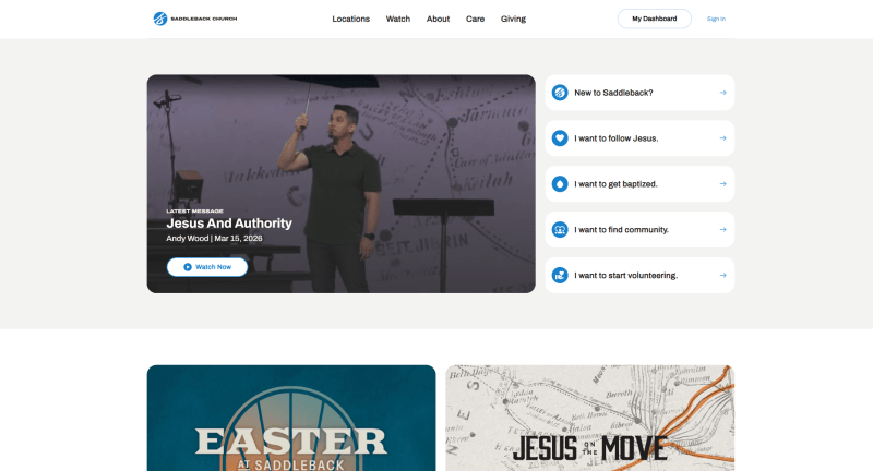
Saddleback’s website stands out with a unique main section that provides direct links to key areas. I like how the “New to Saddleback” section offers essential information for first-time visitors, making them feel welcome and informed. The “I Want to Find Community” block is particularly engaging. It uses accordion-style buttons to answer frequently asked questions, helping visitors find what they need quickly without overwhelming them.
Watoto
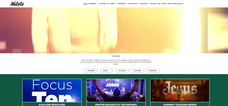
Watoto’s homepage effectively communicates the center’s vision, upcoming events, and contact information. I also like the leadership section, which clearly shows bios, beliefs, and the organization’s history. A smart addition is the block with quick links, including podcasts and FAQs for newcomers, which makes exploring the site easy and engaging. This is one of the standout examples of church websites that balances attractive design with practical functionality.
The Wesleyan
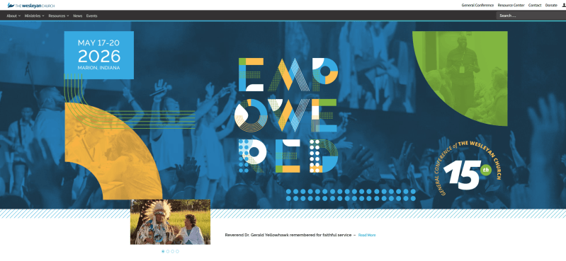
Another good design with a modern, engaging structure. I like bright colors and varied design elements combined with the simplicity of navigation. The site offers free resources to read, links to stay connected with the community, and up-to-date news. It also includes a donation link, which I think is a smart feature for smaller churches looking to support their work online.
Park Street
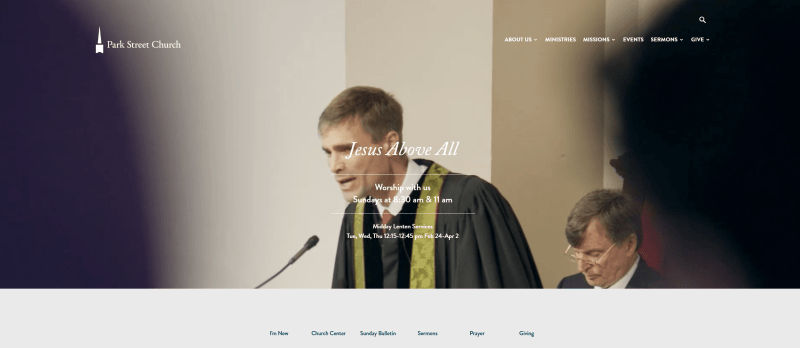
Park Street’s website immediately provides visitors with information about the nearest church location, making it practical and welcoming. Essential details like sermons, prayers, and giving are easy to access right from the main page. The footer includes a newsletter subscription form, social media links, and contact information, ensuring visitors can stay connected. Offering multiple platforms like this is key to keeping the community growing.
Tips to create a church website
1. Use a responsive design
Your website should adapt seamlessly to any device or screen size, with readable fonts and properly scaled visuals. Since most people now access websites via mobile devices, responsiveness is essential. Website builders like Weblium automatically ensure your site looks perfect on desktops, tablets, and phones.
2. Keep the structure simple
Even a clean single-page website can be highly effective. Avoid overused religious clichés (such as open Bibles, stained glass, or automatically playing hymns), which can distract visitors. If you accept donations, use a few well-placed, stylish Donate buttons rather than overwhelming the page.
3. Communicate clear messages
Visitors want to quickly understand your mission and offerings. A strong, memorable tagline clearly shows your purpose and sets the tone for the website. Keep messaging simple, direct, and easy to scroll.
4. Focus on essential content only
Use visuals and text to quickly explain who you are and what you offer. Your homepage acts as the front door, introducing visitors without overwhelming them with excessive detail. Detailed information can be placed on secondary pages for those who want to explore further.
5. Highlight your community
The heart of any church is its people, not the building. Feature high-quality images of parishioners, gatherings, and community events. They communicate warmth and connection far more effectively than text alone.
6. Ensure visual and structural consistency
Maintain a unified design across all pages. Keep navigation menus in the same location and consistent styling to prevent users from feeling lost or having to return to the homepage to access other sections.
7. Test all links, menus, and buttons
Every link and button should function correctly and provide clear visual cues. Avoid unconventional link styles that may confuse visitors. Follow recognizable standards like blue underlined links. Ensure that non-clickable text isn’t mistaken for links, which can frustrate users.
Conclusion
Building a professional, engaging church website can be simple with website builders like Weblium. Even without technical skills, you can launch a polished site in as little as 30 minutes. Customize ready-made templates or create your own design from scratch.
Pre-designed blocks, intuitive forms, and drag-and-drop functionality make structuring your site fast and efficient. High-quality images and icons ensure a visually appealing experience, while the built-in blog can keep your community informed and engaged. You can also use pop-ups and announcement banners to highlight upcoming events or important updates. Start today and launch a website that inspires and serves.
Create a church website for free
FAQ about church websites
Why should a church have a website?
A website is a modern way to attract new members and stay connected with your congregation. It provides a virtual space for your mission, worship schedule, events, and news, and allows participation online through donations, event registration, or streaming services.
What should a church website include?
Key elements include a homepage with your mission and values, a worship schedule, news and events, an About Us section with history and leadership, and contact information with a location map. Additional features like a donation section, blog, or media archive enhance engagement.
What is the average cost of a church website?
Costs vary greatly by functionality and design. With Weblium, you can start just from $8.25/month, while a custom-designed site may range from $1,000 to $3,000.
What is the structure of a church website?
The structure should be simple and user-friendly: homepage, service schedule, news and events, About Us, contacts, and map. Optional sections may include donations, sermon recordings, and photo/video galleries.
What is the best website builder for churches?
Top platforms include Weblium, Wix, Squarespace, and WordPress. They offer customizable templates, intuitive interfaces, contact forms, and integrations – making it easy to create a modern, functional church website.
