
13 Best School Website Design Examples To Learn From!
Weblium, being a pioneer website builder creating effective online solutions for business, is constantly analyzing the latest technologies and events happening in the global web environment.
That is why Weblium is always aware of all the unique novelties! We are constantly making various tops of the best sites in various niches, so we could not help making these websites for schools top!
School websites are the business card of an educational institution. Website creation is the first step towards solving many problems of the educational plan. And first of all, it is necessary in order to simplify access to modern educational methods, concepts and technologies for students, teachers, and parents. Sometimes there’s even a section for a piece of psychologist advice on school web pages!
One more important function of school and district websites are creating a means for simple communication between all participants of the educational process.
We have made this top school website examples list to show you the best design ideas and tell you in detail what makes the best school website!
Contents
What makes the best school websites?
#1. Modern school website design
According to Blue Corona’s case study, 48% of website visitors consider the site’s design a number one aspect of creating the credibility of a school. Create a website design according to the latest trends – and you won’t have to make a website redesign soon!
Making your school website, you should move towards creating a clean and neat, modern school website design with an appropriate balance of high-quality images, comprehensive texts and enough of white space. In addition to the right blend of fonts and colors, this will help you to create the desired impression.
#2. Uncrowded website home page
There is one important and common feature for all the best school websites. And this is the convenient, uncrowded home page! However, it is important to place all the necessary information for visitors here.
WebAlive claims that entering your homepage, 86% of visitors want to see the information about products or services. 64% of them look for contacts, and 52% of them look for detailed info about the company.
Despite the fact that this is the first page your visitors will see, do not try to put everything here.
Instead, you should create logical sections to help users easily identify where to find the specific information they need. Try to keep it simple, provide quick links to most important website pages.
Add news and calendar of events, place some spectacular mages here.
#3. Intuitive navigation
This is the key factor of your website’s usability, especially on great, district websites. The navigation should be as straightforward and short as possible!
Ask yourself: are the latest school news, special events, important menus, school staff contact information, FAQs easy to find and convenient to use?
If we are talking about the school website’s navigation, you should be more intuitive than creative. People come here to find important information quickly, but not to get fascinated by an impressive style.
#4. Perfect user experience
Usability is a very broad concept. Let’s talk about convenient, time-saving website features. Things like online forms, descriptive calendars, updating schedules, sections for targeted audiences always provide a better user experience.
Add everything that will save your visitors from having to call your office.
#5. Сross browser compatibility
Your website should look perfectly and function properly in all popular web-browsers.
According to w3schools study (May 2019), the share of Google Chrome «fans» was 80.4%. However, this does not mean that you have to lose visitors that use other browsers!
Your website should look perfect in all popular web-browsers!
#6. Make your school website mobile-friendly
According to Statista.com, the share of mobile accounts is almost half of the world’s web traffic. In the first quarter of 2019, they generated 48.71% of global website traffic.
You don’t want to lose these visitors right? Then you should do your best to make your website responsive on mobile devices!
If you are not pretty sure that your school website is mobile-friendly, use a mobile responsiveness testing tool by Google!
#7. Fast page speed
According to Google, the acceptable page load time is 2-3 seconds. The ideal time is the user’s reaction time, that is, 0.5 seconds.
Here is the convincing fact from SEMrush.com statistics: 57% of visitors will leave the site if the page takes more than three seconds to load.
There are many ways to increase the download speed of the site:
- reducing page size;
- reducing the image weight;
- removing all unnecessary things (pieces of code from third-party resources, services, add-ons, duplicate scripts, unnecessary plugins, widgets and forms inside the CMS;
- avoiding using JavaScript;
- using the data caching;
- using CDN-content delivery services.
#8. ADA website compliance
Studies of the United Nations show that 19% of less-educated people have a certain form of disability. That is almost 56 million reasons to make your site accessible to all community members.
Your site should be adapted to the visually impaired (and other categories of people with disabilities).
Firstly, following these guidelines will make it easier for users with disabilities to interact with the site. Secondly, it will make it easier using the site for the visitors with limited technical capabilities (low-speed Internet; no mouse; small screen), as well as for older people.
#9. Add to your school website frequently asked questions page
The FAQ is a very important section for parents and communities.
91% of participants of a recent Zendesk survey said they prefer to use the FAQ section first.
The FAQ allows customers to find answers to questions themselves, instead of waiting for the reply of customer service. When users instantly get the problem solved, it helps to reduce the load on the department staff and increase the user confidence in your site!
#10. Up to Date content
All website content should be current and frequently revised. When you constantly add content to the website, it shows that your school lives a full life, that there are always new events happening. It also encourages both parents and students to check your website.
#11. Easy to find contact information
According to the Sag IPL blog, 64% of website visitors look for a company’s contacts on the homepage.
Be sure to add the school postal address, email and phone number in the website header and footer – these are the most common places where visitors look for them.
#12. Staff members section
It is always a good idea to add photos of teachers and tutors along with brief information about their career achievements. The contact info will create the possibilities of communication between the teachers, the parents, and the students.
#13. Calendar
Even if you have your website news section, it is a good idea to create a calendar on your main page. It will become an illustrative way to showcase the upcoming key dates, special events, and schedules.
#14. Class Pages
Teachers can choose the best students’ works (homework, tests, and quizzes) and showcase them on class pages on the website. This will help to build the self-esteem of the students
Students’ works should be regularly showcased to build self-esteem and cultivate a culture of excellence.
#15. Alumni page
Whether you have a website of an elementary, middle or prep school, creating an alumni section will help you to show the brilliant achievements of graduates of your school. That contributes to the perfect image of your school.
#16. Education Philosophy
It is a brilliant idea to add a declaration of your school values that will help new website visitors to understand the school’s mission.
Add here some links to curriculum information and extra activities, a listing of educational courses, awards, and grants to help the newcomers learn more about your school.
#17. E-newsletter
There should be a list of your school’s current and archived newsletters and class blogs.
#18. Interaction Opportunities
Create links to other school social media websites, blogs, or forums, offering some additional ways to build communication.
School Website Design Examples
1. Best Private School Website: The Archer School for Girls
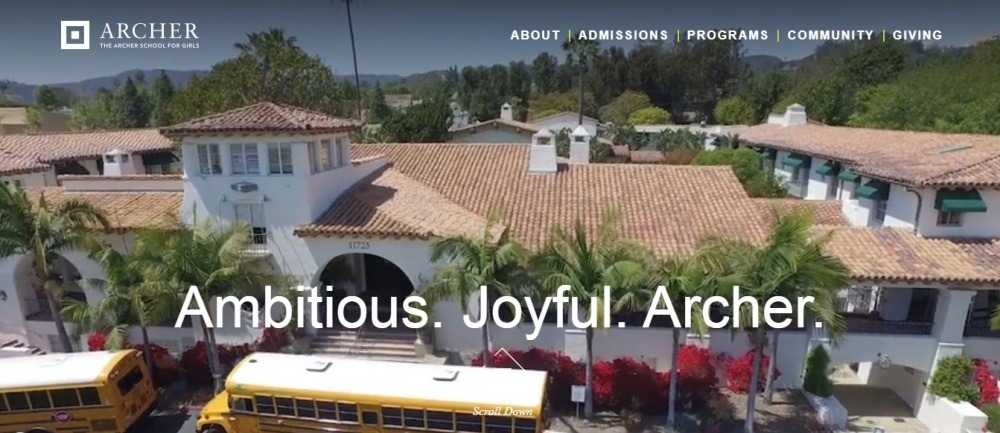
Visit the website: https://www.archer.org/#/
This site has a very simple design that uses rich, vibrant colors. They attract attention and facilitate navigation.
The banner on the main page shows a video fragment of the life of the school. In addition to the convenient utility menu in the header, the colorful main menu flaunts right in the middle of the screen. It contains high-quality photos of the school’s weekdays. Each site section is marked in color, which facilitates your orientation.
Due to the fact that family opinion is important in children’s education, there is even a separate page for grandparents!
2. Best District Websites: Arrowhead Union High School
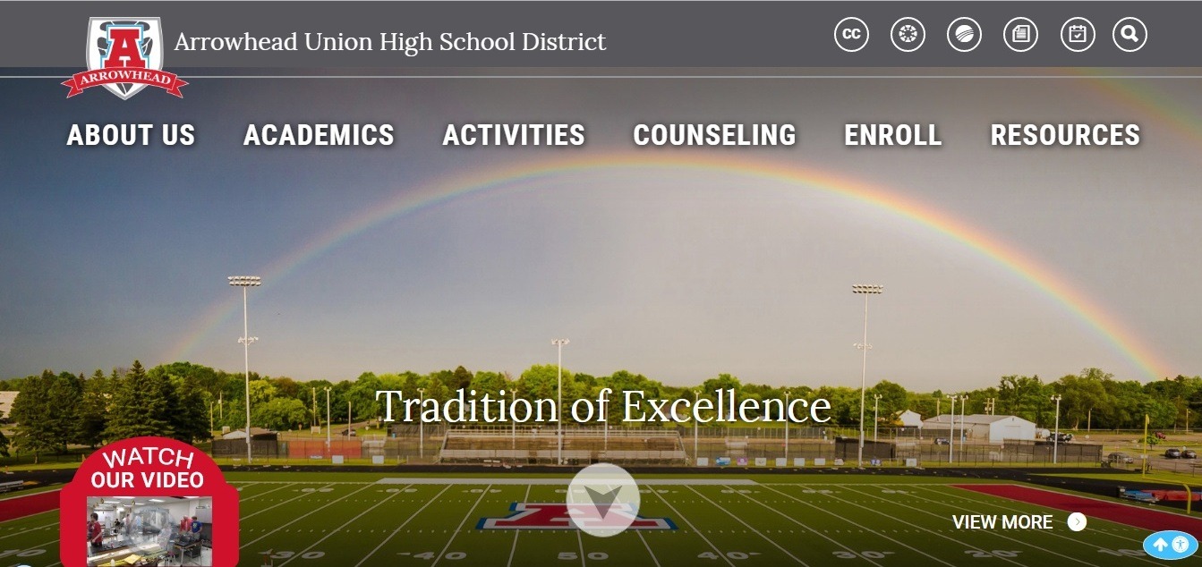
The main page of the site immediately greets you with a beautiful, juicy, and promising picture of a huge school stadium. The site has a very responsive design and a well thought out menu.
Here, on the main page, you will find multiple animated icons that will direct you to various important pages.
Thanks to LaunchPad Portals, you can quickly and easily find the resources you need without scrolling across the page.
3. Queens Park Academy: public school website example
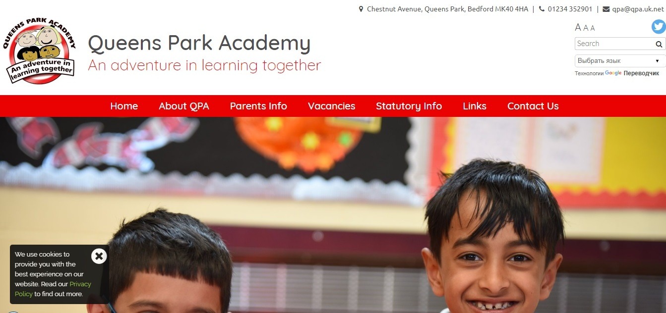
Visit the website: https://www.queensparkacademy.co.uk/
The owners of this school web portal can be proud of its stunning images, responsiveness, and storytelling!
No matter what device you are using, the site looks excellent on any screen.
It is very easy to navigate on the Queens Park Academy website. More than that, it is pleasant to use it: you won’t find any annoying design elements and pop-ups here!
4. Best school website design: SCAD

Visit the website: https://www.scad.edu/
The bright and modern visual elements and effects are designed to motivate students. The site design was developed by one of the former students of SCAD, which is a nice element of the school portfolio itself!
The top menu on the main page offers quick access to all important sections.
5. Best Private School Websites: The Blake School
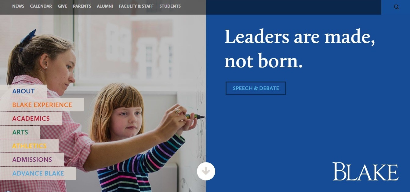
Visit the website: https://www.blakeschool.org/index.cfm
All private schools compete for students, just like the companies compete in the market. Therefore, branding is so important for such educational institutions. Blake owners did an excellent job to show the uniqueness of the school in the Minneapolis market.
Greetings in several languages on the main page, the mission of the school, photographs, even colors create a feeling of internationality that permeates the school’s brand.
The Global Focus website section has many useful links to its Global Online Academy and service-abroad programs.
Owners of the site and the segment of mobile users have not forgotten: the site looks perfect on any mobile device!
6. Best Charter School Websites: Woodstock School
Visit the website: https://www.woodstockschool.in/
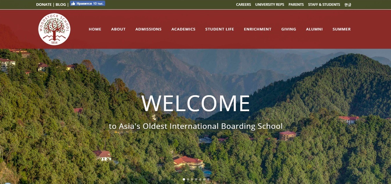
Located on Himalayan foothills (this is confirmed by the bright, breathing fresh air picture on the main page of the site), this school has every reason to be proud of its rich history (which, by the way, is clearly described on the site’s pages).
The main space is occupied by stunning full-size images that are better to see once than to hear about a hundred times
The school has an excellent and informative blog, which also occupies an important place on the site.
The site has all the important design elements of the best school websites, including an alumni webpage, pages for students, parents, and teachers. Of course, there are all the necessary links to useful resources and private web portals. Great job!
7. Best Elementary school websites: Hawksworth CofE Primary School
Visit the website: https://www.hawksworthceprimary.org/
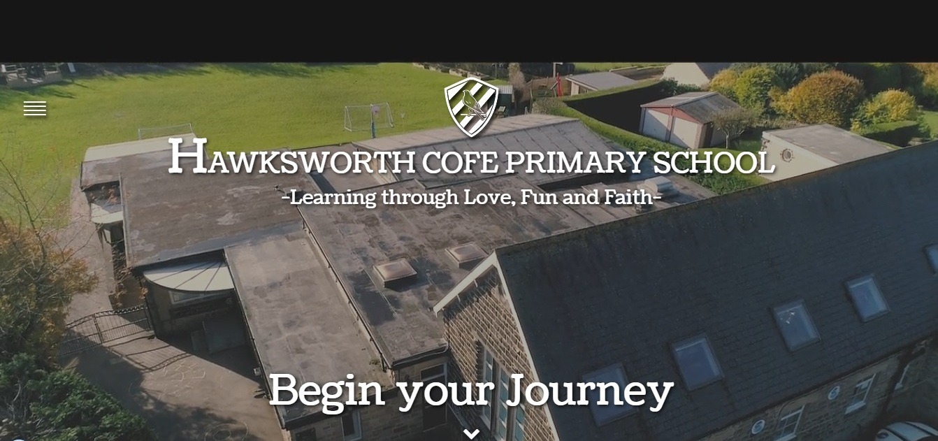
The owners of Hawksworth CofE Primary school have come up with a great way to show the panoramic views of their academic institution. These guys have made an impressive beautiful video using a drone! This video greets you right on the homepage.
The site has a very modern, neat design that instantly builds trust.
The combination of high-quality images, video, and animation involves the visitor unforgettable user experience.
8. Cedar Hills website
Visit the website: https://www.cedarhillskp.org/
Cedar Hills creates a community education for all its students.
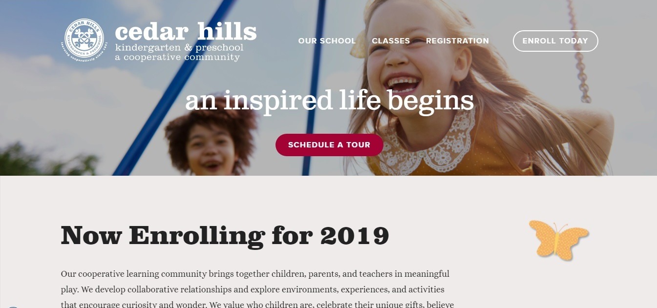
At first glance, the site navigation menu seems quite tiny. But then you realize that it is organized in the most correct way using the drop-down menus.
One more great idea is placing the “Schedule a Tour” CTA right in the header! The visual design elements are accurately chosen, and the whole site design is just perfect for kindergarten and elementary school!
The site is very user-friendly. Just take a look at the contact form with Google Maps next to it!
9. IADE Lisbon best school website
Visit the website: https://www.iade.europeia.pt/en
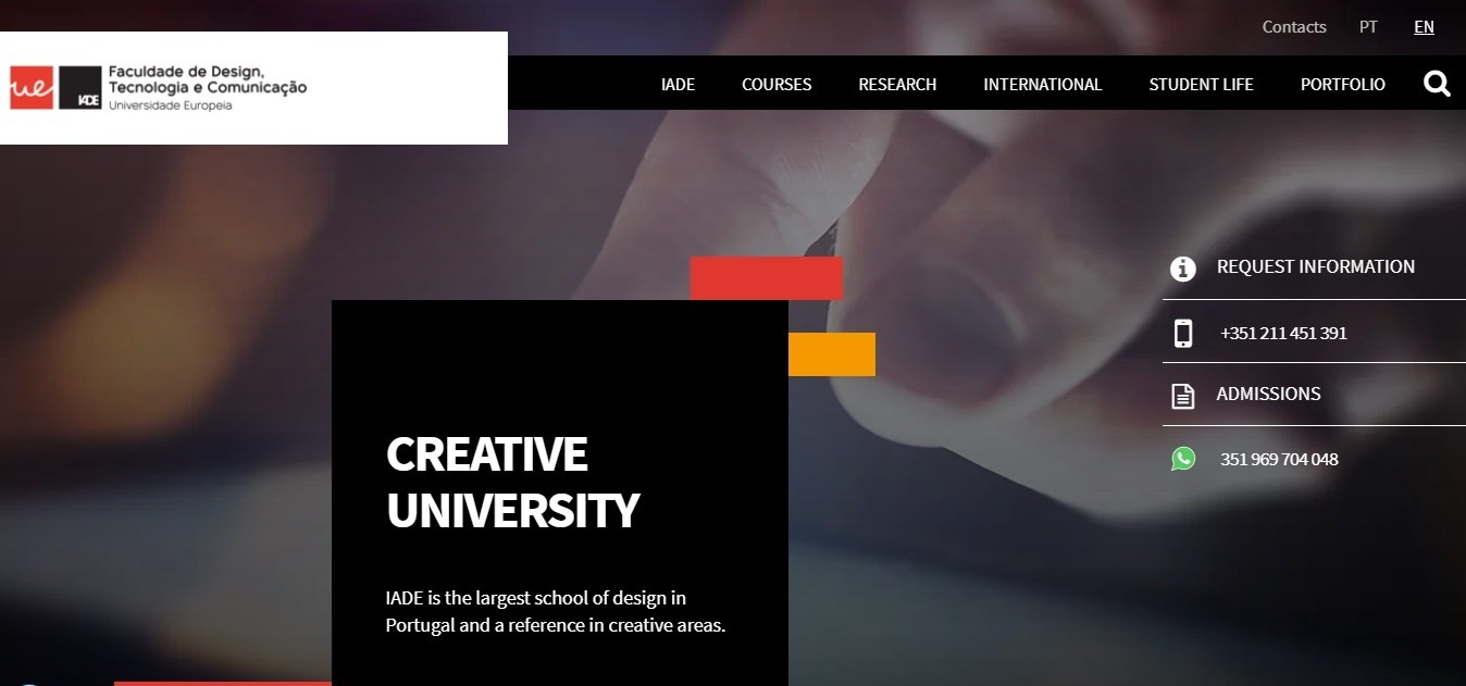
IADE Lisbon site has a very nice and modern design, designed to build to trust. Different fonts help you easily navigate the main page.
The clickable “Request Information” buttons and contacts are fixed to the right of the page, making it possible to contact the school even easier!
10. Best school website design: The New School
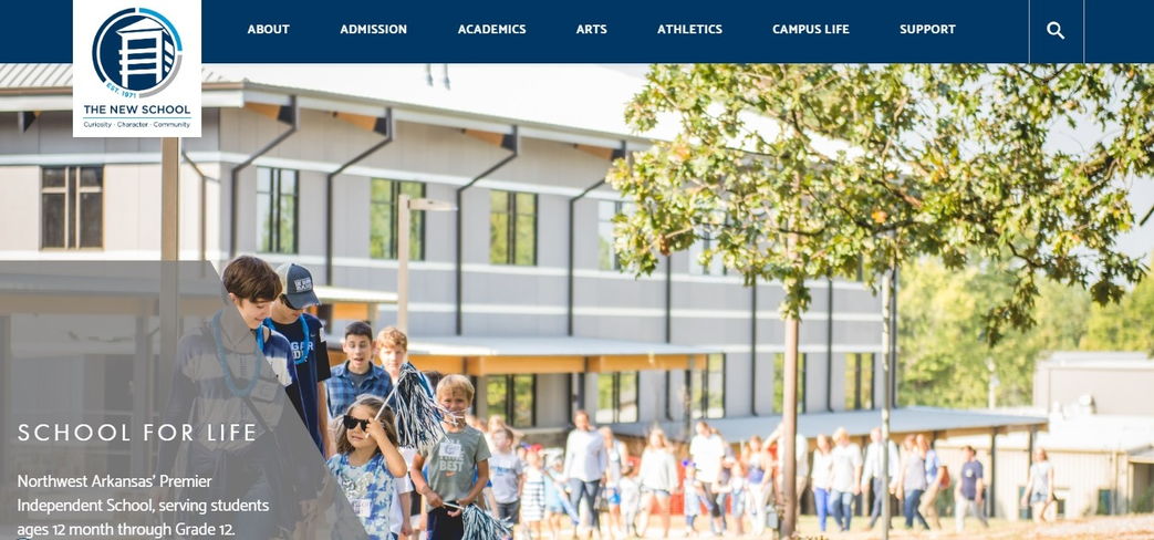
Visit the website: https://www.thenewschool.org/
The school provides its beneficiaries with the three directions of self-development – academics, arts, and athletics.
The site is very well structured, so all the important information is just a click away. The menu uses drop-down submenus. This has become a traditional move for sites with a large number of subsections.
Most of the CTAs are appropriately located on the main page of the site: there is information about the achievements of students and teachers, faculty qualification, and other important information.
The site is perfectly displayed on all screens.
#11. Riverstone International School website
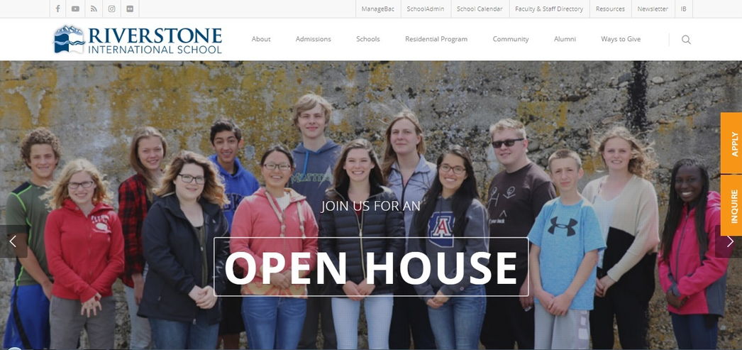
Visit the website: http://riverstoneschool.org/
Riverstone International School had set a goal to prepare students for future success by any means possible!
The top menu of the site is fixed horizontally, which is convenient when you scroll the page. The bright «Apply» and «Inquire» buttons are fixed on the right of the page, which allows easily finding and using them.
The banner of the main page shows a slideshow with high-quality images telling about the benefits and life of the school.
The separate clickable Elementary, Middle and high school sections icons are very easy to notice.
There is also some useful statistical information about the achievements of students available on the main page.
#12. UCLA school website
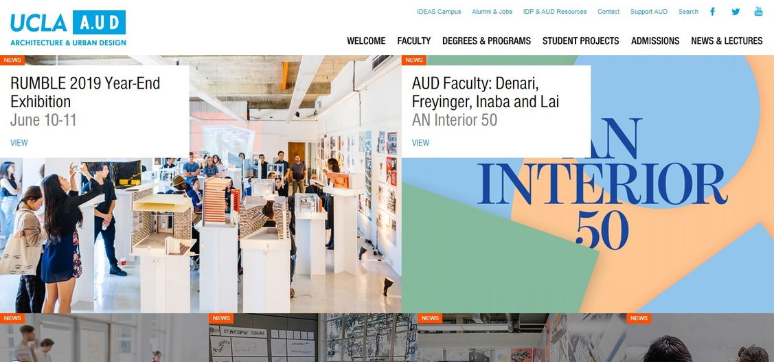
Visit the website: http://www.aud.ucla.edu/
The banner on UCLA’s main page is a collage of clickable images. It works like the additional menu of the site. This solution looks very modern and is a convenient way to fit in all the important information on the main page.
#13. Mentone Girls Grammar School Website design example
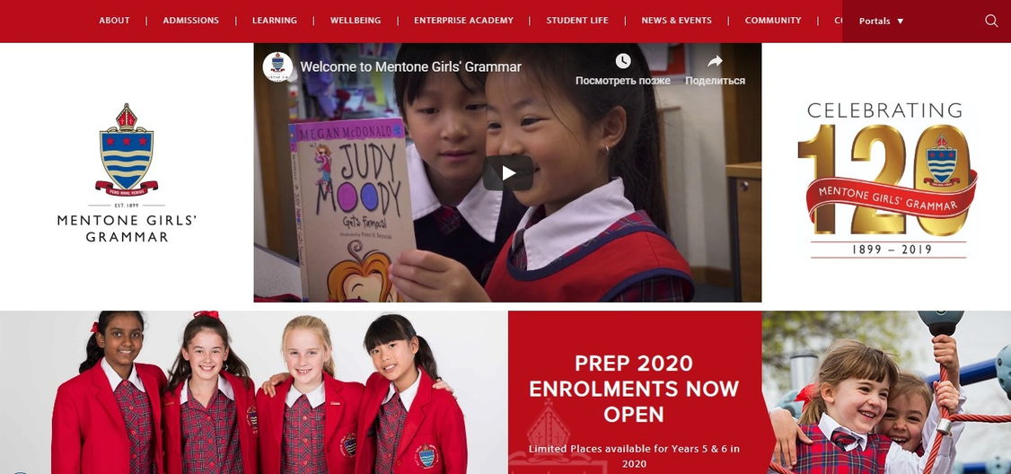
Plenty of white space combined with red and blue accents looks very attractive, helping the visitor to navigate the main page.
Another interesting design element here is the red “Enquire”, “Apply” and “Contact” buttons, which are highlighted when you hover the mouse.
Summary
The most important question that will help you to create a perfect school website is “what unique features make this school stand out from thousands of others?”. Only when you will give an answer to this question, you will exactly know which site your school needs!
Only then, you will be able to choose a unique design, think through convenient navigation with its blocks, sections, and headings. After that, you can start an effective promotion campaign, keeping in mind to frequently update your website.
If you need a website for your school, you can do everything easier and much cheaper. Use the next generation website builder Weblium now!
All Weblium templates are designed on the basis of a deep study of a niche. This means that the school website templates have the modern design, easiest navigation, and contain the maximum of necessary blocks, buttons and other design elements of the site.
Using the most convenient Weblium editor, you will be able to create a jaw-dropping school website yourself. Also, prepare yourself to get a number of additional bonuses, such as basic Seo-tools, free custom domain and hosting on Google Сloud.
Log in and see how easy it is to create a school website with Weblium!


