Top 10 Web Design Trends for 2026
Web design is not only about beautiful pictures and functional websites. It is an art that constantly changes and evolves, creating new opportunities for business and creativity. Every year, new trends appear, and the question arises: Should we mindlessly follow fashion, or is it better to create innovative solutions? The answer to this question is not always obvious, but one thing is for sure — being up to date is extremely important.
To compile this list, we turned to the team lead of the design department at the website builder Weblium Igor, who shared his view on the main trends in web design. In this article, you will find not just general recommendations but also objective forecasts from a professional that will help you understand what to pay attention to.
Contents
Understated Minimalism

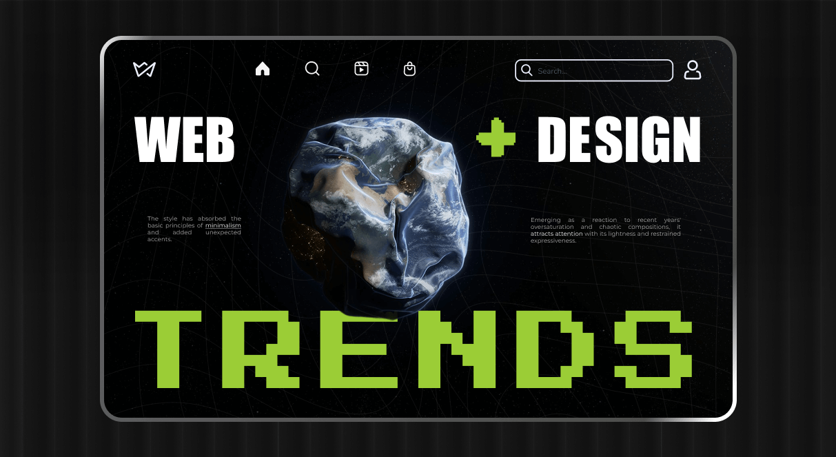
The style has absorbed the basic principles of minimalism and added unexpected accents. Emerging as a reaction to recent years’ oversaturation and chaotic compositions, it attracts attention with its lightness and restrained expressiveness.
Understated minimalism involves using simple geometric shapes — lines, rectangles, and circles — to form a clean structure. Elements are arranged in a clear hierarchy that is easy to perceive. When creating a color palette, you should focus on one or two main colors and saturated accents. For example, you can use pastel shades with bright neon green or orange.
To create a sense of tactility, you can add a textured background (paper, concrete, fabric). Minimalism allows you to pay special attention to typography, using modern serif fonts or with accents — one unusual letter or different thicknesses. Symbols or even individual words can be integrated into illustrations or abstractions.
In order not to overdo it with the redundancy of elements, do not forget about white space — literally the empty space between blocks and sections. This will maintain ease of perception, as well as keep the focus on the main elements of the design.
Best suited for:
- Designer portfolios and corporate websites;
- Logos of niche or premium brands that combine restraint with creative details;
- Advertising banners with a strong central element.
Why is this important in 2026?
In the era of information noise, understated minimalism is a great way to achieve peace and harmony but also interest the audience. As technology continues to develop rapidly, it is necessary to find a balance between accessibility and innovative approaches.
Thanks to skillfully placed accents, visual restraint allows the design to be clear, pleasant, and memorable. This style is easy to adapt to different needs and formats, making it easy to create a cohesive brand visual.
Experimental Typography

This direction breaks the standards and creates unique, artistic solutions. It is rapidly gaining popularity, standing out among similar fonts that are often used for online business.
Hand-drawn fonts and their digital imitation create a feeling of imperfection that attracts with its naturalness. These can be uneven contours, variable line thickness, or the effect of drawing with a pencil or brush.
The style involves non-standard forms, which allow you to violate traditional principles of proportions, symmetry, and even readability. For example, letters can be twisted, stretched, superimposed on each other, or combined with visual elements. Thus, they can become objects or metaphors. For example, the letter “O” can become part of the sun or a planet, and “T” can look like a tree.
Followers of this trend are inspired by fonts from the 1970s, 1980s, or 90s and combine them with modern elements, such as the VHS effect, pixel graphics, or psychedelic waves. You can try animating typography and giving the text dynamics: words and sentences can change shape, location, or color. Don’t be afraid to experiment with materials and overlay imitation textures (wood, stone, metal) to create a three-dimensional effect.
Best suited for:
- Unique logos based on the company name.
- Festival pages and other art-related events.
- Websites aimed at the creative industry.
Why does it work in 2026?
Representatives of the same niche increasingly use the same fonts. Experimental typography, thanks to its uniqueness, creativity, and departure from standards, is an excellent solution for attracting attention. It is an ideal way for brands and designers to stand out and evoke emotions.
Retro-digital aesthetics

The trend is a reflection of nostalgia for the early years of digital technology. It uses visual elements typical of the era of the first computers, game consoles, and low-resolution television effects. It is used as a way to create an emotional connection with the audience.
The style involves using low-resolution images where each pixel is clearly visible. It is often used in illustrations, web design, or animations reminiscent of old video games. Fonts inspired by the displays of old monitors or early versions of Windows and monospace fonts reminiscent of DOS programming are also standard.
The chromatic effect can be achieved by imitating image defects, as on old TVs or VHS tapes: color breaks and noise.
Do not forget about bright color gradients inspired by the 1980s and 90s. These gradients resemble the screensavers of old computers or movies. The design can be complemented with stylized icons, rough lines, and an 8-bit color palette.
Best for:
- Video and gaming projects to resonate with the audience that used the first computer games.
- Digital and advertising agency websites.
Why is this style popular in 2026?
The market’s primary audience consists of people who grew up in the 1980s and 1990s. The retro-digital aesthetic evokes warm memories and a sense of community in them. Modern web design trends try to contrast this with hyper-realistic and perfect visuals.
Most choose this style because of the ease of design creation. Pixel images or glitches are easy to develop with modern tools. In general, there is a trend towards returning to the pop culture of the past — remakes of old movies, video games, music albums, etc.
Integrating Artificial Intelligence

The use of artificial intelligence in design is not losing popularity. In 2026, AI will be a way to quickly generate an image or website, saving time and resources and achieving a high-quality result that will meet the needs of the business.
Tools like Adobe Firefly or MidJourney create images based on text queries. They allow you to quickly make several options for layouts, illustrations, or graphics so that the user can choose the one that best suits them.
AI can analyze user behavior and offer design solutions that increase interaction. For example, it can recommend color schemes or layouts for websites based on the target audience.
AI-powered services, such as Photoshop AI, can also be used for retouching, automation, object removal, or color correction, greatly simplifying post-production. Platforms such as ChatGPT or Adobe Sensei will be helpful for collaboration, discussing ideas, or getting recommendations.
Best for:
- Creating logo variations based on the brand’s style, colors, and personality.
- Concept art that combines different styles, color palettes, and compositions.
- User-driven UI/UX design to improve the user experience.
Why is this style popular in 2026?
AI is a quick and efficient way to create multiple design variations without much effort. It takes over routine tasks, allowing designers to focus on their creativity. AI can also generate unconventional ideas that are difficult to imagine or implement manually.
AI tools are becoming more accessible, even for freelancers or small businesses. However, the massive use of generative AI can lead to monotony in content.
There are also growing ethical concerns about using images based on the work of other artists. Of course, even with automation, designers’ involvement is necessary to assess quality and effectiveness.
Levity and Laughter

The emotional factor is essential to consider, and in 2026, design trends include integrating humor and playful elements. This approach helps designers create visuals that not only attract attention but also evoke positive feelings, ensuring a strong connection between the brand and the audience.
To achieve the desired effect of visual saturation, it is worth choosing a palette of bright colors (yellow, pink, blue) and combinations of contrasting shades. One way to liven up the design is to use hyperbole and caricature, for example, creating characters with grotesque proportions or exaggerated objects that resemble cartoons or comics.
You can also add dynamic elements that move or change shape or animated details, such as winks. This style also uses non-standard “toy” fonts with rounded shapes, asymmetry, interesting elements, or those that resemble children’s handwritten inscriptions.
To diversify the design even more, you can use absurd elements placed in unusual places and perform non-standard actions. For example, you could create surreal scenes like a dancing coffee cup.
Best suited for:
- Advertising blocks with humor to increase brand recognition.
- Interactive details: buttons that “run away” from the cursor or unexpected changes during interaction.
- Bright UI design: unusual icons, creative fonts, and comic-style elements for a “wow” effect.
Why is this style popular in 2026?
People are looking for positive emotions in content to counteract the stress of the modern world. Humor becomes a way to improve mood and create a connection with the brand. Playful content is more memorable and encourages people to share it with friends or on social media, which ensures high engagement.
Humor can be universal (depending on culture) and used in design for different audiences. In general, companies that skillfully use this technique are perceived as more friendly and open to customers.

Retrofuturism (Time Warp)

Retrofuturism is a style that combines the aesthetics of the past with ideas about the future. Inspired by retro designs from the 1960s, 1970s, and 1980s, this style adds modern elements, creating a feeling of both nostalgia and novelty. For the color palette, you should choose shades that were popular in the past, such as mustard yellow, terracotta, mint green, purple, and pastel colors. You can also add bright neon accents that symbolize the idea of the future.
The style is characterized by smooth lines that resemble early concepts of spaceships or electronic devices. It is also worth using geometric shapes that are often found in logos, posters or interfaces of those years. Fonts inspired by advertisements from the last century have large serifs and a futuristic look.
Add avant-garde elements, such as illustrations of flying cars, robots, space landscapes, or retro technology. Pay attention to graphics inspired by fantasy films of the time, such as “2001: A Space Odyssey” or “Blade Runner”.
This trend complements modern gradients or 3D effects, as well as the use of textures and materials: glossy surfaces, imitation metal or glass, and interiors reminiscent of space stations.
Best suited for:
- Logos inspired by the aesthetics of old computers, arcade machines, and space technology.
- Atmospheric websites with pixel graphics, neon shades, and synth-wave elements.
- Advertising banners in the style of “future from the past”.
Why is this style popular in 2026?
The trend symbolizes how the ideas of past generations about the future resonate with our present. Retrofuturism satisfies the desire to return to “better times”.
The aesthetic component is also essential because the combination of soft colors and futuristic shapes creates compositions that are pleasant to perceive. This style has gained popularity in pop culture; it is widely used in films, TV series (for example, “Stranger Things”), and music.
Immersive Design (Immersive Appeal)

This trend aims to fully engage the audience through interactivity, multi-sensory elements, and a deep emotional connection. It allows you to create unique experiences that make the user not just an observer but an active participant.
Interactivity can be achieved using various elements that react to the actions of visitors. For example, websites where figures change their appearance or position depending on how the user interacts with them.
The use of visuals in combination with audio, video, and tactile elements is becoming popular. For example, presentations with musical accompaniment. 3D effects and virtual reality are being introduced into design, which allows for the creation of the illusion of space.
For an emotional connection, it is worth using appropriate colors and shapes that evoke a sense of delight, surprise, or, conversely, calm. The main principle is to minimize barriers between the user and the content, so the interface design should provide a natural and immersive experience.
Best suited for:
- Sites that respond to mouse movement or scrolling which creates a sense of spatial depth.
- Platforms that offer virtual tours or simulations, for example, for museums or stores.
- Interactive presentations that allow the user to explore the content at their own pace.
- Augmented reality (AR) campaigns, for example, users can scan QR codes to see the product in 3D.
Why is this style popular in 2026?
Audiences are looking for a new level of interaction with brands that goes beyond the usual viewing. As technology advances, AR and VR are becoming more accessible to the mass market, fueling the growth of interactive content.
Immersive design allows for the creation of intense emotional experiences that drive long-term brand or product loyalty. People expect intuitive, simple, yet engaging experiences on digital platforms.
Skeuomorphism

This design approach recreates real-world textures, materials, and physical objects in a digital environment. After years of flat design dominance, it is making a comeback in a new, modernized form to create a more tactile and emotional experience.
Use textures that resemble wood, metal, leather, fabric, or paper. Materials should be rendered realistically enough to feel like you can touch them. Objects should have shadows, highlights, and lighting to create a three-dimensional effect.
Skeuomorphism often recreates familiar physical objects, such as vintage clocks, radios, or notepads, that evoke fond memories. On the other hand, new skeuomorphism uses modern technology to achieve an almost photographic quality and create the most realistic effect possible.
This style integrates with flat design or neutral colors, making it less intrusive and more adaptable to modern platforms. Elements not only look tactile but also interact with users.
Best for:
- Creating visually appealing and intuitive platforms, such as imitating physical objects such as notepads, calculators, or musical instruments.
- UI elements that look like they can be “touched” include buttons, sliders, and switches.
- Product visuals that seem to “come alive,” such as highly realistic textures.
- Exclusive and sophisticated branding, such as 3D logos with metal or wood elements.
Why is this style popular in 2026?
Users are looking for more tactile interactions with the digital world. Today’s high-resolution screens, GPUs, and design tools allow users to create textures and objects without sacrificing quality.
Skeuomorphism brings warmth and emotion back into design. Realistic objects are easier to understand and perceive because they are based on visual analogies with reality.
Glitch Effects

This style recreates digital “errors” and distortions that are characteristic of malfunctions in electronic devices, such as old TVs, monitors, or video cassettes. In 2026, this trend is gaining popularity due to its ability to convey the dynamics, modernity, and atmosphere of last-century technology.
The first thing to focus on is image defects: line breaks, irregularities, and color interruptions that look like signal transmission failures, such as “broken” images with vertical or horizontal stripes.
It is also worth using chromatic aberration — an effect in which colors (red, blue, green) “flare” at the edges of objects, creating the illusion of incorrect image synchronization.
You can add small white and black dots that resemble television noise or video glitches. Geometric distortions can be achieved by “stretching” or “warping” objects. In animations, glitch effects can be presented as blinking, shaking, or shifting objects.
Best for:
- Advertising campaigns for IT companies and festivals that emphasize technologicality and modernity.
- Futuristic sections with a digital aesthetic inspired by science fiction.
- Animated elements with dynamic visuals to attract attention.
Why is this style popular in 2026?
For many, glitches are reminiscent of the era of the first computers, televisions, and video games, evoking warm memories of the past. In today’s culture, with its interest in artificial intelligence, technology, and the future, glitch aesthetics reflect the idea of the unpredictability of the digital world.
Society is increasingly accepting and even appreciating imperfection as part of beauty, and glitch effects perfectly reflect this. They stand out against the background of “clean” and flat styles, attracting the audience’s attention with their energy.
Neo-Brutalism

Rough, angular forms, a lack of ornamentation, and an emphasis on functionality characterize this design style. It was inspired by the architectural brutalism of the mid-20th century and returns attention to the basics and authenticity, rejecting the complexity and “ideality” of other styles.
The use of sharp, angular, and rough shapes, as well as textures (concrete, metal, or brick), are often integrated into the design to create a sense of reality. It is worth limiting the color palette, choosing black-and-white schemes, shades of gray, or basic colors (red, blue, yellow).
Visuals consist of massive blocks of text or graphics that are not burdened with decorative elements. Fonts are often rough, monospaced, and have an industrial or even “imperfect” look.
Since the style focuses solely on functionality and content, it involves a lack of embellishments and minimal use of decorative elements such as gradients or shadows. Buttons, element borders, and other elements can be left “incomplete,” as if they were ripped from an unfinished template. The design can look rough or intentionally unbalanced, with unconventional text or image placements.
Best for:
- Sites with large blocks of text, minimal images, and no embellishments.
- Posters using bold fonts, gray backgrounds, and sharp contrasts.
- Minimalistic covers with large fonts and “raw” textures.
- Independent brands that strive to look rebellious and honest.
Why is this style popular in 2026?
After a long dominance of “perfect” design, neo-brutalism offers something authentic and “imperfect.” In a world where brands compete for attention with bright and complex visuals, neo-brutalism attracts with its simplicity and directness.
The style is ideal for startups, independent artists, and companies that want to appear honest and transparent. Designers are looking for a way to emphasize content over form, accentuating functionality. The rough and asymmetrical look adapts well to web design, creating a sense of novelty.
Summary
Web design trends involve not only style but also innovations that make your site modern, functional, and attractive to visitors. Whether you follow them or not is your choice, but understanding these trends will help you create a site that meets the needs of your audience and stands out from the competition.
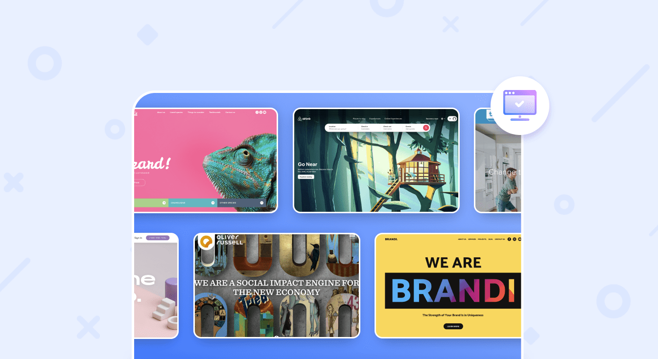
If you want to easily and quickly create an attractive website that considers all modern trends, try the Weblium builder. Thanks to the intuitive editor, professional templates, and powerful tools, you can implement any idea without much effort.
Create your functional and trendy website with Weblium!