Anatomy of a Website 101: Must-Have Web Design Terms
Anatomy of a website may soon become a self-sufficient discipline. You don’t need to be a designer or developer to start a web platform, neither need you to hire one. Maybe you’ll just need to Google a couple of basic terms to make sure you are doing everything right.
We’ve decided to provide a brief insight into the anatomy of a web site for those who just start using Weblium or have found interest web design lately.
Newbies often don’t clearly understand the difference between web design and web development. Web design and web development are often used interchangeably.
Put shortly, the primer is drawing a nice website (web design) and the latter is an implementation of those ideas (website development).
Today, we’ll pay attention to website design terms – header, footer, favicon, and more. Web development terms – like ajax, cache, backend, etc. – we’ll save for later.
Artificial Intelligence Website Templates
Contents
Basic Website Terminology
#1. The website prototype.
It is a model of a future site that defines site structure, location of navigation blocks, application forms, and other functional and information elements. A prototype is the foundation of a web project, based on which developers build a complete and effective system of user interaction with the site.
#2. Website Header
It is an upper part of a website. This area at the top is identical for all website pages. It can be divided by a line or have a color contrasting to the main block. A header may feature a website name, a logo, and elements of secondary navigation. A well-designed header engages a user to surf a website for a longer time.

Read our article about website header design and how to make it good.
#3. Website Footer
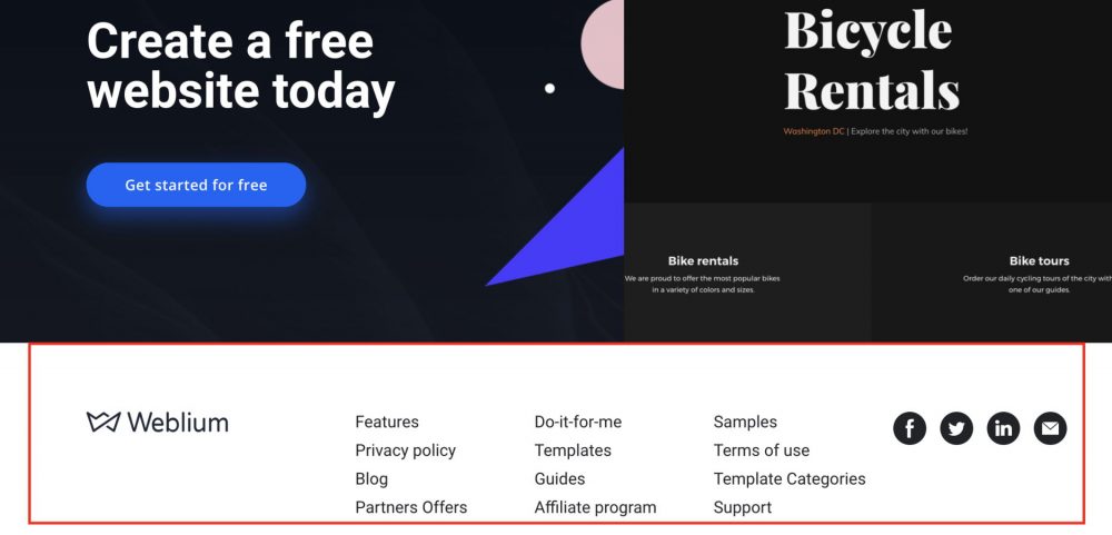
It is a part of a site that appears at the bottom on all pages. A footer may show your contact information, terms of use links to sections of the site, social buttons – any information that can be useful for a target audience and should be featured on a website in a compact form. A footer can be a helpful tool for lead generation.
#4. Favicon
It is a small icon displayed before a page name in a website tab and searches history. It can be a logo, first letter on the name, or any other symbol symbolizing a website. In some browsers, favicon appears in an address row before a page URL. The standard favicon size is 32×32 or 16×16 pixels. A favicon is important for branding and makes a website more memorable.
![]()
#3. Content
It is the full scope of information and multimedia featured on a web resource, including texts, images, audio tracks, videos, etc. It can be available for viewing or downloading. Content is significant for website promotion so it should be unique (not copied from somewhere) and regularly updated.
#4. Website Navigation
It is a system of links that allow users to surf a website, easily finding necessary pages and materials even if people use a web resource for the first time. The navigation should be clear, logical, and intuitive.
#5. Dropdown Menu
It is a horizontal menu located at the top of the site that is used for aligning website navigation structure. It is a popular option thanks to the compact hierarchical structure. An optimal number of levels in a dropdown menu is one or two – just enough to display the most important pages. The fewer levels you add to a menu, the easier it is to find necessary information.
#6. Homepage
It is the main page of a website. It is a place from which you can easily get to other web pages and site files. A home page opens by default when a visitor enters a site from a list of search results.
Great homepage examples you can find here.
#7. Landing Page
Landing page – is a web page designed in a specific way to promote a certain product, informing users about something, collecting contact information, etc. Sometimes business owners use a one-page site for those purposes.
#8. Negative Space
It is part of a web page that doesn’t feature any content. It is a free space created between elements on the page or around them. Negative space becomes a self-sufficient element of the composition, balancing a positive space and supporting it. They add up both to website aesthetics and usability.
#9. Responsive Design
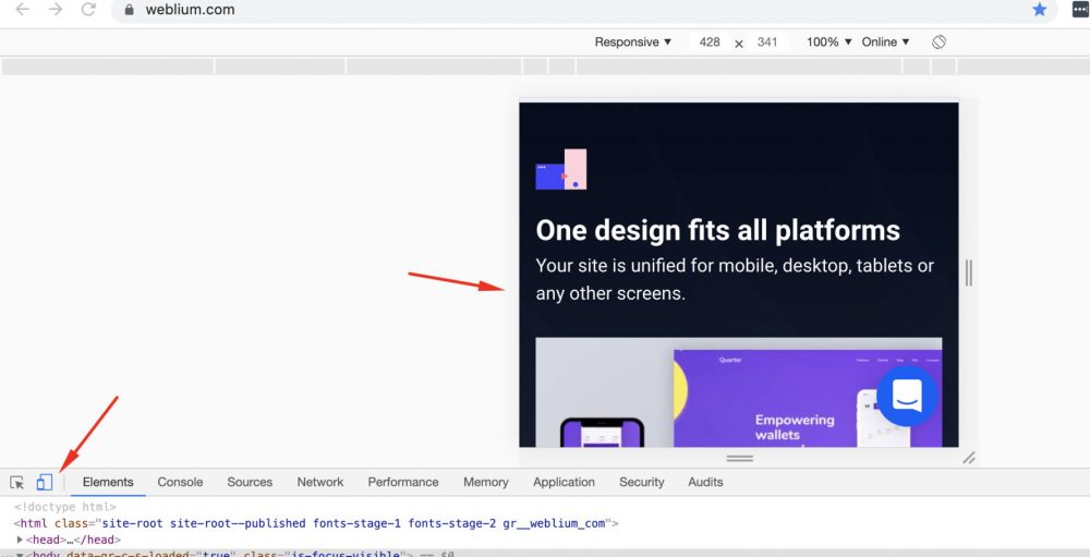
It is a type of website design that allows displaying page content equally correctly on devices with all screen sizes. It is a default adaptation of a website for further convenient using any laptop, smartphone or tablet. Responsive design gets more important every year due to the increasing percentage of mobile traffic globally.
You can test how responsive design looks using our website: https://weblium.com/
Bottom line
These are key web design terms. To become fully proficient in the anatomy of a website you will need some practice. You can find more detailed information in our blog articles or create a profile and experiment with website builder features.
