10 Best Retro Websites: Vintage Websites Design
Did you know that all New is well forgotten Old?
Fashion in web design is changing rapidly, and retro designs come back. But they do not return in their original form: they undergo some crucial changes influenced by the times they come back to.
The mysterious, nostalgic, unusual retro design has its niche in web design: handwritten fonts, old cars, models of retro goods, old-fashioned photos, and even vintage Atari video games.
Retro websites intrigue, creates a sense of value, subconsciously inspire confidence among visitors and are always remembered!
We have selected for you the 10 best examples of modern retro design websites, and also we will give you some crucial tips for creating a unique vintage website design!
Contents
What are the pros and cons of retro web design?
Pros of modern retro style:
- it looks light and airy;
- bright colors in elements and shapes attract attention;
- pixel-style causes positive emotions;
- black and white photos, pixel images allow visitors to dive into their childhood memories;
- retro design is an excellent opportunity to try something new for yourself, to practice your creative skills and attitudes;
- retro art can instantly convey the spirit of the era if necessary;
- the modern retro design conveys such features and characteristics as playfulness, lightness, friendliness, and cheerfulness, it allows using an abundance of cool decorative elements.
Cons of retro style:
- retro designs are not for everyone, some people may not understand it at all;
- modern retro design is a rather autonomous style that does not fit well with many modern trends;
- retro style may look messy if you overdo it with fonts, shapes, and color schemes;
- in modern retro and vintage styles, digital images and videos are often not allowed;
- vintage style fonts from the early days of the Web do not look good on desktops and mobile devices;
- fashion is changing rapidly, so retroelements should not be used too actively, as users may think that they have come to the site from a prehistoric era.
Retro website design examples
Check out the best examples of old-school and vintage web design websites. Get inspired and create your own in the same style.
Theatre vintage website design
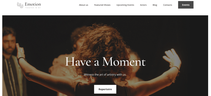
This incredible website with an old web design beckons with its simplicity. The palette here is simple, pastel and minimalistic. The refined font resembles the signature of an old letter – it gives a feeling of elegance and exclusivity of such a theater. This design is suitable for more classic art websites, but not for modern, absurd and contemporary ones. You should consider some other style.
Band old school website design
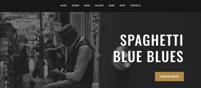
For classic blues bands, there are similarly retro atmospheric sites. This example is recreated in black and white and really resembles a photo shoot from the last century. It uses a lot of old photos with different exposures, which creates the feeling of looking through an album. This authentic design evokes nostalgia by combining classic elements with modern functionality. This design is perfect for musicians and bands that want to capture the spirit of the classic music scene and create a real retro vibe!
Bold & Noble
website: https://boldandnoble.com/
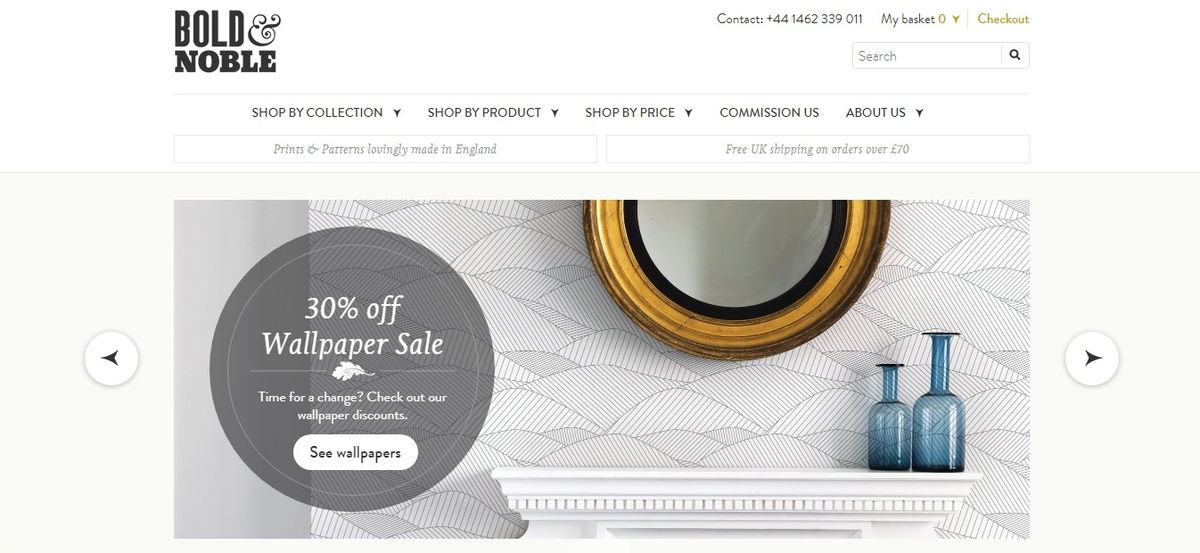
Retro site design is relevant if you sell retro products!
Bold & Noble is a great example of how web design complements products with a large number of eye-catching fonts that add a touch of retro modernism.
And they do cause the feeling that they were written by hand!
Magneti Marelli (Awwwards winner)
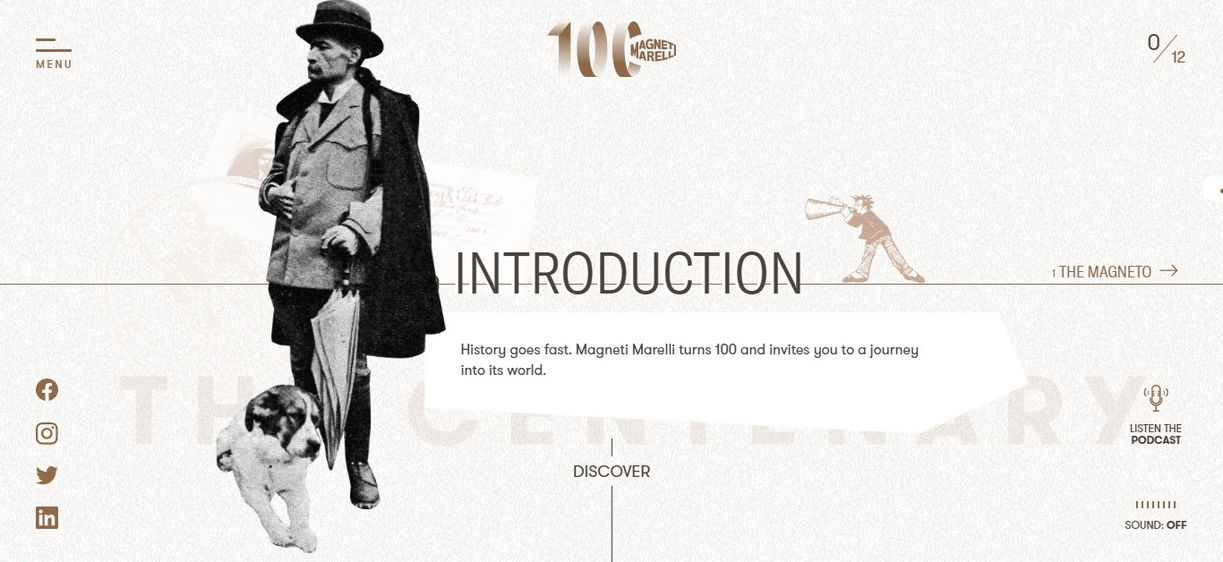
This website in vintage style tells you the breathtaking story of Magneti Marelli through twelve chapters that are offered in reading and listening mode. Using the stylized retro graphics, animation & and vocal narration, the website created an astounding experience.
ThunderFuel retro website
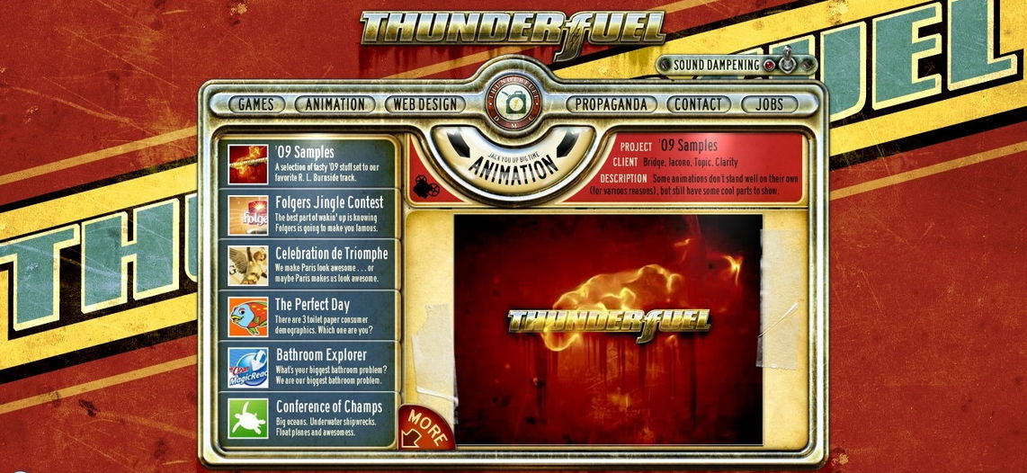
ThunderFuel is just a great example of a modern retro graphic design!
The company offers a great variety of services, from design and animation to games. After reviewing their flash website in retro style, we would definitely order something! It’s a very cool implementation and idea!
Tennessee vacation
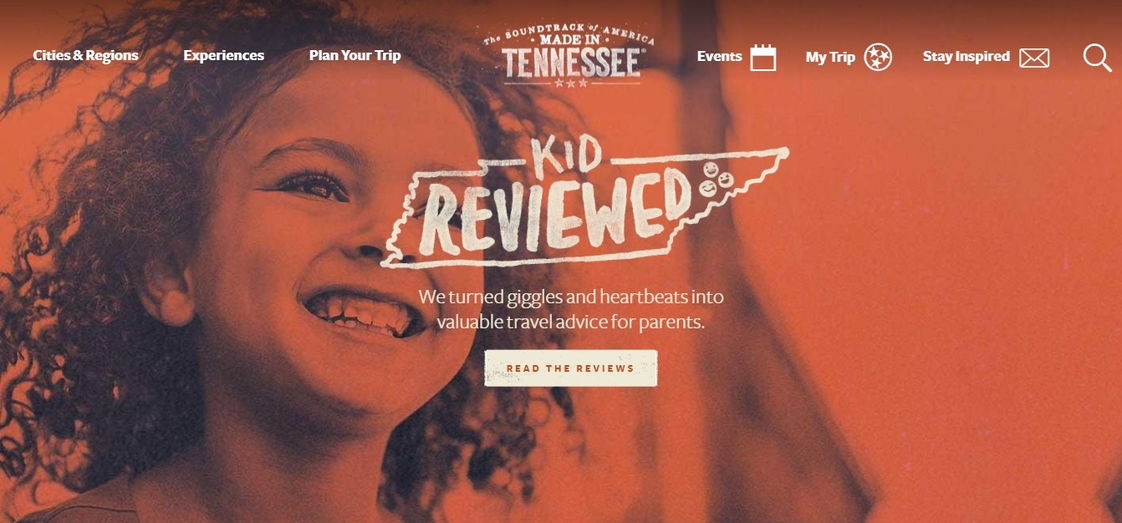
Tennessee Vacation is the place on the Web that was created for all lovers of the Tennessee state and nearby areas. The site has a very cool implementation in retro style, where attention is paid to almost every little thing.
This is one of the best sites in a similar style that we have seen!
All Star Lanes retro design
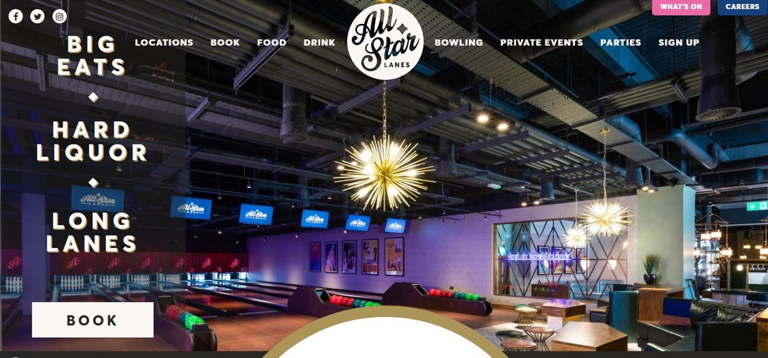
This site, performed in retro style, has a very clear and intuitive menu that facilitates navigation. You won’t miss the big “Book” button at the top of the page. All information that can interest you as a customer, from locations to parties, is presented very competently.
New York Moon retro website design
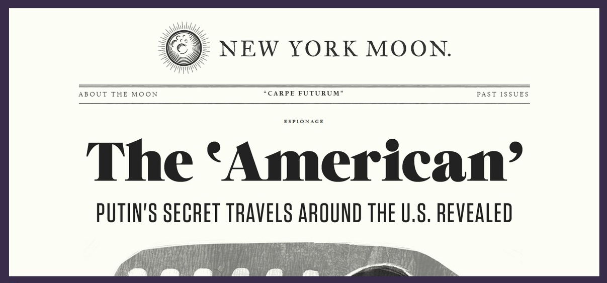
New York Moon is a lively publication on the Web, with the drawn illustrations, animation, and pages, accomplished in pastel tones. Its retro design immediately creates a sense of a past, when people were reading the news while having their morning coffee.
Anita Gelato (CSS Design Awards)
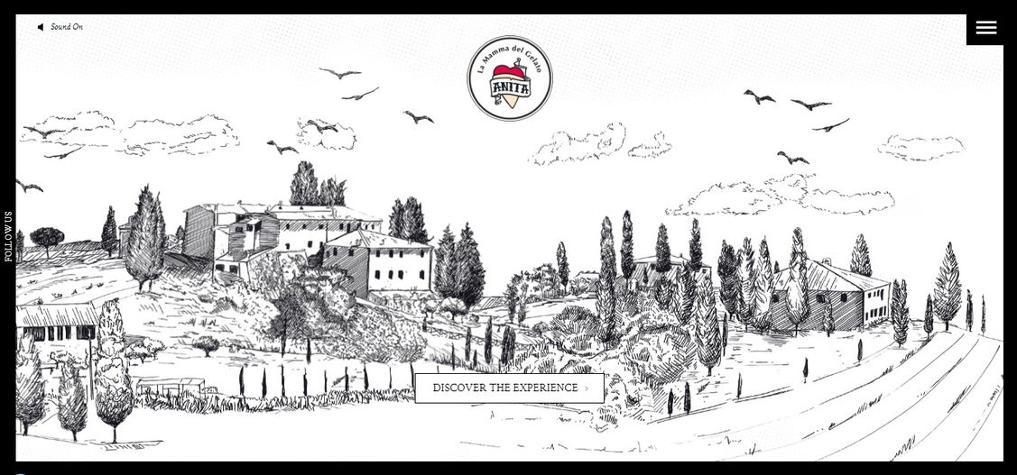
We have never seen a vintage website design of an ice cream boutique, and we absolutely love it!
The site is great: the parallax background resembles the pages of a 3D book with the hand-drawn pictures, and the modern hamburger menu completely fits the style!
Click the “Discover the experience” button – and you will go to the modern part of the site, with a gallery of beautiful, high-quality photos where you can filter the search results by source, country, hashtag, and even taste and color!
Portraits of Guilford (Crunchies winner)
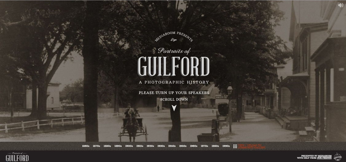
This amazingly designed website, implemented in retro design offers you to experience the city of Guilford.
On the first page, you will see a photo gallery sorted by year. You can choose any year – or you can just scroll down from 1860 in order, studying the history of the city. The progress bar on the right on the page fits the theme well.
Macaroni Bros retro website example
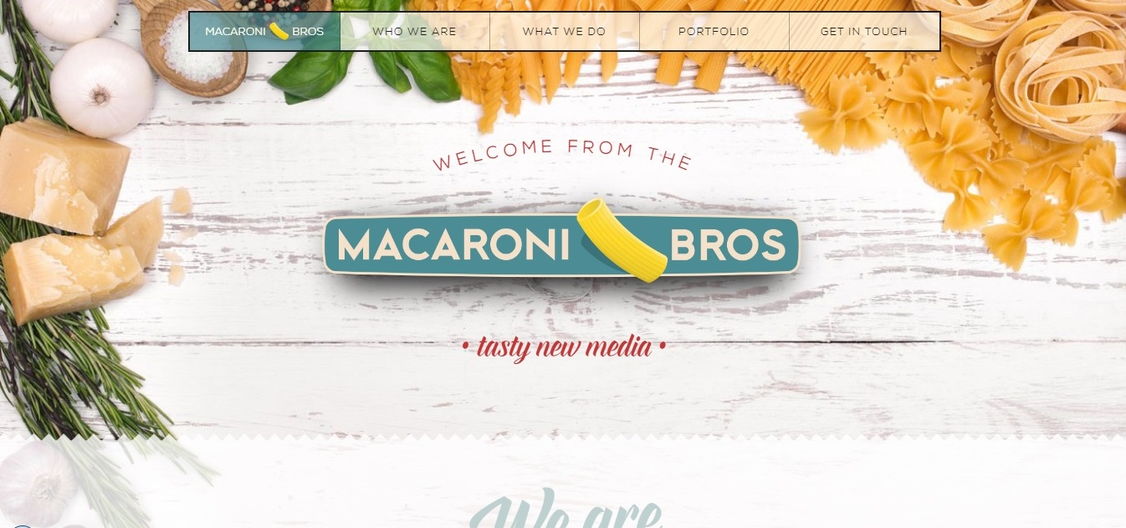
Do you think this is the pasta restaurant website? Then you’re wrong: you are now chilling on the territory of a cool branding company website that offers its «tasty digital recipes» to customers.
On this site, the retro style organically coexists with the modern design.
A stylish main menu of the site, laconic information available by scrolling, a section of services made in the form of a restaurant menu – this site is made according to all the rules of proper web design with a touch of creativity!
What is a retro style?
It is considered to be those fashionable directions of the second half of the 19th – the first half of the 20th century belong to the retro style. And the fashion trends, that are 20-50 years old are considered to belong to vintage style. Retro design implies the web design with a focus on a specific era, the culture of the past.
Vintage website design often involves using such characteristic elements as vintage television and radio devices, calligraphy and vintage fonts, old photos, neon elements, pop art, images of the first cars are often involved.
What is good about vintage website design or even about its elements is nostalgia, sensuality, memories. And they can create a very stable relationship between website design and visitors, influence the perception of content, the presentation of material, advertising, encourage clicking buttons, checking out the products, etc.
What is modern retro?
Modern retro design is gaining popularity and designers feel this trend. The fashion of the past decades often seems ridiculous and amusing, but people find old website design with vintage elements interesting, fresh and attractive.
This trend did not appear by chance. To some extent, it is a consequence of the fashion for flat design, in which the 1980s and 1990s approaches fit quite well.
Modern vintage website design is a new style that is popular in some subcultures. This is design for nerds and geeks, hipsters and just clever guys. Various categories of users can feel nostalgia so the retro design can be used in various web projects.
Retro graphic designs
What businesses modern retro design is suitable for?
Modern retro style harmoniously fits into the design of sites of creative subjects: portfolios, photo studios websites, sites of artists, designers, models, as well as sites of retro events, retro institutions, travel companies. Vintage design suits blogs very well.
How do you spot the retro web design?
1) Shapes
Simple, geometric shapes of different sizes, with bright colored backgrounds, attract attention and allow you to adapt the page space to separate elements and create an emphasis on content. Geometric shapes are highlighted in brighter colors in relation to the background.
2) Color schemes
Retro design often uses limited palette collection, not bright, more often – pastel (beige and light gray colors). Two-tone coloring is usually enough for vintage website design.
Sometimes, on the contrary, designers choose a focal color, which is mixed with a small number of selected colors. This allows for creating a unique and extraordinary theme.
3) Typography
The peculiarity of modern retro graphic design is simplicity, font positioning, duplication, and pixel strokes to add uniqueness and reflect the designer’s taste. Often, they use serif fonts, angular fonts of a large size, successful combination of bold and bent.
4) Illustrations
Clean abstract illustrations of people, pixel illustrations that reflect the graphics of vintage video games, old cars, retro graphic images of products, early electronic devices and other old images that create the stylization of antiquity with their whole appearance are widely used in retro design.
5) Separators
Borders, frames, lines are a fascinating part and a must when working with retro designs. They can be used to crop images, highlight content, make areas and sections. They can be created in a solid color or have a decorative design.
6) Textures
Light texture structures, noise, barely noticeable patterns in the page backgrounds help to create an attractive modern retro style that will not look obsolete, dull and outdated in modern times. Some designers use canvas texture, others – plain textures with thin lines and strokes, the texture of old paper, coarse fabric, wood.
7) Logos and badges
These elements bear a great responsibility in creating a spirit of vintage design. As a rule, they have a round shape and developing elements near, above or below them. Refined, contrasting colors are an important detail. They are clearly visible, readable and understandable at once.
8) Buttons
Retro graphic design is often accompanied by buttons in the form of signs, badges, buttons on old-fashioned equipment, etc.
Summary
Modern retro style is a noticeable trend in web design. Those users who listened to music recorded on vinyl or audio cassettes will instantly recognize these elements in the design. Other people are closer to digital technology, they better read pixel design or primitive computer fonts.
Whatever you choose: the tragic 20s, caramel 50s, flower 60s, disco 70s or picturesque 80s you will have what to work with. Building on the past, adding your own feelings and using the rich features of contemporary graphic editors, you can create a little masterpiece!
Create your jaw-dropping website design with Weblium , a new generation progressive website builder to create a perfect website in no time!


