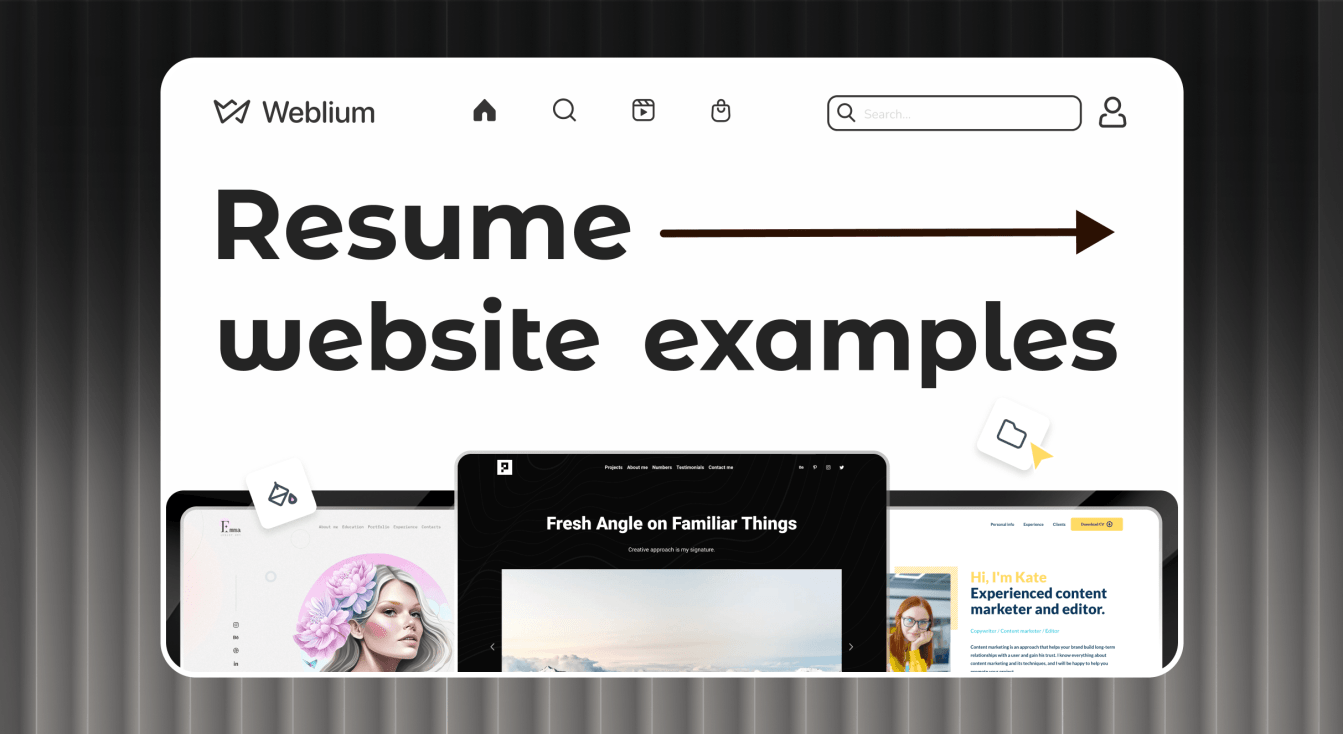
Professional and Successful Resume Website Examples
Have you ever thought about turning your resume into a website that works for you 24/7? Instead of just sending a PDF, you can showcase your skills, experience, and personality in a way that really stands out. A personal website is one of the easiest ways to catch a recruiter’s attention and increase your chances of getting noticed.
In this article, I’ve gathered real resume website examples that I find especially inspiring. Take a look and see how others present their experience online. You might get the idea for your own perfect digital business card.
Contents
Resume
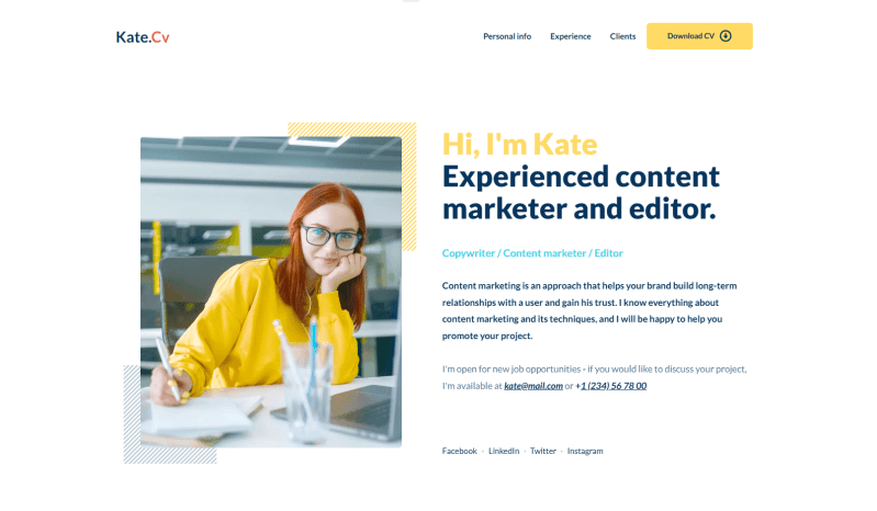
This template has a modern, minimalist style that immediately highlights readability and clarity. I like how the structure clearly presents key information such as experience, education, and contact details. The restrained palette of white, black, and gray is complemented by bright yellow accents that draw attention to important elements.
Each text block is organized with lists, which makes the information easy to scan. In the editor, you can simply add your own text and photos to turn this template into a unique personal site. There’s also a convenient button to download the CV, so recruiters or potential employers can quickly access your resume and contact you.
Summary: Icons, sliders, and active links add a bit of movement and give the page a modern feel.
Developer CV
This template would work great for a developer, data scientist, or software engineer’s resume. The white background gives the site a professional feel, while bright accents like yellow and purple add a bit of energy. The layout is also well-suited for showcasing skills, achievements, and projects.
On the main page, visitors immediately see a section with project cards. Each project leads to a dedicated page with detailed information, screenshots, and useful links. The blocks are clearly separated, so it’s easy to build a personalized website without much effort. You can simply replace the text, upload your media, and quickly create a polished digital profile with no coding required.
Summary: The minimalist design and simple contact form work perfectly for tech-focused resume website examples.
Worker Portfolio
This portfolio template is an excellent option if you’re looking for even more elegance and stylishness. I like its concise layout, modern fonts, and the way different elements are combined within sections to present key information in an engaging way. Social media links, contact details, and the address are neatly placed in the footer, which keeps everything organized. There’s also a clear call-to-action heading that shows you’re open to new projects.
The customizable blocks make it easy to add your own information without any hassle. You can adjust the color palette, edit sections, or remove elements to better match your style. Adding a blog can also make your professional story more appealing to potential employers.
Summary: A creative way to present yourself online as an artist, model, author, or other creative professional.
Architect CV
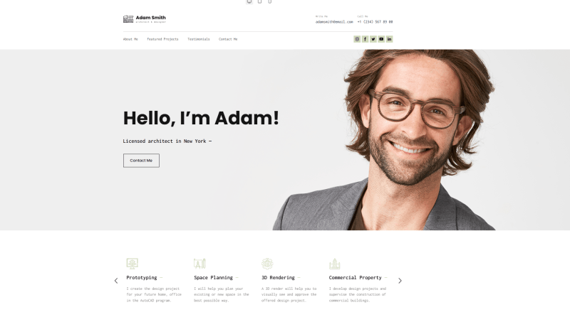
If you’re looking for a modern and professional option for your personal brand, this template is perfect for showcasing your digital portfolio. I like how the layout allows you to combine visuals (such as drawings or completed projects) with clear, well-structured text. Sliders and subtle hover effects in the gallery add movement and make the portfolio more engaging.
The minimalist icons, high-quality photos, and detailed testimonials, combined with elegant fonts and colors, create a professional image. The intuitive editor allows you to change the text, upload media, and customize anything. Even beginners can customize it.
Summary: A great resume website example for professionals who want to attract more clients online.
Alex Naraghi
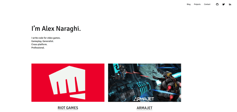
The profile is based on simplicity and functionality. What stands out to me is how basic fonts paired with striking images give the career summary a modern feel while still keeping the focus on key achievements. The combination of visuals, social media icons, and clear buttons makes it easy to understand the person’s professional skills and experience at a glance.
The blog mixes text with graphics, which, in my view, creates a clean and intuitive interface. Smooth animations, hover effects, and video demonstrations add energy to the page and make the interaction more engaging for potential clients. I also find that sharing insights in a simple layout helps maintain the right balance between aesthetics and usability.
Summary: This is among the most practical examples of resume websites with plenty of white space that feels current and easy to explore.
Nate Hinners
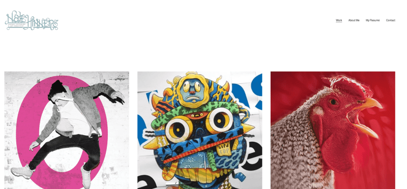
This personal resume is unique for its conciseness and strong focus on presenting creative work. What immediately catches my attention is the emphasis on projects. Visitors can evaluate the pieces almost instantly. The clean white background and minimalist fonts reinforce the modern style, and the interface feels simple and intuitive.
The structure is clear, which makes it easy to find essential information without unnecessary searching. I also notice how the smooth, subtle animations add a professional dynamic without distracting from the content. High-quality images and thoughtful layout help keep the focus exactly where it should be – on the portfolio itself.
Summary: A minimalist, project-focused design that delivers maximum visual impact.
Anthony Wiktor
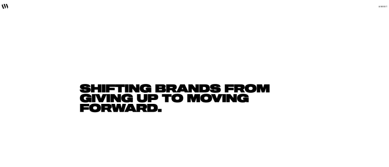
This bio looks impressive due to its creative approach to each section. From the first screen, the dark background paired with light fonts creates a bold, modern vibe, while media elements add extra depth to the presentation. I find that the clear separation between sections makes navigation intuitive and helps visitors quickly locate information about experience, skills, and projects.
The animations are subtle yet interactive. Smooth transitions between sections add movement without overwhelming the page. Even with a lot of content, the navigation feels well thought out, making the browsing experience comfortable and structured.
Summary: What truly distinguishes this resume website example is its trendy typography and striking black-and-white concept.
Rajat Dua
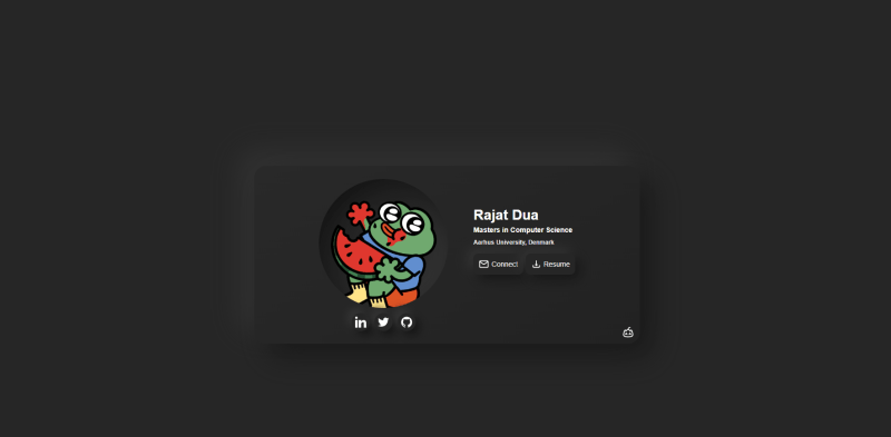
This student resume website may be the simplest one, but that’s exactly what makes it cool. There’s plenty of white space, just two clear buttons — one for contact and another to download the CV – and links to resources related to his work.
The combination of calm color shades with a playful image creates a relaxed, non-boring impression. I think this straightforward structure makes the interface feel intuitive and easy to navigate. The absence of animation actually adds a sense of lightness, and the mobile-friendly graphics help preserve the clean, simple concept across all devices.
Summary: A smart choice for software engineers who want to share GitHub, LinkedIn, and Discord links without adding unnecessary details.
Create a professional resume website with Weblium
Caroline Li
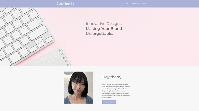
This personal resume stands out with its girlish design in soft pink pastel tones, which immediately emphasizes individuality. The color choice makes the profile feel warm and personal while still remaining professional. The clear and straightforward structure helps the specialist present her key skills and experience without confusion, and bright accents effectively draw attention to the main ideas.
I also notice how the zoom feature for artwork adds a more refined touch. Visitors can explore each piece in detail, which makes the portfolio feel more immersive. The generous spacing between sections gives the illustrator room to highlight important elements, increasing their visibility and impact.
Summary: A unique blend of cute and feminine aesthetics that truly elevates creativity.
Roya Hamburger
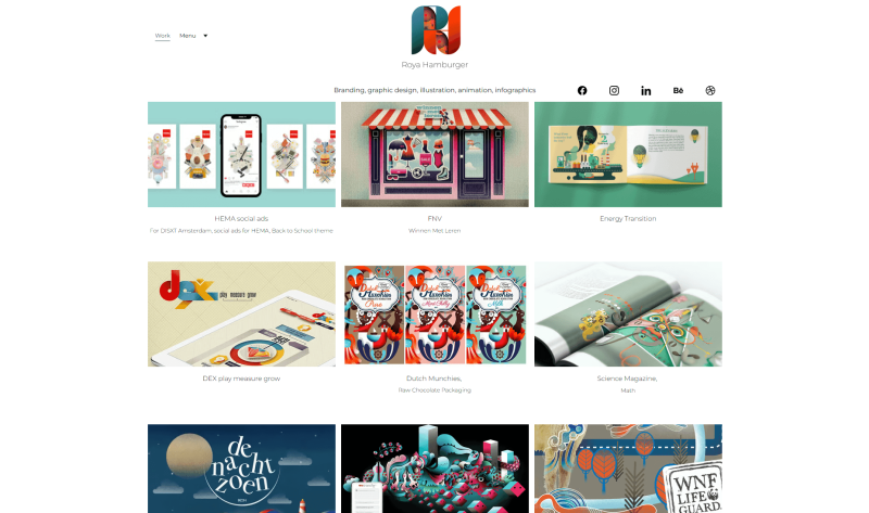
This career summary immediately grabs attention with its awesome visuals, intuitive structure, and overall sense of futurism and energy. I particularly appreciate how the combination of graphics and photos reflects a creative approach, while the simple layout keeps the digital CV easy to navigate. The unconventional arrangement also helps visitors absorb information quickly.
The animations during loading and interactions add a sense of dynamism without overwhelming the user. I also notice how the bright colors paired with a grid layout create a harmonious, stylish, and professional atmosphere.
Summary: A well-organized structure and smooth animations make exploring this CV a truly engaging experience.
Anulika Nwankwo
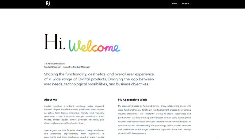
This online profile immediately feels unique thanks to its different backgrounds on each page, creating an engaging and interactive vibe. The mix of fonts, sizes, subtle effects, and smooth animations makes the content pop while keeping the experience pleasant and intuitive. Highlighted buttons and hover effects make the bio feel fresh and easy to explore.
The project blocks, filled with high-quality screenshots, convey elegance and inspire a sense of trust and professionalism. I also like how the navigation is simple and accessible, letting potential clients quickly find the information they need.
Summary: Clear visuals and consistent clarity are maintained through the clean, minimal color palette.
David Thomas
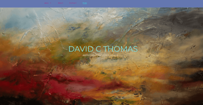
The thoughtful layout with unique shapes distinguishes the portfolio. The thoughtful layout with unique shapes distinguishes the portfolio. The mix of pastel and imagery backgrounds with bright accents catches the eye with individuality and personalization, emphasizing important pieces. The buttons and links on the site are clearly noticeable, which allows the artist to maintain ease of perception.
The work history section is designed so that users can interact with the content without unnecessary clicks. I also notice how strong contrasts and playful colors (turquoise for buttons, lilac for the header, and deep blue-magenta for the footer) reflect the creator’s individual style.
Summary: This online CV effectively communicates the artist’s personality through a personal and distinctive color scheme.
Ximena Vengoechea
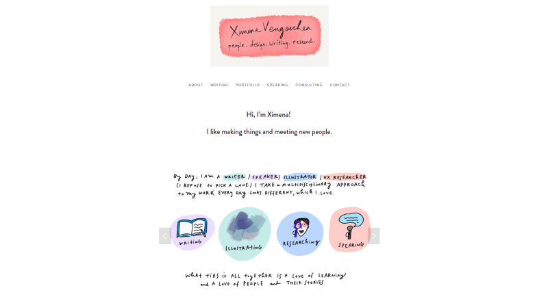
This career summary immediately draws attention with its bright, modern color palette, giving the site a lively and dynamic feel. I like how the visual accents guide the eye to the most important items, while the navigation remains simple and intuitive. The key information is organized to create a minimalistic, calm atmosphere.
The animations and sliders feel smooth and interactive without ever distracting from the main content. I also appreciate how the FAQ section answers common questions and includes links to external resources for anyone who wants to explore more illustrations.
Summary: The standout feature of this CV website example is a combination of graphics and liveliness.
Seth Godin
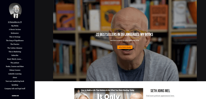
This resume web page stands out for its straightforward, concise design that keeps the focus on key information. I like the vivid images that create a memorable impression and naturally draw attention to the main points. The clear structure makes it easy for visitors to find the details they need quickly.
The contrasting background and minimalist design give the site a modern, professional feel. I also like how the absence of unnecessary elements lets users focus on personal information, making the interaction more efficient.
Summary: The left-side menu is a great distinctive feature, which combines style with functionality.
Sharam
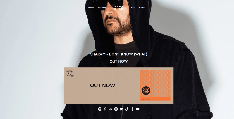
This portfolio feels really trendy with a sticky header, striking cover images, and bold black buttons. The gray shades contrast with white text, creating a clean, fresh, and stylish experience. Large font accents naturally draw attention to the most important pieces, making the bio, news, and other content easy to absorb.
The subtle hover animations make interacting with links enjoyable without causing distractions. I also notice how the minimal palette and large visuals give the artist’s page a sophisticated, modern feel.
Summary: The remarkable contrasting elements keep focus on the latest updates.
Alex Fisher
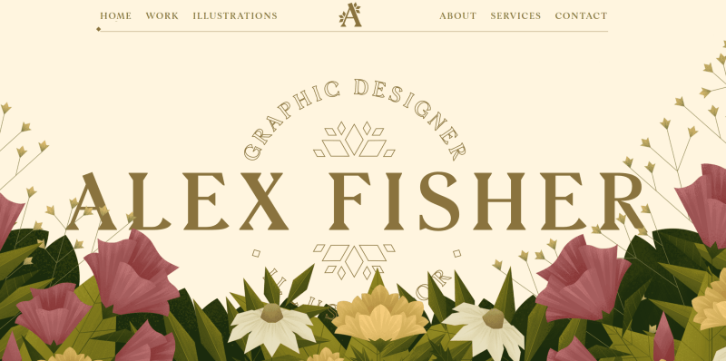
This online resume grabs attention with its floral patterns, dynamic elements, and engaging graphics. I like the clear structure, auto slider, and sticky menum which make navigating the site easy, while each section still highlights individuality. The portfolio feels visually appealing, with striking images and fonts, and the accents help draw attention to illustrations, services, and contact information.
The animations present text and media smoothly, adding energy without overwhelming the visitor. I also like how the transparent elements and stylish icons contribute to a modern, harmonious atmosphere.
Summary: The bright palette and dynamic details create one of the most welcoming and engaging resume website examples.
Kantwon
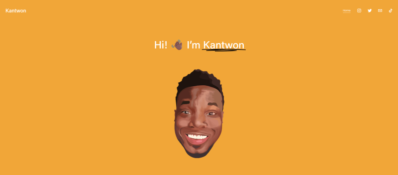
The resume web page impressed me with its colorfulness and free arrangement of elements. It combines a modern layout and wide-spreading emojis for enjoyable interaction. The work history is unique and stylish, with cool fonts and various pictures, ensuring an engaging experience without overload.
The CV balances simplicity and functionality, with useful links and embedded video players. I also notice how contrasting colors, along with galleries, help visitors absorb information easily and harmoniously.
Summary: Creative presentation of key facts using emojis, underlined words, and interactive questions.
Arlen McCluskey
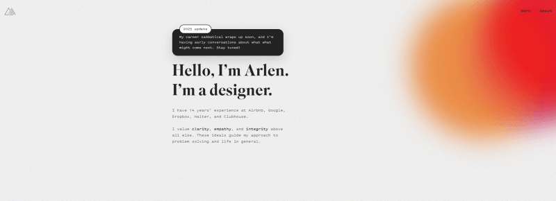
The bio attracts attention with its diverse palette, combining various tones for an elegant yet lively appearance. I like how the sections and lines are clearly organized, making it easy to explore projects, while large headings and animated GIFs create a personalized atmosphere for visitors.
The gradient background blends seamlessly with the overall style. Scrolling through the pages feels smooth, and interacting with the content is intuitive and enjoyable.
Summary: This is one of the most stylish examples of resume website with a well-balanced mix of dark fonts and bright visuals.
Sophie Kahn
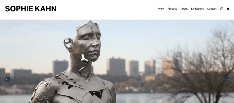
This resume website example caught my eye with its main section, featuring a slider that showcases the latest artwork. I appreciate how it feels stylish and easy to follow, with plenty of white space and soft shades. The page describing the creation process includes authentic photos, while the About Me section presents video explanations and presentations that feel personal and engaging.
The clear block layout and intuitive navigation make it easy for anyone to find important information quickly. I also like how large fonts and a simple color palette give the site a convenient yet visually appealing look.
Summary: A blend of minimalism with high-quality presentation, a striking and memorable appearance.
Conclusion
A resume website is a great way to make yourself visible, even when you’re offline. With Weblium, you can use ready-made templates and blocks for any purpose – or to start from scratch and fully customize the layout to match your style. Visitors and potential employers can quickly access your social networks and portfolio through links, and if needed, you can even add password-protected pages for private content.
Recruiters will definitely notice this professional approach. Don’t wait – start building your perfect digital CV in just a few clicks!
FAQ about resume websites
How to build a resume website?
Creating a CV with Weblium is easy. Choose a ready-made template or build one from scratch. Add your data, portfolio, social media links, etc. All this can be done in a few hours without programming skills.
How much does a resume website cost?
The cost depends on the chosen builder. With Weblium, you can create it for free, and the Pro plan for advanced features starts from $8.25 per month annually.
What is the best website builder to use for a CV?
Weblium is the perfect choice. It offers modern designs, blocks for any purpose, full customization, tools for adding links, and password-protected pages.
Do I need to have a resume website?
Yes, if you want to stand out from other candidates. It demonstrates your professionalism and creativity, and also makes it easy for recruiters to access your information. It can significantly increase your chances of finding a job.