Watercolor Background: 15 Great Examples for Your Website
Watercolor (also known as aquarelle) – is a type of paint that is diluted with water. The transparency of aquarelles is its main attribute and main value: it gives the characteristic lightness of watercolor painting.
Contents
Watercolor background in web design
Watercolor background are a popular trend in web design because they add a touch of art to the routine. As a result, they help the website design to stand out from the crowd, giving it a unique refinement and originality.
Watercolor techniques in web design are used not only to create watercolor background vectors but also to make patterns or even individual elements of website design (headers, dividers, buttons – up to logos and fonts) – or they may be used to combine different design elements.
The reasons why you should try watercolor background images in your web-design are:
- versatility;
- beautiful, fluid colors;
- handmade effect;
- originality;
- adding «soul» to digital design;
- amazing texture.
Of course, not all existing colors and patterns will be perfectly good for your watercolor background. Therefore, creating a watercolor design, you should focus on the most suitable colors – let’s find out which ones!
Different watercolor backgrounds
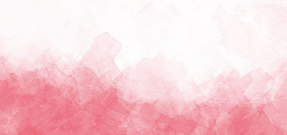
Pink watercolor background
Associated with sensuality and tenderness, love and sentimentality, the pink background color is ideal for the background of websites for women (children, family, cosmetics, etc.).
Blue watercolor background
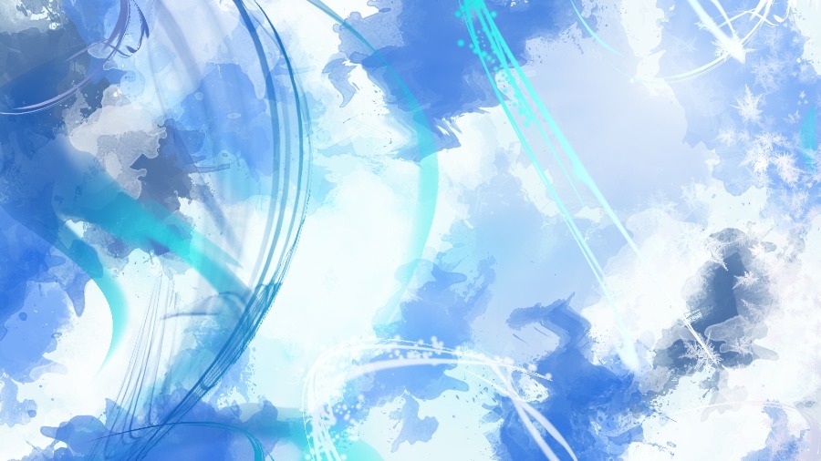
Blue is a perfect color for gaining user confidence and convincing him in your professionalism. It looks luxurious and aesthetically pleasing when used in the watercolor background design.
Watercolor flower background
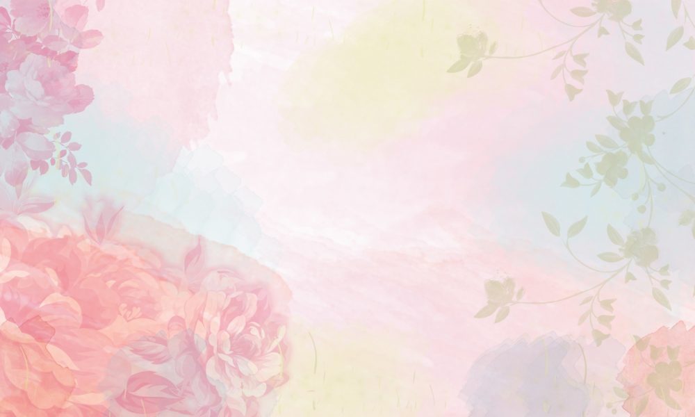
The unique, delicate floral watercolor background with the right selection of elements and textures is much more attractive than the boring and faded classic website background!
Black watercolor background
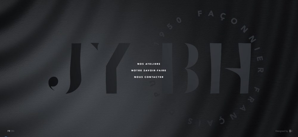
Refinement, dominance, and minimalism – the black website background is ideal for presenting expensive, luxurious goods.
Watercolor background: how to make
Today you can easily create a realistic watercolor effect using Photoshop. To do this, just download free brushes (if you are an advanced user – you can create some unique brushes yourself), use special filters or action sets (ColoreeXign Art, Lively, Watercolor Oil Paint, and others) that allow you to transform a picture or photo in one click!
Then, you can easily upload your watercolor background photos or drawings to the editor of the site builder, CMS or the admin panel of your site, and then experiment with the image using the tools available in the editor and use it as the background of your site!
Watercolor background website examples
Jacksonville Artwalk watercolor background example
website: http://jacksonvilleartwalk.com/
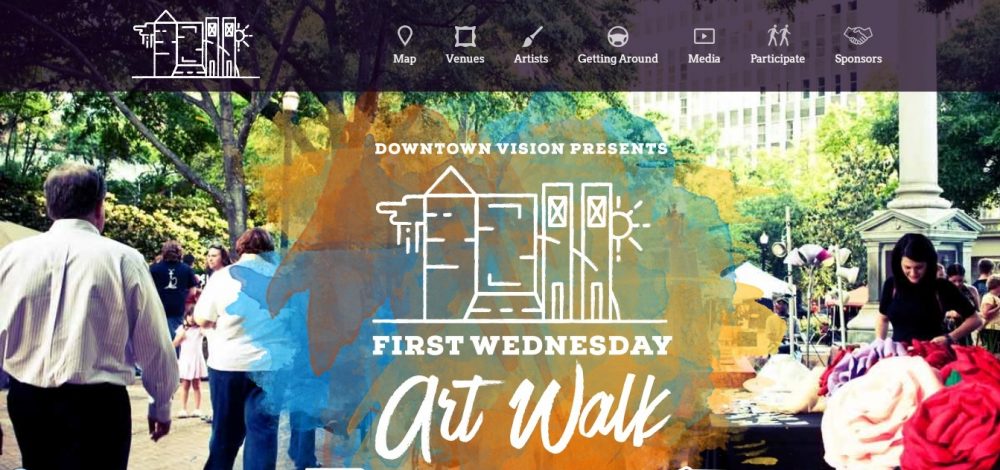
Having created an amazing watercolor background, the designer had the nerve to apply the effect on the main page of his website.
He used a photograph as a background, and then placed a spot of several watercolor layers in the center. This solution perfectly reflects the informal nature of the event.
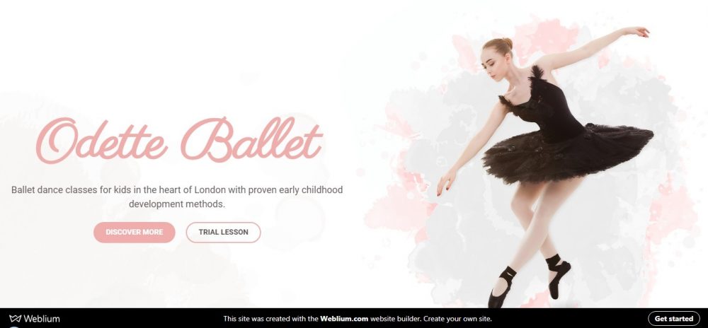
Odette Ballet studio (Weblium watercolor website template)
website: https://ballet-studio.weblium.site/
To create the watercolor design that will draw attention, it is not necessary to put watercolor texture over the entire page! It is enough to use the background with individual spots that are competently woven into the composition and focus the user’s attention on important information.
Use this template to make your watercolor website
House at Khlebny website with watercolor background
website: https://hleb-dom.ru/
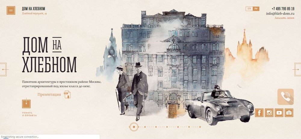
The site is created in a highly artistic watercolor style, combined with pencil drawings. This style gives the project sophisticated and original features and allows the site owner to reduce the distance between himself and website visitors.
Barbara Olszanska
website: http://olszanska.pl/
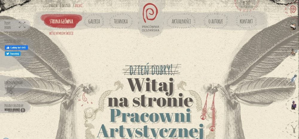
The site of the Polish artist is a complete eclecticism, a bizarre mix of a variety of styles! Watercolor effects are everywhere on the site: background textures, illustrations, headers, and design elements. It’s a perfect design example to get inspired by!
The boat: watercolor background website
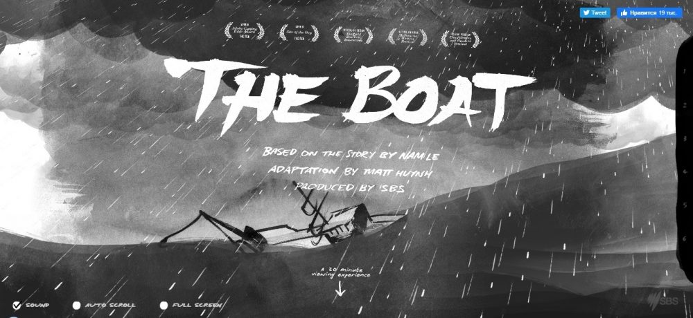
http://www.sbs.com.au/theboat/
The watercolor-style background is made in the form of illustrations or strokes and stains, but the fonts are strict and corresponding in color and type. The font style surprisingly matches the style of illustrations!
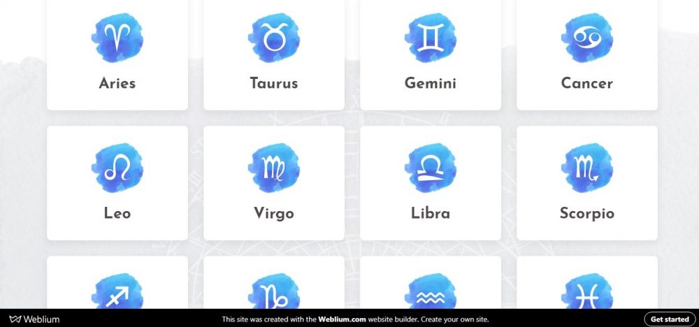
Kate Sun Astrology (Weblium website template)
website: https://astrology.weblium.site/
Why not use watercolor techniques to decorate certain blocks of the page, creating a unique contrast, emphasizing the exclusive style of the author of the website?
Little Things

website: http://thelittlethingsmovie.net/
The Little Things website looks quite modern with these pastel watercolor elements, and fabulous animation on the header banner makes the website design memorable!
Billy Hughes at War
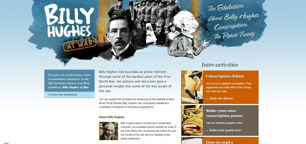
website: https://billyhughes.moadoph.gov.au/
Billy Hughes at War website looks very showy, thanks to the use of bold watercolor splashes and amazing typography choices.
Small White Bear

website: http://www.smallwhitebear.com/index.html
The design of the Small White Bear website uses the watercolor texture that sets the tone and accompanies a fun illustration in the foreground.
The color scheme of the site is very soft, there are no bright colors, except for the orange buttons and short text. The watercolor effect creates the desired mood and adds depth to the site.
Create your perfect website right now 🚀
Gummisig
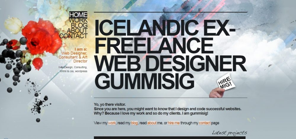
website: http://www.gummisig.com/
This designer’s website has a simple, yet very interesting watercolor background. Despite the abundance of splashes and strokes of watercolor paints (mainly in the header and footer of the site), the background does not distract you from the primary content on the page.
Big Cartel
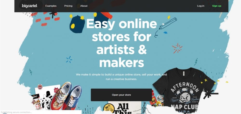
website: https://www.bigcartel.com/
A large spot of watercolor paint with bright accents beautifully contrasts with a white background. Such a composition in the header is just enough to emphasize the unusual style of the website!
Duirwaigh
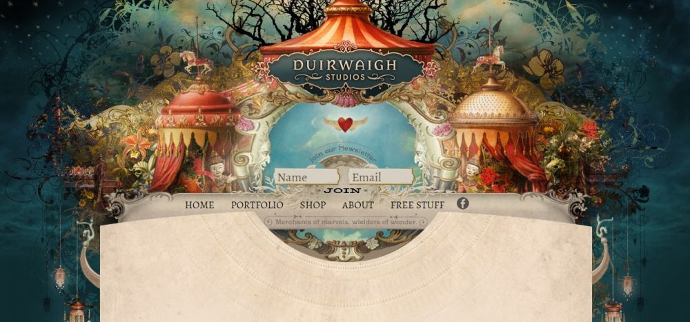
website: http://www.duirwaigh.com/
Duirwaigh studio got serious about the creation of the design of its website: in the header, there’s an amazing picture that has both watercolor and oil-painted elements.
Take a look at the footer – we really liked it, it’s very cute! The whole site looks like a fairy circus! By the way, the site has a cool copy that fully matches the style of the design!
CSS addict
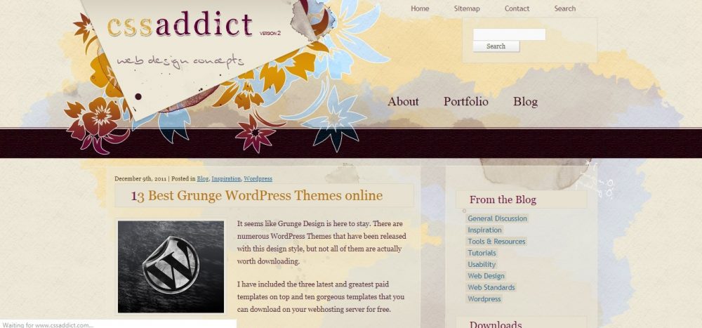
website: http://www.cssaddict.com/
We like the way the site owners made only a slight accent with a watercolor effect on the main page, adding bright flowers that frame the website’s logo! It looks simple, but interesting and tasteful and goes well with a minimalistic design in bright colors!
This is the perfect option for that case when there’s no need in making serious experiments with artistic design, but you need to create a twist!
Fabien Barral
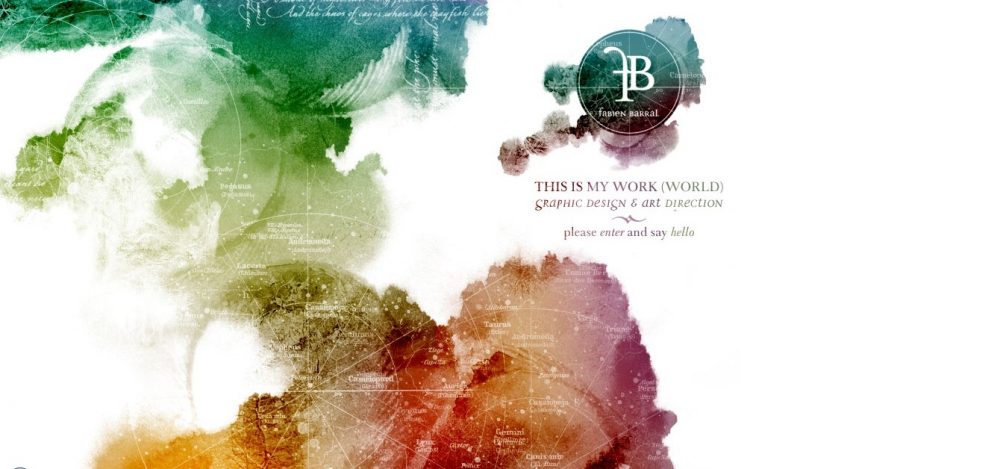
website: http://www.fabienbarral.com/index2.htm
Fabien Barral knows very well that there is no better way to emphasize the beauty and sophistication of watercolors on the website than to combine them with a white background!
On his new website, the designer decided to introduce amazing watercolor techniques, that have a complete refreshing effect on the design. The clear outlines of the starry sky map combined with blurry watercolor spots create an unforgettable effect!
K4lab: light watercolor background
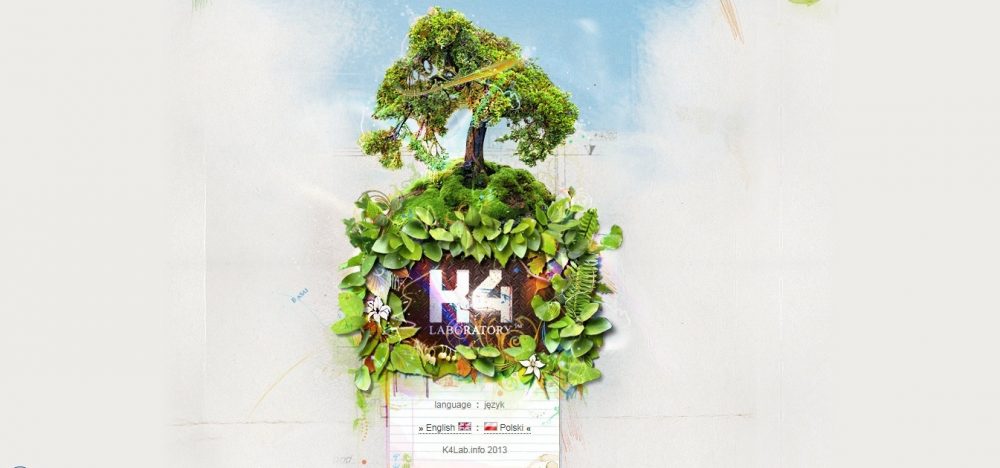
K4lab uses light watercolor accents on the background, focusing on a brighter illustration on the first plan.
When moving to other pages, you see that the website header combines similar light and blurry watercolor accents in combination with rich, clear, illustrated elements.
Wrap up
If you want to add a touch of art to the routine of web design, watercolor techniques are a must!
Here are a few ways to get started with watercolor design:
- try to create a font;
- make a pattern;
- use a watercolor background;
- use watercolor for creating the main image, designed in artistic style;
- create a logo with watercolor elements.
The watercolor design perfectly suits for:
- artist portfolio websites;
- various informal Web projects;
- projects that are designed for kids;
- online save the dates;
- event work;
- and, if used properly, for commercial websites.
You want to create your website that meets the latest trends in web design and usability, but you don’t have enough money for web-studio and coding skills?
Try Weblium – and you will be able to create your perfect website yourself in no time!
