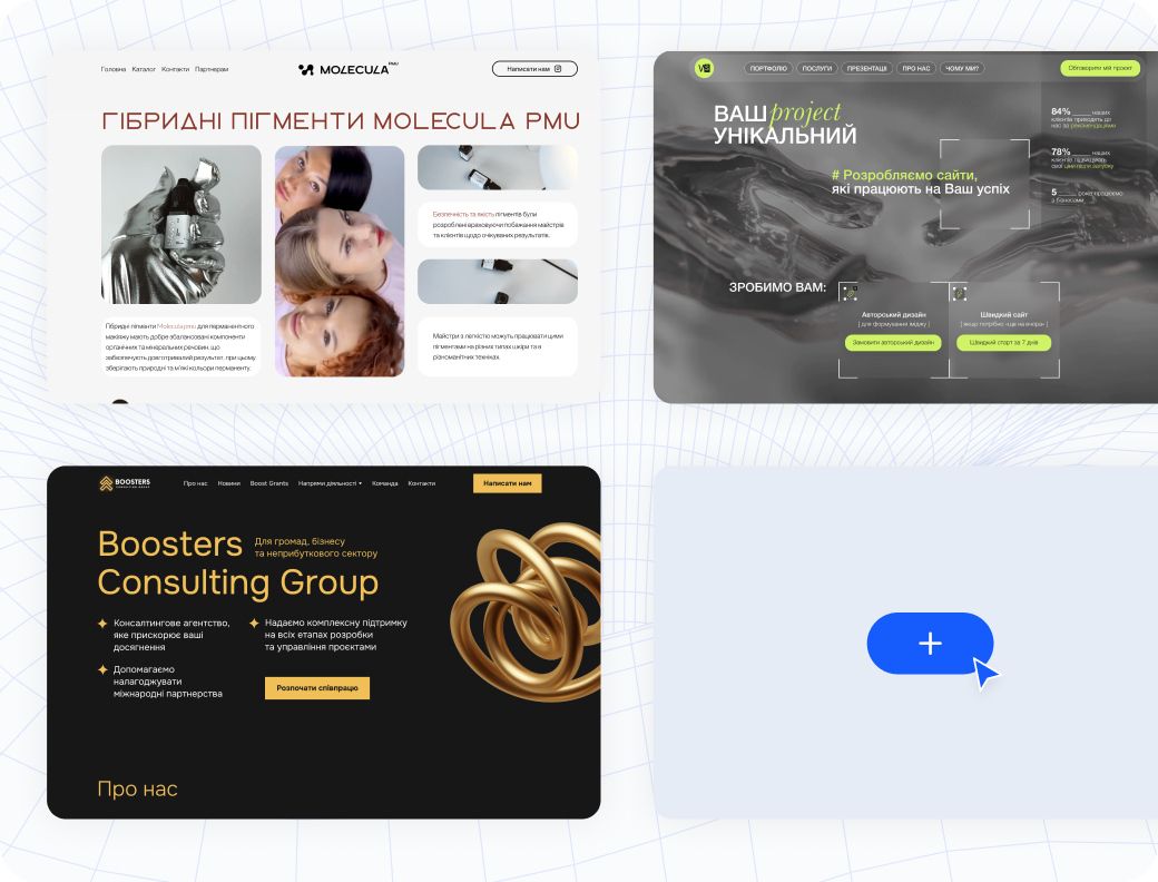
Get inspired by outstanding website examples from our users
and see what’s possible with Weblium.
FAQ
We select the best projects from the websites you submit and feature them here.
We also include sites discovered during our regular review of Weblium websites.
Our judges are experienced Weblium professionals.
They review hundreds of websites daily and stay up to date with the latest design trends and business goals.
Click the button at the top of the page and fill out a short form.
We receive many submissions every day, so our team cannot provide detailed feedback to everyone.
If your project is selected, it will be added to the catalog right away.
Foremost, we rely on our experience. We pay individual attention to each website, but if you are interested in the basic principles most important to us,
press here.
Here are the main points that our team considers when estimating the websites.
This is not a guide that guarantees your website will be selected, but it does provide some tips for improving
your website.
1. Colors.
The colors have to be relevant to the project’s theme. They should contrast with each other but also be easy to
perceive.
Don’t use too many colors on your website — it’s enough to use just two of them to accent the important details
and add some contrast between elements.
2. Fonts.
The perfectly chosen and combined fonts could accent the strong sides of your brand, but irrelevant fonts can
also make your website boring and weird. Don’t use antiqua typefaces for big text blocks, and also be careful with
decorative typefaces: they are perfect for H1-H2 and large font sizes, but they are very hard to perceive in
buttons
or headings with small font size. Pay your attention to the line and letter spacings — if you set them right,
they could boost the style of the fonts you’ve chosen for the website. And don’t forget about font weight — it’ll
be a
difficult challenge for your customer if you’ll set the Semi-bold font weight for paragraph text.
3. Blocks and elements spacing.
Firstly, all spacings on the website should be similar. They should provide a straight edge between the blocks of
content,
but shouldn’t be too large. Too small spacings, as well as too large spacings, make the perception more difficult.
Pay your attention to the spacings between elements in the columns or sections of your website (especially when
you use
Flex block or Custom block) — they should be similar
within one axis and help you to group some elements in one structure group (for example, heading, description, and
CTA-button).
4. Style identity.
Remember about the single style for the website and each block on it.
When you use some corner radius for buttons or images, it should be provided for each similar element on your
website.
Icons and images placed in one block should have similar sizes and aspect ratios.
The font size of identical elements (headings, paragraph texts, etc.) should be similar.
Remember: the more different styles you use on your website, the less attractive it becomes.
4. The quality of images and icons.
Unfortunately, low-quality visual content can break even the most perfect web design.
If your website contains photos in different sizes with noises or watermarks, try to find some tools that will
help you improve the quality of your images.
These are the main points according to which our designers decide about websites selection.
Of course, we always support creativity and unusual ideas, but balance and easy perception are the core of the
perfect website.
Just sign up on Weblium, choose a ready-made template, and start customizing.
No coding skills are needed — you can create a professional website in just a few hours.
Want to see your website here?
Send us your project, and our experts will review it to see if it can be added to
our collection!
Submit your Weblium website
Get a chance to be featured in our gallery of websites built with Weblium!