19 Best Website Templates for Your Perfect Website in 2025
You are ready to create a website, but you are not sure that you can do it yourself? Using ready-made website template designs from this list, you can easily cope with this task!
Template designs allow you to figure out how it works and understand all the nuances of creating your own website based on the template you choose.
Your best website templates are all here: all of them are created by professional designers and based on a deep study of each market niche. That is, these templates are perfect for their purposes! You will only have to choose a suitable material design, customize it to your liking and launch your online business project in no time!
Check out these website template images: now we will tell you in detail about the features of each template, and you will figure out why they are the perfect solution for creating your website!
Contents
What are website templates?
A page template is a set of graphics files, blocks of HTML and CSS codes, as well as various scripts responsible for the visual presentation of a website. In other words – this is the website’s frame with all the design elements you need!
If you have no designer and coding skills, web template design is your excellent way out! Of course, it is also suitable for experienced developers in case they need to use a ready-made solution, which makes it easier to create a website and avoid creating it from scratch.
The templates have pre-developed design and layout; it is the result of the well-coordinated work of a team of different professionals – designer, layout designer, developer or webmaster.
Simple HTML templates are used to create basic static HTML sites that do not require frequent updates; they are used for creating, for example, brochure websites.
More complex templates are used to create a site that uses CMS; these templates consist of:
- a set of images for different parts of the site,
- CSS style file (cascading style sheets),
- files for the formation of functional blocks of the site,
- plugged-in files.
Key elements of website templates
- Accordance with the type of business:
Your business activity largely determines the structure of your site, the functionality and the principle of visual presentation of site elements. For example, an online store template must support a plugin for a shopping cart and online commerce plugin. Templates for online catalogs and marketplaces must have an advanced site search feature, etc.
- Responsive design:
67% of users access websites from mobile devices. By choosing a template with the mobile-first responsive design, you will turn your website visitors into customers! Also, pay attention to the cross-browser compatibility, which allows you to cover all possible target audience, regardless of what types of browsers it uses.
- Friendly interface and usability:
67% of mobile users will leave the website if they are frustrated with the navigation. A user-friendly interface consists of many well-thought-out details: a good navigation system, an interactive shopping cart, a button for switching languages, tabs for displaying information, and so on.
- SEO-friendly:
SEO optimization opportunities are crucial for website promotion. The SEO-friendly template contains breadcrumbs and supports structured data protocols. Many modern templates have the optimized code and basic scripts implemented, which significantly speeds up the website load speed.
Related Post:
Why Doesn’t My Website Show Up On Google Search?
- Customization options:
Flexible settings can include customizing colors, logo and other graphic elements, fonts, the appearance of content blocks, export and import settings.
- Multi-language support:
This function is a must-have if you are planning to start trading in global markets or you are focused on a country that uses several languages at once.
- Additional elements:
We are talking about the location of blocks of content, sliders, a place for banners with promotions, a subscription to an e-mail newsletter, social buttons and many other components. All these elements make it possible to attract the attention of visitors to the necessary things and successfully use calls to action!
- Update frequency:
Frequently updated template ensures its proper display and performance of the entire site and clearly shows the quality of this product and the professionalism of the developers.
How to use website templates
#1. Start with choosing a website template
Most website templates are offered with a pre-designed header. They can have images, entire galleries, and even videos! But do not get too excited with the tricked-out option; choose a template with a header you will be able to work with, that will deliver your business core message.
#2. Select a color scheme
According to KissMetrics Stats, 85% of online customers believe that color is the main reason they purchase a product.
Choosing your perfect color strategy, take care of these three things:
- the main color (the one you want your customers to remember) combined it with an additional color;
- a background color;
- a similar color scheme throughout the website.
It is a good idea to use the primary color of your logo as your website’s main color. The most important elements of your website should be designed in this main color.
#3. Add your unique content: fonts, images, and text
- fonts. No matter how beautiful the font you have chosen may look, always take into account the readability of the font style.
- content. Your content should serve your business purpose and motivate the visitor to take a certain action. Important tip: When adding contact info, use Schema Markup: Google uses it to put your business into local search results. If you don’t know how to write a great website copy for your website we recommend reading this article: How to Write Website Copy: Essential Guide With Examples;
- images. According to various studies, we only remember 10% of the things we hear but we remember 65% of the visual info we get. Stunning images can turn a common site into a visual party! Good visual content is a win-win opportunity to increase engagement and clicks. And don’t forget that cool images stick in the visitor’s mind!
#4. Test & publish (and don’t forget to update)!
Test how everything works. Keep in mind that your designs should function perfectly on a mobile as they do on the desktop.
Website builders made it easy: you can preview your future website on different devices in one click!
Later, make sure that:
- Your content is up-to-date (news, awards, contacts, product lists, prices, photos and copywriting).
- The content navigation is easy-to-understand.
- CTAs are placed in the best places of the page and have eye-catching color schemes and fonts.
The difference in using web templates on WP and Website Builders
The way you install a template is essentially the same for a CMS (let’s take WordPress as an example) and for a site builder (for example, Weblium). But you should keep in mind that the above-mentioned actions are only the second (simplest) stage in creating a site using a template.
Because when using a CMS, you need to do the following first:
- buy a domain (and this is not as easy as it may seem);
- then connect this domain to the server.
- set up the necessary data on the server.
- connect the domain to CMS.
And only then you can download the template you need!
Website builders (Weblium, for example) have made things much easier:
- just choose one from the list of proposed domains;
- сlick OK!
Good news: even on the free Weblium plan, you get the Weblium domain absolutely for free!
Just login with Weblium website builder – and you will get the full access to all existing templates ready for editing and publishing your website! No special skills required!
Best website templates
Medical Website Best Template
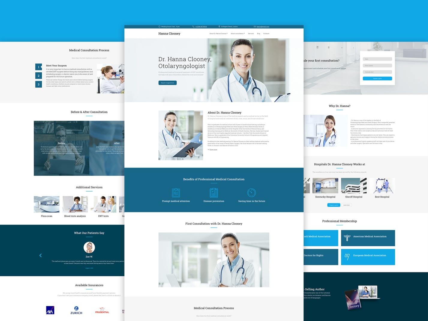
- The template uses color combinations that cause a feeling of purity, trust, competence, comfort and other positive emotions associated with a respected medical institution. Graphic images, successfully harmonizing with plenty of white space, carry a positive emotional message, creating a feeling of a healthy, decent life.
- All benefits, merits, “before & after consultation” highlights, patient reviews are shown in the most suitable locations.
- An online appointment system will help the visitor to easily choose a doctor, date and time when it is convenient to make a visit.
- The correct structure of the site, the names of categories and subcategories coincide with customers’ search queries. The presence of nested menu items allows your customers to find the necessary information in 2-3 clicks. The navigation menu is displayed on each page, so the visitors won’t get lost.
- The top of each page has the header, logo, contact info and opening hours.
- The blocks structure, their content, CTAs and buttons for lead generation increase the conversion of the site and help to increase sales.
Beauty Salon Website Template
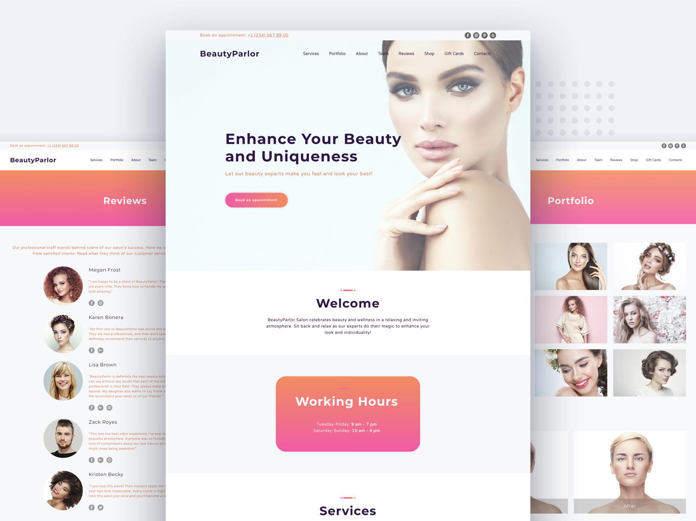
- The stylish, elegant and eye-catching design is the main feature of this beauty salon web site html5 template! It has all the necessary elements to create a full-fledged, multifunctional and fascinating beauty salon website.
- The design of the pages is created using light colors and has a neutral background, which will appeal to both young and middle-aged women.
- The structure is designed in a way to make it easier for customers to search for information. On the main page, you can place information about current discounts and the most popular services. The navigation menu is very simple – it includes only the most necessary sections.
- Full-screen photos, salon video tour will allow the customer to make sure that visiting your salon is worth the time. Staff photos and their professional qualities summary will help to leave no doubts and build trust. “Before” and “After” photos are the best option to demonstrate the effectiveness of procedures!
- Your site will have the option to sign up for a hairstyle or manicure online, and you will be able to constantly monitor orders.
Office Launch Delivery Website Template
All templates are available after login
Interior Design Portfolio Website Template
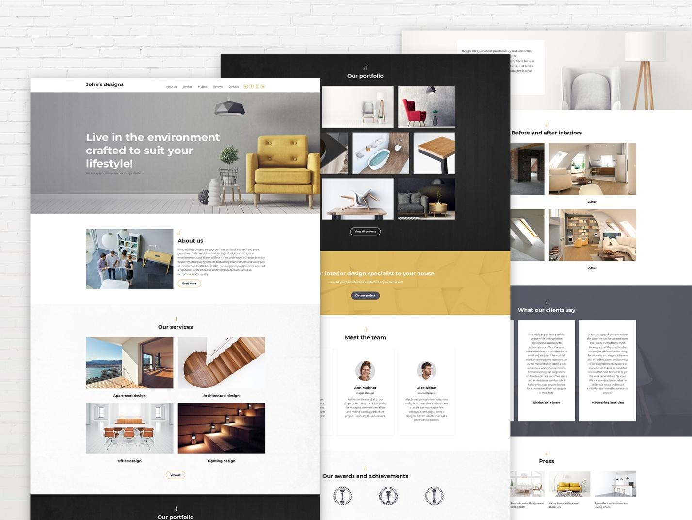
- Greetings on the home page of this template will help visitors to feel more comfortable on the site.
- The attention is focused on your portfolio. The template helps to demonstrate your most important projects, the success you have achieved, the things you have been working for all these years. Here, visitors will be able to check out the tiniest details of a specific project.
- The navigation system is as straightforward as possible: access to viewing your work, your contact information and other important sections of the site are always at hand. On each page, as expected, there are blocks with the contact information and social network buttons. The common navigation menu at the top of the page is convenient for most visitors – this is just classics!
- Here you will also find a well-designed «Meet The Team» section, which provides complete information about the designers.
- There’s also a bright block with CTA, that offers your client to discuss the project right away.
- «Testimonials» and «Our Awards and Achievements» will help to convince your visitors and turn them into potential customers.
Bakery Website Template
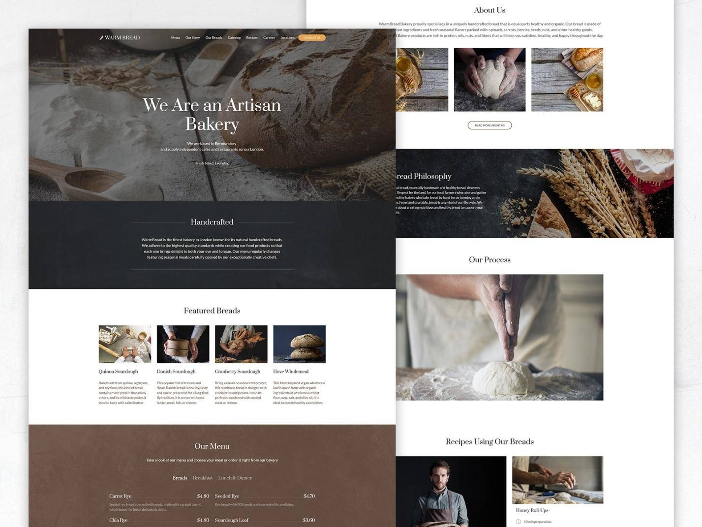
- Beautiful full-screen photos of the interior, exterior and bakery can speak louder than words, convey emotions to your visitor and make him make his choice.
- This template has a logical and understandable structure; the most basic and necessary categories are highlighted in the navigation menu.
- The Weblium design of the bakery website template is created using correct, delicious colors, which, in combination with clear, readable fonts, delicious description of dishes, proper classification, and, of course, photos, will make your website work as it should!
- Social network buttons will help visitors quickly share their impressions and recommend your bakery to others.
- The template is fully responsive – it looks excellent both on the desktop and on any mobile device!
- Reviews can play a decisive role as the lead generation element: let your customers express an opinion about your place that can inspire other potential customers!
Fitness Center Website Template
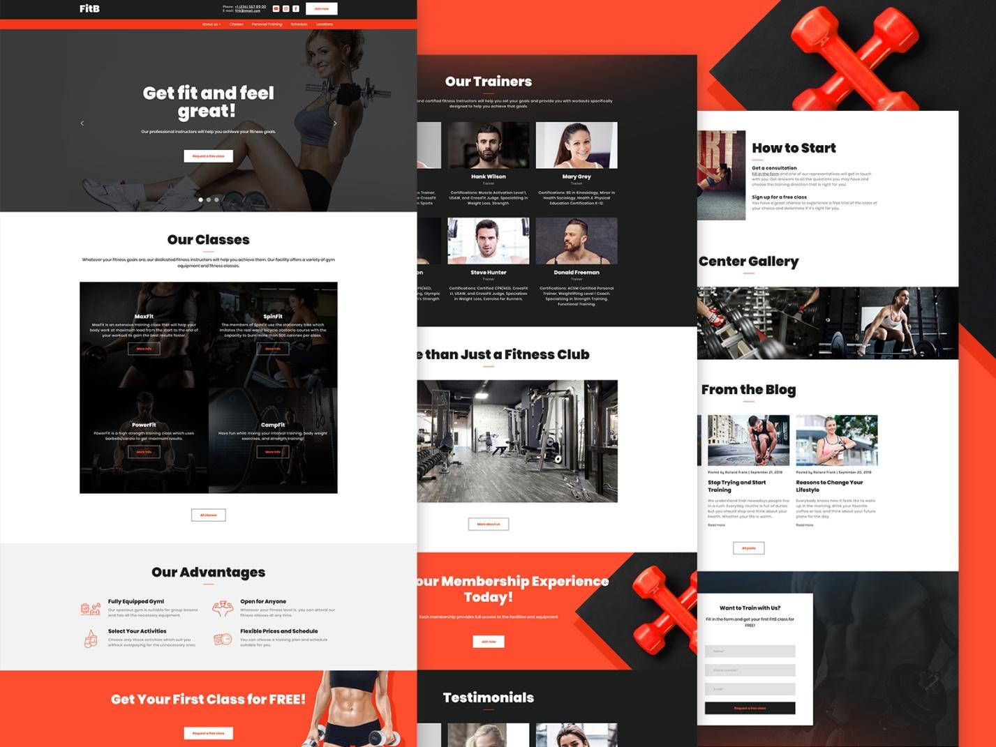
- With this fitness website template, the first 3 seconds the visitor spends on your site will be enough to make him understand why your fitness center is the best one. The very first screen gives most of the answers to his questions. It is a good idea to place a block with the advantages, beneficial statistics and the info about various classes here.
- The visitor will definitely notice your bright strong CTA, offering him to get the first class for free!
- The other page can be used for showcasing detailed information about the fitness center, accompanied by the high-quality and bright photos of the hall, changing rooms, reception. If the design of your fitness center has some breathtaking elements, you have a great opportunity to focus the attention on them!
- «Our Trainers» section will make the visitor stay here a bit longer, and this has a positive effect on its promotion.
- It’s a good idea to turn your website into a more convenient place, creating a personal account system where your clients can get a piece of advice from coaches, find the schedule of group classes, see various promotions, subscribe to news, etc.
- In a blog, you can publish some interesting content on behalf of a specific trainer: this allows you to show them as the experts.
Winery Website Template
Travel Agency Website Template Example
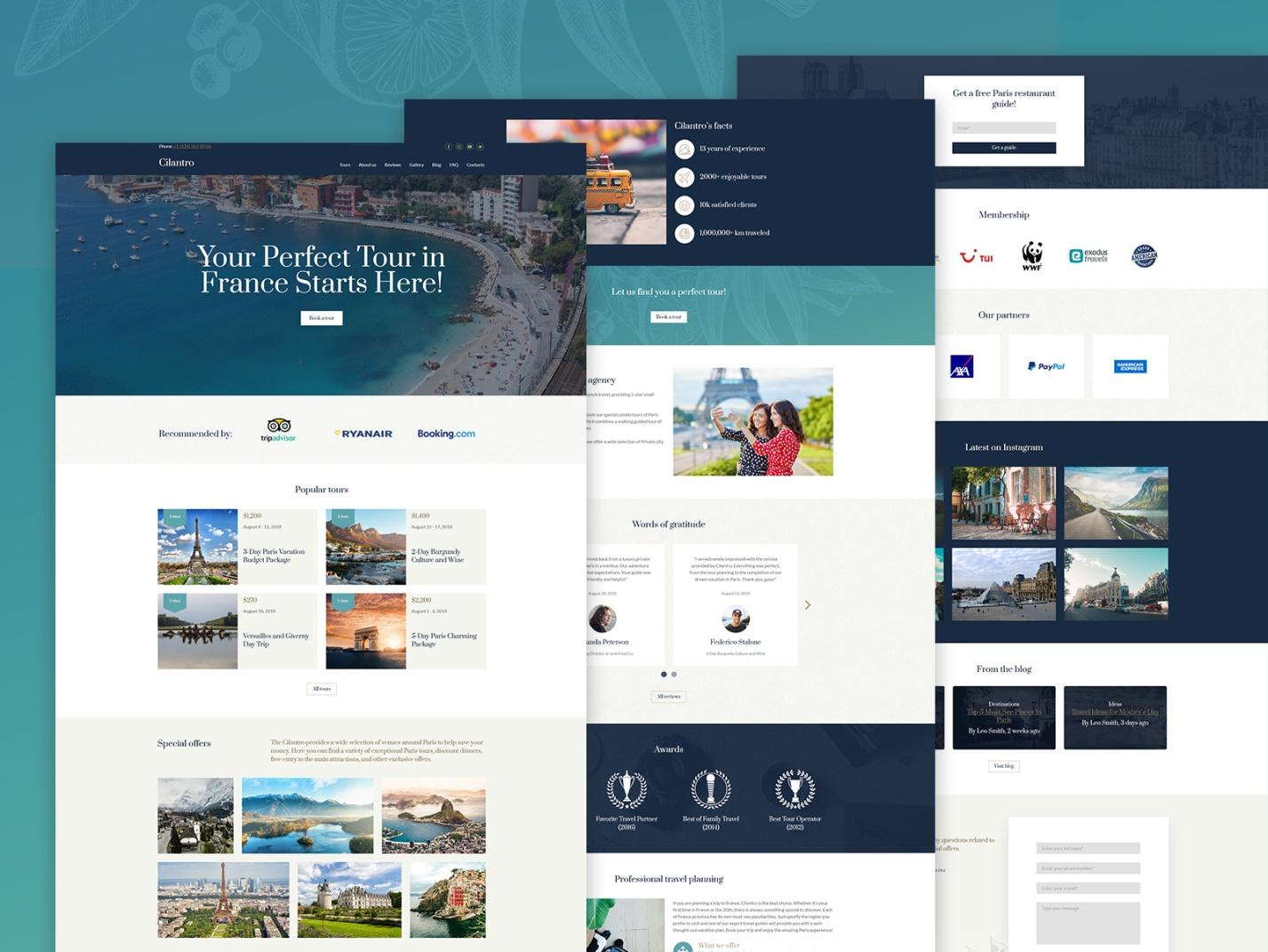
- This template has a memorable design in bright colors that trigger positive emotions. Website header design plays an important role in creating the right emotional state, and large theme photos do their great job.
- The main page of the template is ideal for exploring your offer, as it contains important functional elements:
- the header has a search bar and «Book a Tour» button;
- the center part of the main page has an easy to customize block offering the most popular tours and directions;
- «Special Offers» at the bottom engage the visitor even more.
- Also, the template has a well-planned, simple and clear structure. The user gets easy access to all important sections and functions of the site.
- A blog with articles on resorts and attractions will help customers make decisions, and you will get more traffic from search engines!
- Besides the “like” button, social networks buttons offer many convenient options:
- comments to articles from social network accounts;
- logging in using social network accounts;
- embedded posts from social networks;
- “Share” and “Subscribe” buttons.
- Installing Google Analytics counters will come in handy for tracking the effectiveness of the tour search and see how many visitors fill out the form and how many of them have made an order.
Wedding Website Template
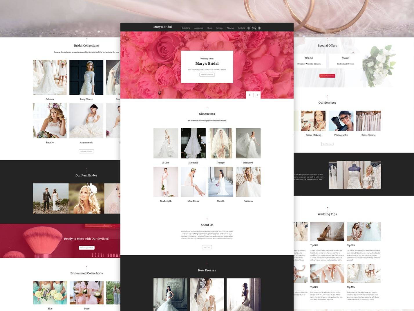
- This template has a very thoughtful structure, focused on the maximum convenience of the visitor. On the main page, there is an interactive block, followed by a catalog of popular silhouettes of dresses with photos and descriptions of dress models.
- “Our Real Brides” photo gallery is one of the main sections of the site that affect the level of trust. Photos of beautiful brides will convince your potential clients of your skill and professionalism, demonstrate your style and approach to business. The impression is complemented by the “Bridal Collections” and “Bridesmaid Collections” illustrated sections.
- Modesty will never promote your business, but customers’ reviews and recommendations will: place them in a special website section and let everyone see how happy your customers can be!
- «Special offers» block will allow you to draw more attention to your loyalty programs and the best deals!
- «Wedding tips» section will provide answers to popular questions of your customers, making it easier to make a choice.
- When a customer is engaged enough, he will never miss your CTA “Ready to meet with our stylists?”!
Read full guide: “How to make a wedding website”
Small Farm Website Template
CREATE WEBSITE USING THIS TEMPLATE
Education Center Website Template Example
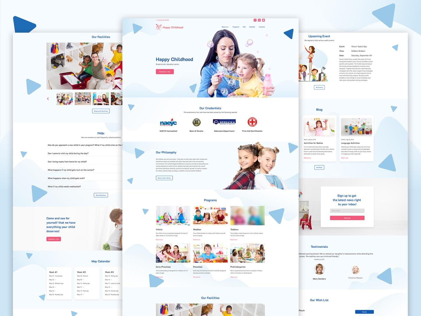
- This education website template is designed in the best tradition of children’s educational sites: it is bright, brilliant, and has plenty of images – the design is pleasant and isn’t overloaded with an abundance of colors.
- The main menu is located in the upper part of the header, creating maximum convenience for the user. The main page and the other pages contain several blocks and each page has the navigation menu, a website search bar, a block with contacts and social network buttons. Right on the main page, a visitor can find the credentials, philosophy, programs, and facilities of the educational center.
- You can publish news, photos and videos, a schedule of events, announcements, teaching materials, information about groups, information about teachers, etc.
- FAQ section will give answers to the most popular customers’ questions.
- «Calendar» section shows all the events available, and the «Upcoming Event» block will help your visitors not to miss the nearest event.
- Certificates of teachers, awards, works of talented children and stuff like that are excellent advertising, supported with facts.
- If desired, the client can schedule a tour of the educational center pressing the bright CTA! The other CTA offers the visitors to subscribe to get the latest news.
Real Estate: Single Property Website Template
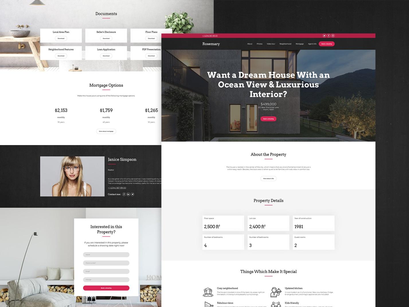
- This special real estate template will allow you to showcase the fullest list of your property’s features and benefits. You can get your visitor astonished with the full-size photos and highlight the win-win features of the property that you are offering.
- The site will be linked to today’s most popular social networks increasing the ability to share, to widening your reach, and leading your customers back to your offer.
- Attractive display of property photos and videos tours the potential customer buyers through their future home.
- On the main page, the visitor is greeted by a large photo and an attractive offer, after which he can immediately familiarize himself with the information about the object, the property details, and special features.
- The visitor is given an exclusive environment where he can be provided with all other information he may need: he will be able to check out all the documents, choose the most acceptable mortgage options, get contacts of a realtor and book the meeting.
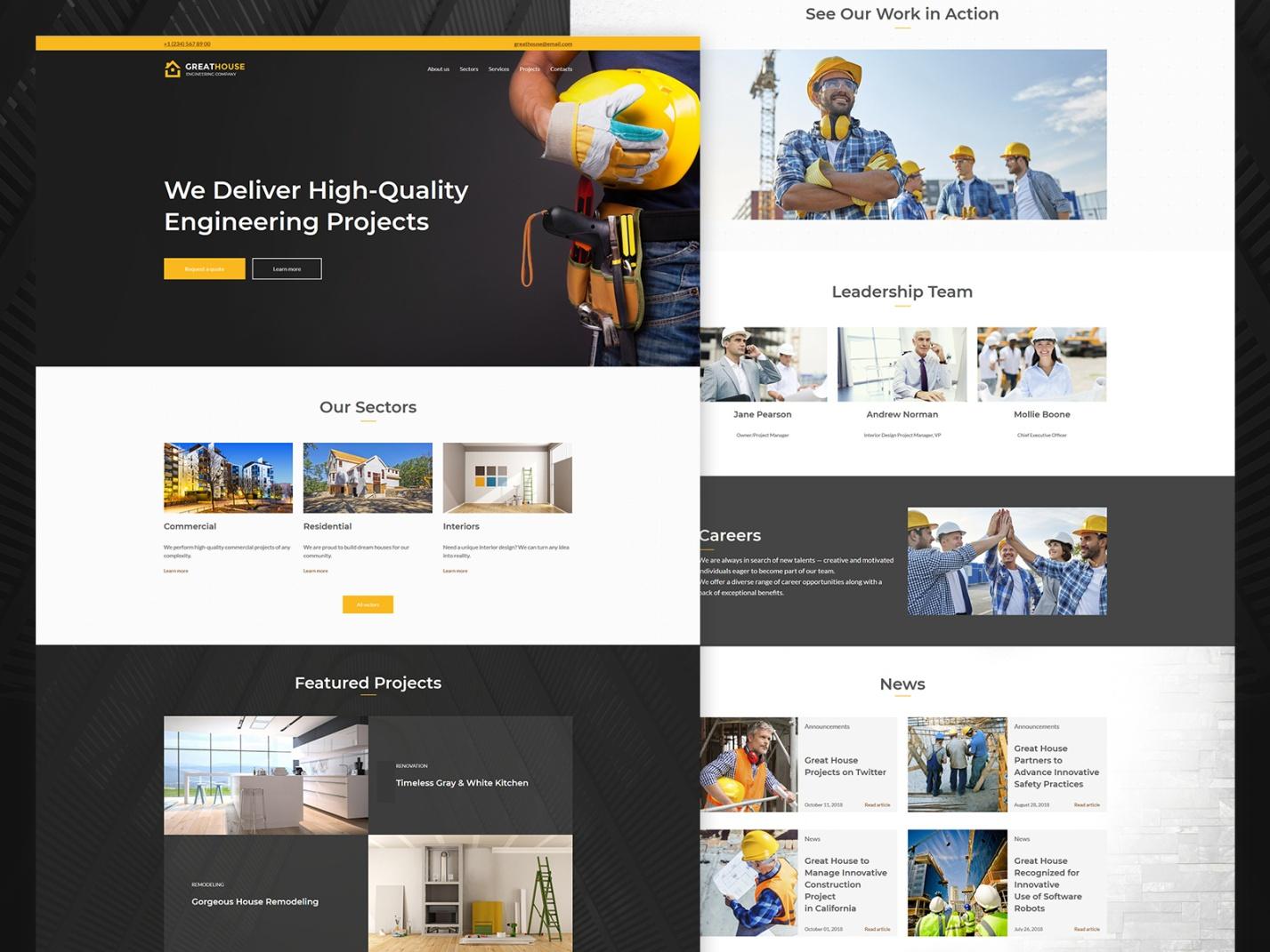
Engineering Company Best Website Template
- the design of this engineering website template has a deep degree of detail and creates a pleasant, bright, and trustworthy impression combined with smooth scrolling.
- when forming the structure of the template, three key requirements were taken into account:
- simplicity;
- a detailed study of areas and projects;
- a clear understanding of what should be on specific pages of the site.
- On the main page, the visitor will be able to learn more about the company. As the website owner, you will definitely need the opportunity to advise clients. You can easily do this, placing the «Request a quote» button. In “Our Sectors” section he will be able to find out what services the company offers.
- Moving down, your visitor will find the «Featured Projects» block, showcasing the technical information, drawings, plans, engineering communications, etc. It is better to present the projects of houses in 3D with color and geometry preservation. Here, the user can also find a photo gallery of the completed projects and houses under construction.
- In the “News” section you will be able to cover not only the «general plan» news but also your company’s plans for the future! Also, your potential client will be able to get acquainted with the team of professionals in the “Leadership Team” section.
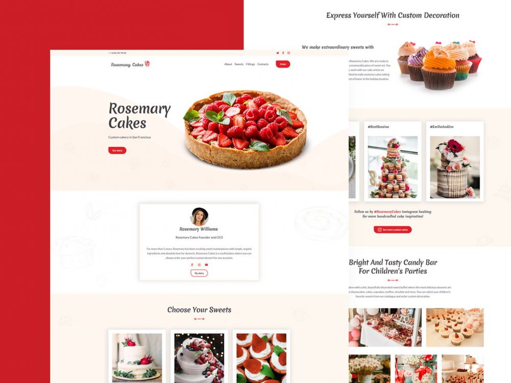
Cakery Website Template
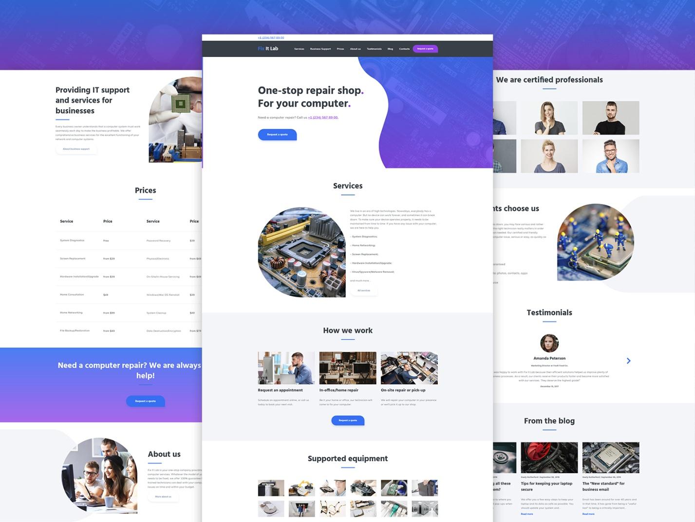
Computer Repair Website Template Example
- The design of this computer repair website template will provide the correct emotional perception of the site, it emphasizes solidity, reliability, success.
- The classic horizontal site navigation menu, located on top will help the visitor to find the main things he needs he in a few clicks
- On the main page, the visitor immediately sees the “Services” section, where you describe in detail the services you provide (in a clear and understandable manner) and the benefits of working with you, convince the user to contact you. The «How We Work» block will further increase the visitor’s engagement, and, if necessary, he can immediately contact your specialists by clicking on the «Request a Quote» button.
- The «Supported equipment» section will tell the visitors what kinds of devices are serviced by specialists of the company.
- A block about the staff will allow you to paint your team members in the best light with the help of photos and precise descriptions.
- The «Why The Clients Choose Us» and «Testimonials» blocks will further demonstrate your true competence.
- Clear prices for certain types of work will increase the level of transparency of your intentions.
- The «About Us» section will allow you to tell the story of your company, highlight the mission, show licenses, and permits, a list of «Customers» and «Partners».
- A blog will provide an opportunity to publish not only news of your company, but also industry news, showing your expert level in this area.
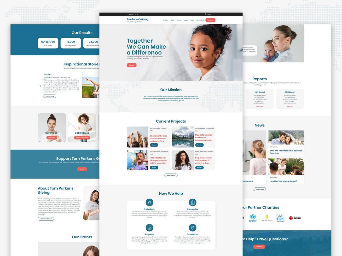
Charity Non-Profit Organization Website Template
- The non-profit websites no more look miserable! This template has a modern design that will allow you to get the exact solution that is necessary for full-fledged work and at the same time will allow you to stand out among the many other organizations.
- The home pages of non-profits are usually the central focus of all important materials on the site, so it is extremely important that it is well organized. Such a “good” organization implies the following:
- visual hierarchy;
- ease of visual scanning;
- availability of choice (it is necessary to provide the possibility of choosing and searching for various types of information, depending on the tasks and interests of the visitor).
- On the homepage of your multi-purpose website, the visitor immediately sees a large, high-quality themed photo with a slogan, providing him with the most important information: the «Our Mission» (mission, goals, and values of the organization), «Current Projects» and “How We Help” blocks, where you explain in detail how everything works.
- Your site will also provide the most important information, showcasing all the necessary documents of the organization.
- “News” section will allow you to constantly inform visitors about current events.
- Telling real inspirational stories, presenting the results achieved in «Our Results» statistical block you give people the opportunity to feel like a part of a big game!
- The “Reports” block gives you the opportunity to generate donation reports for the desired period.
- If your visitor has any questions, he will never miss the large “Contact Us” block.
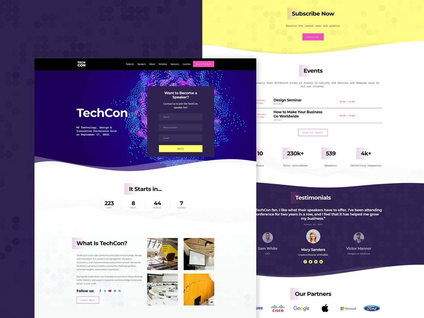
Event Website Template Example
- This event website template is designed in the best traditions of the leading landing page websites of events. All the most important, catchy information is displayed on the first screen: the bright «Become a Speaker» CTA, and a countdown timer of time remaining before the event.
- Here, you will be able to explain to which target audience the event is oriented and why would anyone want to participate in it. This is your USP, which will make your visitor keep scrolling! Also, he will find here the buttons of social networks for sharing information.
- In the special «Events» block you can further increase the value of the event for the target audience by showcasing the program, the main themes or stages of the event.
- Do not forget to use the «Testimonials» block, which will help to describe your advantages!
- Take the best from the «Our Partners» block, which increases the visitor’s confidence in you!
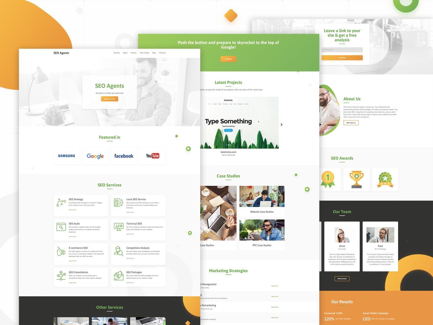
Seo Agency Template
- This template is designed with an emphasis on competent, convenient and understandable to the average user navigation. This site has a large amount of information, and this template gives an opportunity to the potential customer to receive the information he needs.
- On the first screen, in the “Featured In” block, you have the opportunity to list your largest customers, thus increasing trust in your company.
- It is logical that after this there would be a list of your services with visual icons and descriptions, followed by the “Other Services” block.
- The main information resource of the site is a portfolio (“Latest Projects”), with screenshots of sites and detailed descriptions, which presents the results of the work of SEO specialists.
- Increase customer trust with your case studies and a list of marketing strategies that you use in special blocks!
- This template is a great idea and a proven move – to offer your customer a free service in exchange for his contact details.
- It is nice when the information about the company, its employees and its advantages is followed by the list of awards it has got!
- Statistics of the studio`s achievements will be the last part of the presentation and will motivate the visitor to take action.
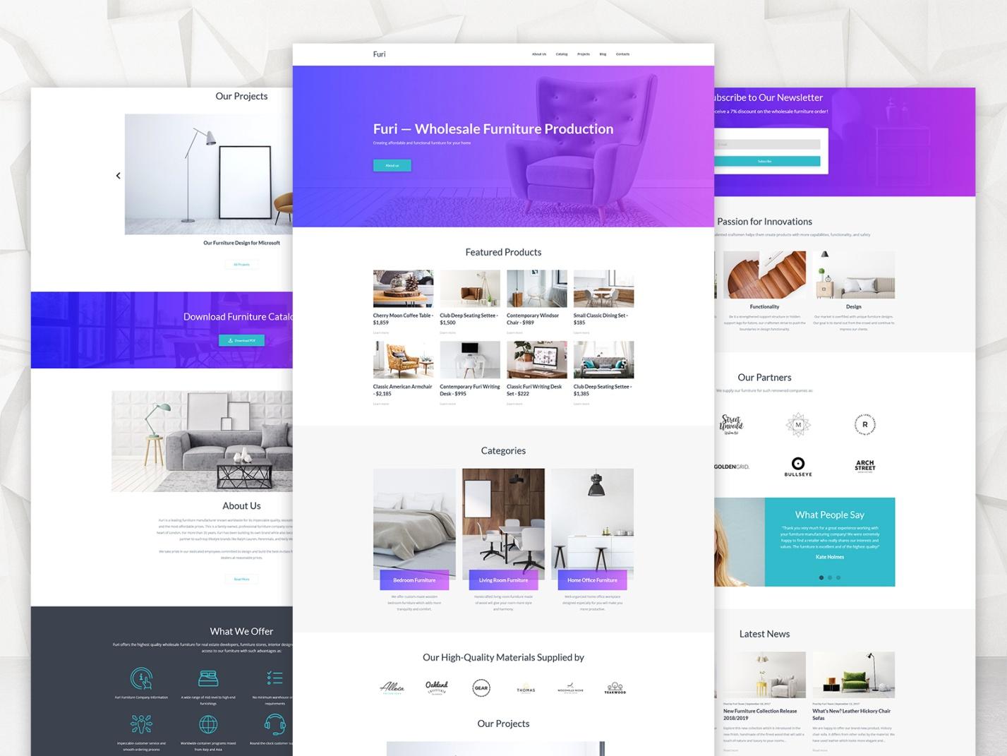
Furniture Manufacturer Best Website Template
- The main page is the company`s face and it should ultimately present you and your products, indicate the main advantages of working with you, provide the product catalog and give the opportunity to make an order.
- The site navigation menu is located at the top right, which is most convenient for most users.
- The design of a furniture factory site should advantageously present its products: it should not be too overloaded. This template presents a modern, minimalistic design with lots of white space, which evokes a feeling of completeness and premium quality. It is better to give preference to calm shades that do not distract attention.
- The “Our High-Quality Materials Supplied By” block focuses on high quality, even before the customer gets acquainted with product descriptions.
- The template implements the idea of the possibility to download the furniture catalog to know more about the products.
- The “What We Offer” section has visual icons.
- The “Our Projects” section announces the company’s achievements, and the “Our Partners” section once again confirms the high status of the company.
- CTA is highlighted and is located in the most prominent part of the page.
More templates:
Entertainment Website Templates
Conclusion
Thus, Weblium websites are filled with the most important pages, blocks, and elements, meeting the requirements of each user. Although the sites are created on the basis of pre-designed templates, you can completely upgrade any of them yourself/ without any help, and make the resource absolutely unique.
All Weblium templates have:
- A modern look in full accordance with the latest trends in site building;
- Responsive design;
- Cross-browser compatibility;
- Full accordance with the type of business;
- Friendly interface and usability;
- SEO-friendly features;
- Rich customization options;
- Multi-language support;
- A bunch of attractive additional elements;
- High update frequency.
Just log in with Weblium – and you will be able to use any of our templates to create your ideal website!
