Types of Websites: 16 Popular Types of Websites
Initially, all websites were informational only. They consisted of plain text without formatting and hyperlinks. Over time, graphic information was added. When Tim Berners-Lee created his first website, he didn’t even suspect that this technology would evolve!
Today, there are so many different types of websites that it is sometimes difficult to classify a particular site to a particular category. However, you need to understand the types of web pages – at least in order to understand exactly which site you need for your business what it should look like.
Now we will give you a clue and help you to quickly and easily understand types of websites with examples, what are their unique features and advantages and what necessary elements each website type should have in order to attract maximum customers!
Contents
Personal Website Type
A personal site demonstrates your personality and promotes yourself, the sphere of your interest, your goals, skills, and achievements, sometimes it includes a portfolio. Usually, it is created by the owner in order to declare himself, to find friends, like-minded people, people with similar views, etc.
The number of pages/structure:
personal websites are not large, more often these are one-pagers. Remember to place your bio and contact information in the top-level navigation of your website.
Design:
personal website design is often complex, emphasizing the individuality of the author.
Benefits:
- it shows your serious attitude to work/things you like to do;
- it shows that you care about not only salary but also self-development;
- it is the most effective personal branding tool;
- it is an opportunity to promote any message concerning your personality;
- it is an opportunity to demonstrate your experience;
- it is an opportunity to make money;
- it is an opportunity to become more visible on the Internet!
Must-have pages and elements of this website type :
- attention-grabbing Homepage;
- informative “About” page;
- Media/Press page;
- Skills page;
- Portfolio;
- links to Social channels;
- Case Studies (illustrations of the process of accomplishing projects) ;
- Resume;
- Blog;
- Praise, testimonials, and recommendations, press mentions;
- Contact info.
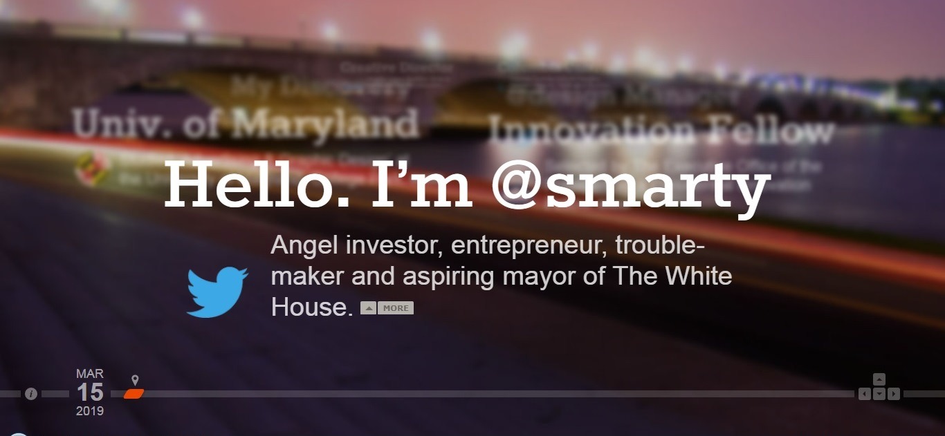
Personal website type example: Marty
Visit the website: http://marty.com
You’d be surprised, but Martin is not looking for a job, ‘cause he already works on Twitter and makes designs. But you should definitely visit this page! You can control the elements with the help of arrows on the keyboard, dive into the past or just take a look at his dog.
In short, this is a very good example of an elaborate personal page!
Personal Blog: Second Website Type
A personal blog is a website with regularly added posts (posts) containing text, images, and multimedia.
The number of pages/structure:
Usually, personal blogs contain several pages. Their number depends on the activity of the author and sometimes blogs can be quite large. The structure of the blog is always simple and clear.
Design:
Often, the design of the blog is complex, corresponding to the subject of the blog,
Among the different types of websites, the personal blog allows emphasizing the individuality of its author in the best way.
Benefits:
- it gives you the ability to write about the things that interest you and share it with others;
- you can easily get new acquaintances, communicate with people you like;
- it is an effective reputation builder;
- it is the perfect possibility to advertise your own talents, skills, products, and services;
- it is a chance to start getting an additional income. (expert services, advertising, affiliate programs, еtс.).
Must-have pages and elements:
- About Me;
- Start Here page;
- Sitemap;
- GDPR compliance page;
- Disclaimer Page (for example, an affiliate disclosure) ;
- Service page;
- Privacy Policy;
- Custom 404 page;
- Archives page;
- Advertise page;
- Write for Us page;
- Press page;
- Squeeze page;
- Subscription form;
- Favorite Posts page;
- Contacts.
Personal blog example: SolopreneurHour
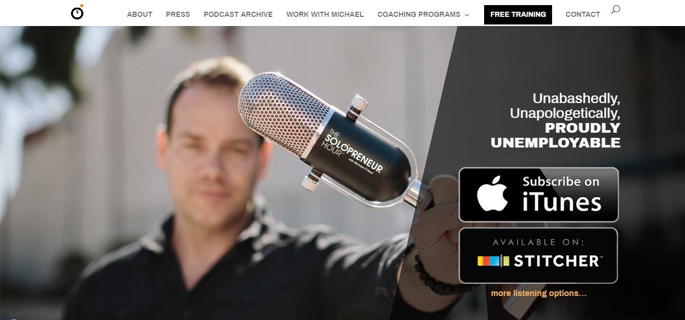
Visit the website: https://solopreneurhour.com/
A perfectly designed and very slick blog that tells you how to become your own boss and create your wealth.
The blog has an active podcast feed: the podcasts have gained insane popularity on iTunes, and we can bet they’re making a lot of money from selling their ad space on podcasts. If you have a cool blog, podcasts are a great monetization tool!
Landing Page Website – a Popular Type of Website
The main goal of the landing page website is forcing the visitor to perform the desired action: buy products, sign up for a course, etc. That is, a landing page should tell everything about a product or service, generate interest and a desire to make a purchase.
The number of pages/structure:
LP is a one-pager with a clear logical structure.
Design:
LP design consists of sections, each of which answers one specific question: «how much does it cost?», «where are the offices located?», «why is this the best offer on the world wide web?», etc. The indents between the sections should be equal. You should alternate sections background: white, gray, white, gray, etc.
Also, you should select a bright color (yellow, orange, blue) for one of the sections (if the landing page is long). Section headers look best when they are colored. Use the same number of columns in the sections, located next to each other, alternate columns and text.
Benefits:
- highest conversion results;
- quick launch (within just a few hours); simple and quick change of information;
- high load speed even on devices with the slow Internet connection;
- LP is a great way to build a base of potential customers: even if the visitor does not order anything, he often leaves the e-mail. So you can always send them e-mail reminders to check out your current special offers;
- LP increases the effect of contextual advertising;
- the possibility to analyze the number and feasibility of online sales;
- If your website is inefficient, LP helps to increase sales;
- LP is quite inexpensive to make.
Must-have pages and elements:
- header with a slogan or clickable phone number;
- unique selling proposition, located on the first screen;
- a block with customer benefits;
- high-quality photos and videos of the product;
- Social proof;
- reviews;
- feedback form;
- strong CTA;
- footer with contacts, social network buttons.
Landing page example: Bellroy
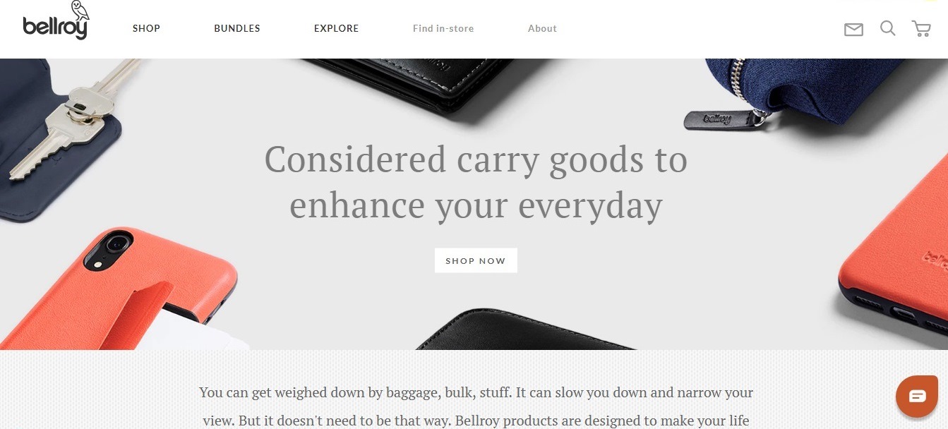
Visit the website: https://bellroy.com/
Awesome site that sells wallets. Spend one minute on this website – and you will be ready to buy one for yourself!
Guys might think that «A picture is worth a thousand words»: when you enter the website it immediately becomes clear what they are selling.
The main page is used for customer segmentation: there are thin wallets and wallets for traveling categories.
Cool images and videos clearly show how the product solves customer problems.
Brochure Websites
The brochure is one of the best ways to increase the online presence of small businesses. The main purpose of the brochure website is to present its owner, the products and services he provides, and to give as many ways to contact him, as possible— address, phone numbers, e-mail, etc.
The number of pages/structure:
due to the small amount of information posted on the site, the structure of the brochure site is always simple and straightforward. Usually, a brochure website consists of 3-5 pages and does not contain additional sections and multi-level menus. It’s up to you whether your brochure will be a static or a dynamic website.
Design:
the graphic design of the site can be quite different, both simple and uncomplicated, and complex, and even exclusive, including the author’s graphics, unique fonts, animation elements, and flash – in short, everything that can emphasize his style and personality!
Benefits:
- inexpensive to make;
- convenient and easy to manage solution;
- minimum maintenance costs;
- the possibility of modernization in the future;
- quick to create;
- a perfect solution to showcase an informative and concise summary of all information;
- an excellent way to attract partners and customers;
- a convenient tool for testing the waters of the market;
- a beneficial solution for organizations with the offline business.
Must-have pages and elements:
- attention-grabbing cover;
- About Us page;
- Product/Services page;
- Points of differences (benefits and unique features of a company/seller);
- compelling content, including educational;
- timeline to show the history of the development of the product;
- Testimonials;
- Evidence page (or Buyer’s experience);
- map with upcoming business events;
- powerful Call-To-Action button;
- Blog;
- Contacts.
Brochure website example: Hampshirelight
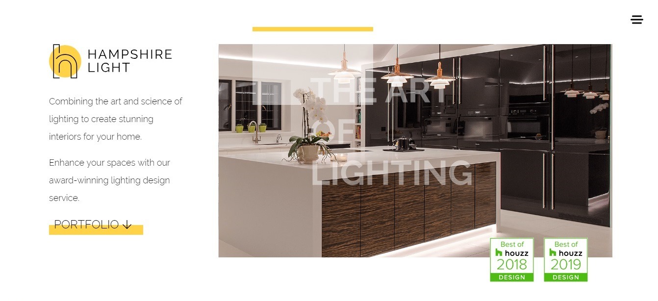
Visit the website: www.hampshirelight.net
A small and informative site of the company that develops the concept of lighting. This brochure site does not contain catalogs and online order forms, but it has an amazing elegant design and plenty of information about the company.
Bright and high-quality photos in the portfolio, well-chosen colors of the site, simple navigation turns this simple website into a powerful business tool.
Entertainment Websites
There are websites, created for moneymaking and business purposes, and there are websites, created for entertainment. These could be fun websites like The Onion, comics like xkcd, or just sites with interesting content like Buzzfeed.
Most of such websites earn money on advertising. If you want to create an entertainment website, you’ll have a huge amount of options for formats. You can offer various informative or just funny videos, write fun blog posts, and create comics or fun quizzes.
The number of pages/structure:
the entertainment website can be quite large, it may have several various types of web pages so it’s important to consider the responsive navigation with a clear hierarchy. Your web site’s title elements and alt attributes have to be descriptive and accurate. The site’s primary navigation should stand out and be consistent throughout the entire website. It is a good idea to limit the number of menu items to 7-9 items, and use some sub-items, if necessary. You can place the crucial info in your website’s fat footer, and you should definitely go for the user-friendly language!
Design:
We’ll give you just one piece of advice – do your best to be creative about your entertainment website’s layout and design! Use the bright graphics and animation, flash clips.
Benefits:
- creating a strong community;
- getting a huge number of followers;
- the possibility to get the good additional income (ads, teasers, affiliates);
- advertising your products and services.
Must-have pages and elements:
- About Us;
- Our partners;
- Advertising page;
- Privacy Policy page;
- Terms of Use page;
- Mobile Alerts;
- Advertising Inquiries;
- Media Inquiries;
- Download the app button;
- Contact Us.
Read more to see what amazing features you can take from the top entertainment website examples!
Entertainment website type example
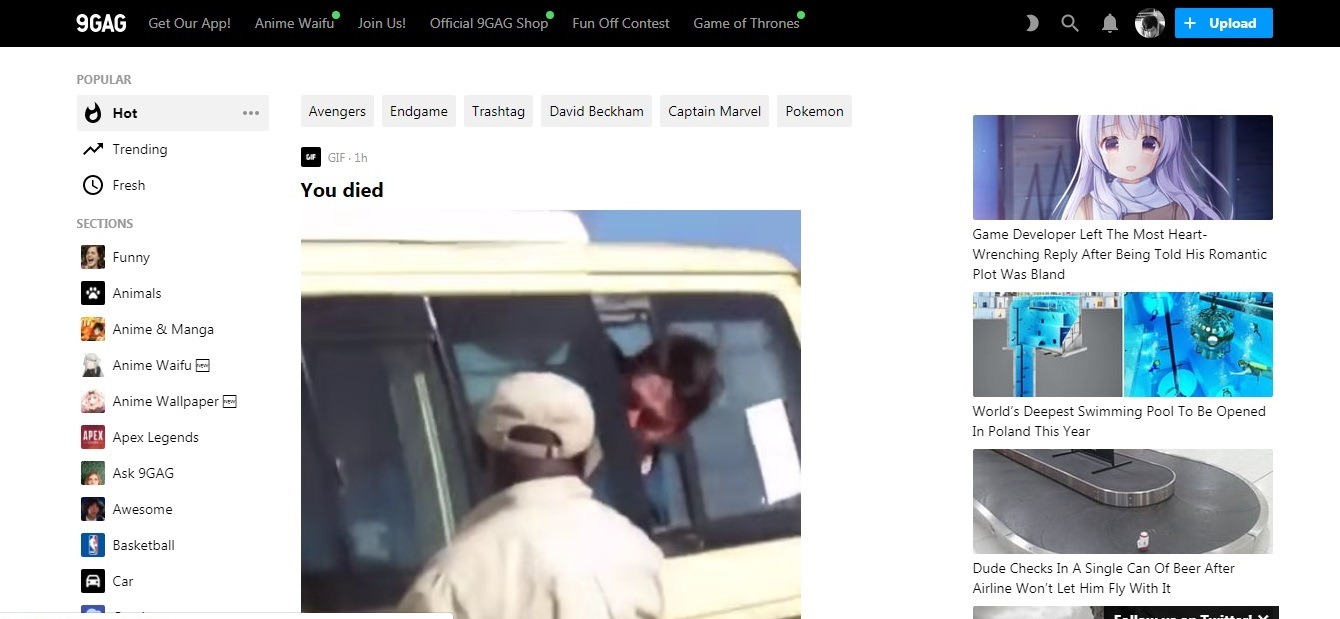
Visit the website: https://9gag.com/
Today, 9gag has grown into a huge community, with its own online store.
Like many other sites like Reddit and Digg, 9GAG uses custom content that is shared by the entire community. The content of the site mainly consists of “Internet memes”. Memes have different categories. You can vote for them positively and negatively, as well as commenting on the content.
“9GAG users are commonly referred to as“9gaggers”.
Catalog Website Type
The catalog website is a convenient solution for informing the company’s potential buyers and partners about all the products offered. Its structure is similar to the brochure website, but, unlike the brochure, there can be dozens or even a few hundred pages in the catalog website. Here, you can find detailed product descriptions with photos, characteristics and other useful information including the prices.
The number of pages/structure:
as we have already said, the structure of the catalog site is complex – in addition to the required components and downloadable price lists, it’s the structure can also include some other, various components and modules.
Design this type of website:
the design of the catalog website can be both simple and complex – it depends on the site owner’s desire.
Benefits:
- maximum profit with minimum investments;
- stable income;
- creating a positive image of the company;
- an excellent tool for advertising and distributing information about your company on the Web;
- an improved shareability;
- more robust product data;
- reduced costs;
- easy to manage and to update.
Must-have pages and elements:
- Introduction page;
- Quick search;
- About Us page;
- Product/Services Catalog;
- Price list download button;
- Contact info (address, phone, e-mail).
Catalog website example: Rykielism

Visit the website: https://rykielism.soniarykiel.com/en/international
This catalog website is dedicated to the famous designer’s clothing collections. The three features of this great website are the laconic menu, visibility, and bright content.
E-commerce Website Type
The e-commerce website is a perfect online sales channel, that is the best of today’s solutions for both presenting your products/services and conveniently managing and using it.
The number of pages/structure:
usually, the online store has a fairly large number (several dozens) of pages and a complex structure. As a rule, the site contains a catalog of products with detailed descriptions, delivery terms and prices and other types of web pages. The online store site is mainly different from the other website types by having software modules that allow you to automate the process of buying and selling products online.
Design:
the design of the online store can be quite diverse and vary in a wide range – from the very simple and discreet solutions to complex, refined and sophisticated websites. Although, it is believed that the online store should have a simple design, that most of the famous e-commerce websites have.
Benefits this type of website:
- convenience and functionality: the ability to easily find the desired product and buy it in a few clicks;
- new business opportunities;
- expansion of the market;
- attracting a huge number of customers;
- costs reduction.
Must-have pages and elements:
- About Us page
- A quick search (+ advanced search with filters) ;
- Product catalog with detailed descriptions;
- Order form (+quick order);
- Shopping cart;
- A personal account with order history;
- Online payment module;
- Static and dynamic banners publishing module;
- Reviews module;
- Online consultant module, callback option;
- Terms and conditions of delivery and payment.
E-commerce website example: Nikos Koulis
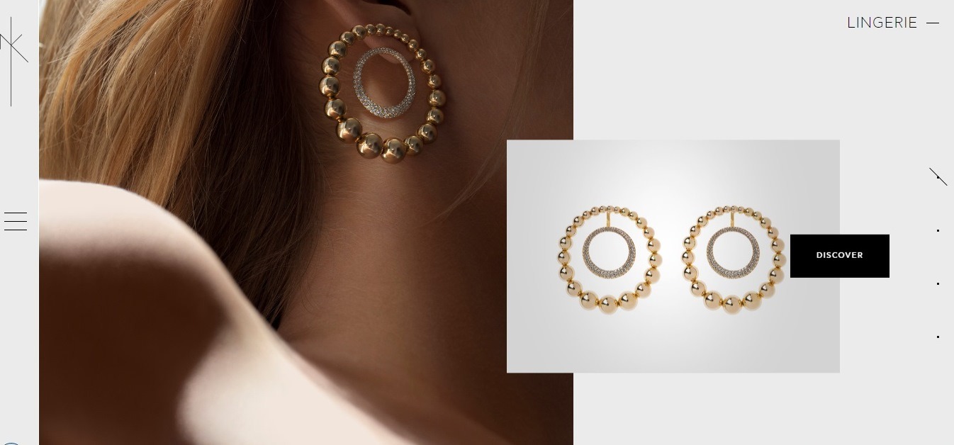
Visit the website: https://nikoskoulis.gr/
Visual balance with asymmetric markup is supported by a large black CTA-button. This is an example of a well-thought-out marketing strategy. Properly used aesthetics of custom design with a stylish sophisticated interface!
Portfolio Website Type
Portfolio sites are designed to attract the attention of a wide target audience by presenting the best works of the author. They gained the most popularity among photo studios and independent photographers, web studios, website developers, etc.
The aim of such a website is to showcase the work results to a potential customer to make it easier for him to make a conclusion and to decide whether he wants to use the author’s services.
The number of pages/structure:
the structure and the design of a portfolio website are somehow similar to a brochure site. As well as the brochure, it consists of a small number of pages and does not have multi-level menus. The main distinctive feature of the portfolio site is the built-in gallery, as well as the smooth navigation.
Design:
the design of the portfolio website, as well as the design of the brochure website, can vary from the simplest to the very complex, even exclusive solution. But still, there are some rules here: clean and clear design, leaned-out website layout, an intelligent theme, and color-coding navigation areas.
Benefits:
- a perfect solution to showcase your professional approach;
- a proven way to generate credibility;
- a good option to remind your potential customers about your achievements;
- portfolio website helps your customers to visualize the process of working with you;
- portfolio site improves your chances of getting the right customers and to know them well;
- a perfect way to set you apart from your competitors;
- a good portfolio gives you a big chance to show your creativity!
Must-have pages and elements:
- a brief Bio;
- your very best works;
- gallery with explanatory text;
- professionals challenges you’ve overcome;
- Awards;
- Education;
- Social media buttons;
- Blog;
- Legalities;
- Testimonials;
- Contacts.
Portfolio website example: Fabian Irsara
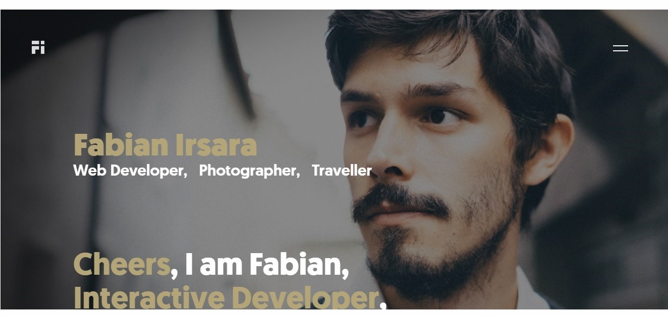
Visit the website: https://fabianirsara.com/
It’s not surprising that Austrian developer, the Awwwards member and founder of the Momate software company would create such an impressive portfolio!
An amazing glossy style with beautiful typography makes you love it from the first sight. The website uses concise, intriguing texts and elements, such as blurring the background when scrolling.
Create a portfolio website using for free AI Website Builder right now!
Promo Websites Type
The general aim of the promo website is to provide the fullest information on a particular product, showcase it in the most favorable way using articles, videos, photos, reviews, certificates, guarantees, newest Web technologies, attract potential buyers to participate in surveys, rallies, and promotions, highlight a certain product from the products of the competitors, showing its advantages and best characteristics.
The main feature that distinguishes the promo website from the other different types of websites is a relatively short lifecycle.
The number of pages/structure:
usually, a promo site contains 5–10 pages with a small amount of content – this is enough for the site to perfectly fulfill its functions. The structure of the promo site is determined by its objectives; in most cases, it is quite simple and not very extensive.
Design:
the appearance of the promotional site should be stylish, vivid and memorable. The developers widely use volumetric graphics, exclusive design, flash animation, and video elements. Such a variety of technologies allows to enhance the visual impact of the promo site on visitors and increase its effectiveness.
Benefits:
- a great way to influence the target audience;
- a perfect solution to provide potential customers with maximum information about the product or service;
- a powerful and effective tool for showcasing the brand and individual products;
- a brilliant presentation of the advertising campaign, that attracts the attention of a huge number of potential customers;
- promo website makes it easier to find new customers and partners on the Web;
- a great way to get reliable data on the success of the advertising company;
- «Word of mouth» effect, as an advantage of viral marketing;
- sophisticated functionality that allows you to perform the target action at any time!
Must-have pages and elements:
- an ingenious main page that lures the visitor to visit as many pages as possible within a single session.
- About Us page;
- Products/services description;
- Contact details: phone numbers, address, e-mail.
- Polls and Voting;
- Feedback form;
- Social media buttons;
- bright and powerful CTA.
Promo website example: The Jungle Book
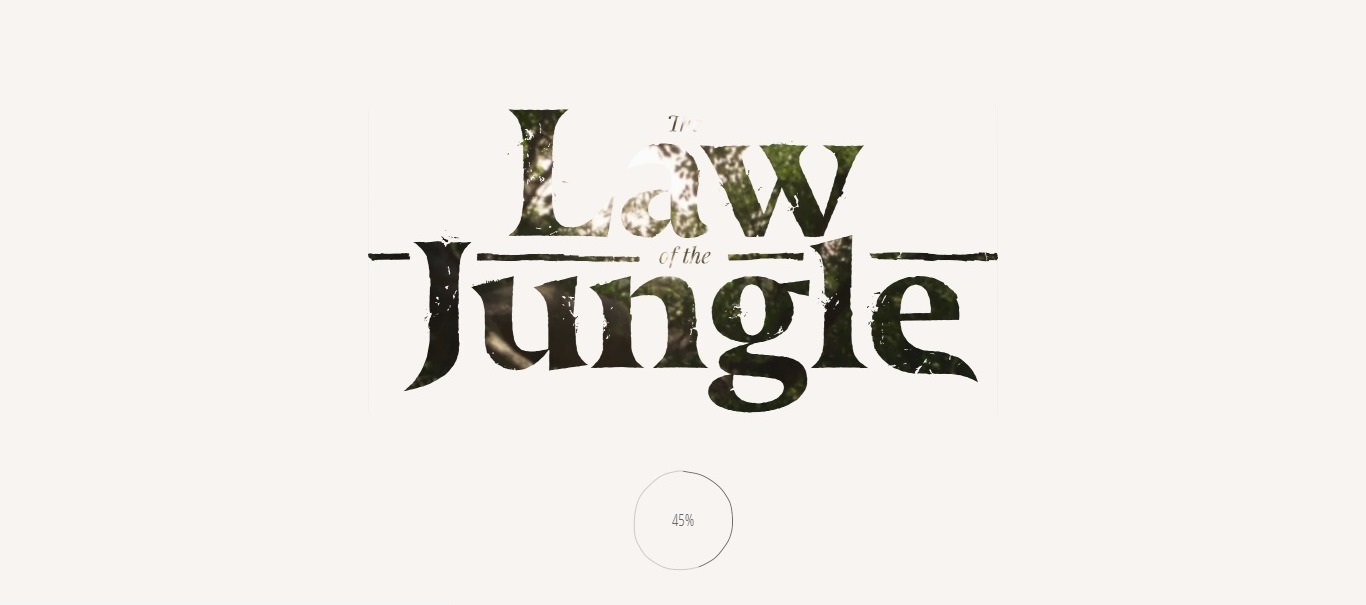
Visit the website: http://thelawofthejungle.com/
This site has a lot of advantages, but the first thing that impresses you is the intriguing combination of dynamic design elements and video. The website’s linear navigation makes the story even more eye-catching!
News Websites Type
The news site is a powerful information resource dedicated to news from any area. Its main purpose is to deliver the latest information to the user as soon as possible, so the news on the site should be constantly updated. With the proper administration and advertising, can bring a tangible profit to its owner.
The number of pages/structure:
the news websites are always huge. Due to constantly updated content, these websites can grow into several hundred, sometimes thousands of webpages. In most cases, the web site’s structure is complicated. As a rule, such sites contain several sections and subsections, complex multi-level menus, a large number of components and modules, various types of web pages, and they can have a forum.
Design:
the graphic design of the news site should be modest. Traditionally, it is always simple: white background, strict header, dark colors of headings, and perfect readability,
Benefits:
- the great possibility to place advertising banners on all pages and generate good income;
- quick content delivery to readers;
- attracting different categories of visitors.
Must-have pages and elements of this website type:
- About page;
- Many interactive elements;
- Many categories pages;
- Awards;
- Partners;
- Voting polls;
- Social network buttons;
- News archive page;
- Subscription and RSS feed;
- Comments;
- information about the website owners, registration as a media resource;
- Editorial staff page;
- Contacts.
News website type example: ABCnews
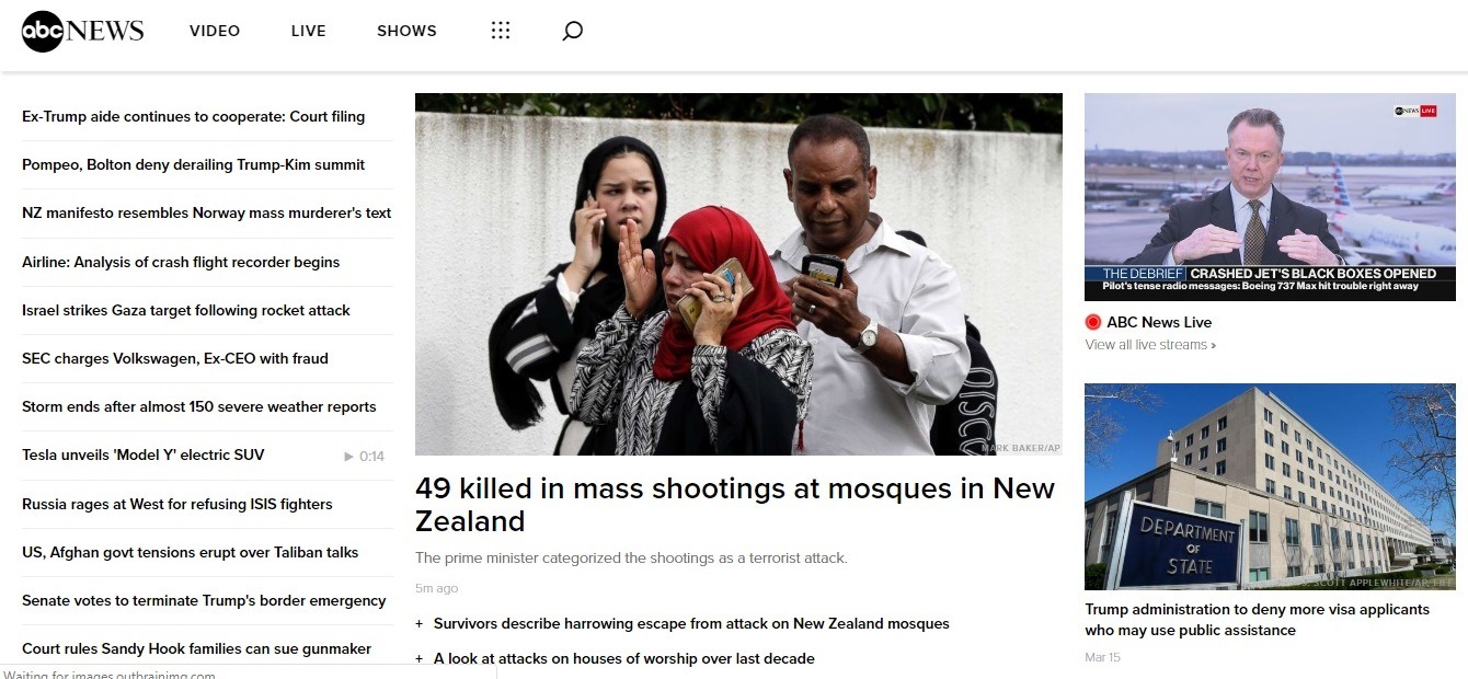
Visit the website: https://abcnews.go.com/
The first thing you see is a big bright banner, which announced 5 “top” news for today, so you can immediately find out what had happened over the past day.
Then you notice the list of the most popular news. Also, there is a categorizer, that will help you to find the section of interest. If you work in the news making field, pay attention to the column on the left side.
Business Websites Type
The business website is an official site of a company, its trustworthy online representation. Creating such a website is the optimal solution for all companies that want to become leaders in their field of business.
The number of pages/structure:
usually, the corporate websites are large, containing from 10 to 100 pages. All the important types of web pages of a good business website are directly linked from the home page. Any page of your website should not be two clicks away from your home page.
The business website consists of multi-level menus; texts containing complete information about the company, products, and services, corporate events; tables; information blocks; various components and modules. Also, the site can be integrated with the company’s internal information systems. It can contain corporate forums and private sections for employees, dealers, contractors, etc.
Design of this type:
usually, the official business site has a modest design. As a rule, the appearance of the business site corresponds to the corporate style. Corporate colors and fonts are widely used in a business website design. Often, these elements are repelled by the company’s logo.
Benefits:
- this type of website is simple to set up;
- It cuts your costs;
- it improves the company’s customer service;
- it makes your business accessible at all the time;
- it targets larger markets;
- it helps you beat the competitors;
- it is a great marketing channel;
- it is a perfect way to reach a wider audience;
- proof of the serious approach and prospects of your business;
- trustworthy representation of the company;
- an inexpensive and proven way to advertise your business;
- conveniently and commercially justified a way to promote your brand;
- a perfect tool to help you to attract new customers and partners for cooperation, expanding the company’s sales market, increasing its rating and customers’ confidence;
- the possibility to order products/services directly on the website.
Must-have pages and elements:
- attention-grabbing Home Page;
- About Us (history, main stages of development) ;
- Services/Products page;
- FAQ page;
- Testimonials/Reviews page;
- Contact page;
- Blog;
- Press/Latest News page;
- Privacy Policy page;
- Terms and Conditions page;
- Sitemap;
- Page not found;
- Useful content (articles, reviews, tips, etc.);
- Products/Services catalog, with photos and descriptions, etc.;
- Price lists;
- Separate sections and login forms for the clients, employees, partners, suppliers, whole sellers;
- Social media buttons;
- Metrics and Reviews page;
- Customer support section;
- Clear & Visible Call-to-Action;
- Contacts.
Read more to see the best examples of business websites from all over the world!
Business website example: Eni
Visit the website: https://www.eni.com/en_IT/company.page
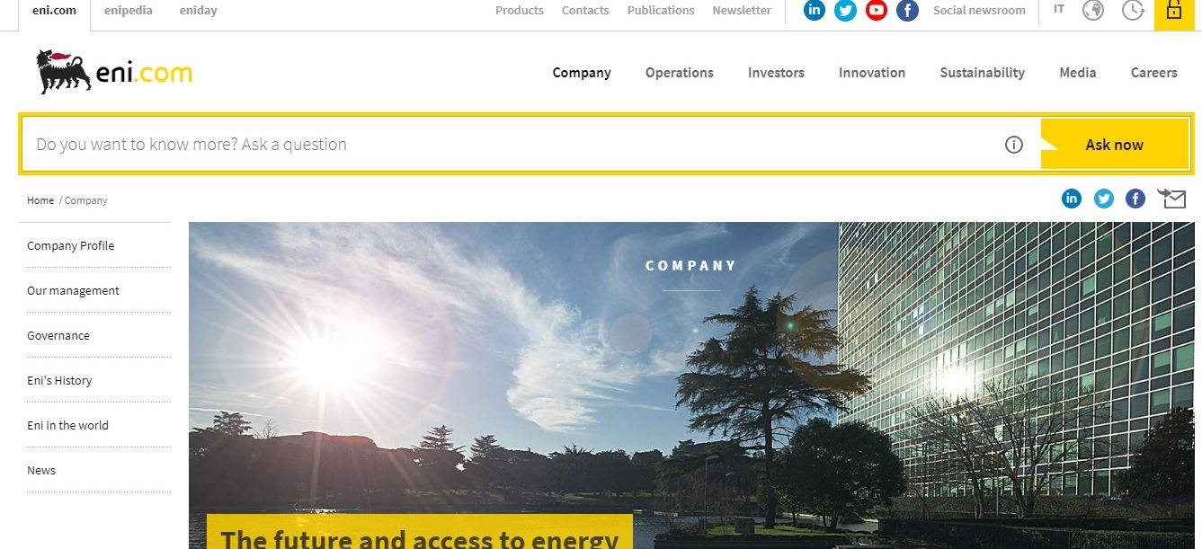
On Eni’s website, the information about the company is filed very competently – take a look at the main page of the “Company” section.
In the corporate governance subsection, the information is sorted out very accurately: there is a general management scheme, control organs, and their representatives, distribution of share capital and its main holders, a risk management program, corporate management reports, codes and articles of association.
In the “History of Eni” section there is a common timeline with the most significant dates and separate pages with a description of key events – with the articles from Enipedia attached to them.
The analytical section “Cafe with Fuel” keeps you up to date with the latest market events.
Website Portals Type
he website portal is the most powerful and most complex type of web resource among the different types of websites. Due to the extensive content portal sites can be quite interesting both to visitors and to search engines.
The number of pages/structure:
the website portal can consist of several dozens or even hundreds of pages. The structure of such a website is always complex. As a rule, sites of this type contain many different sections and subsections, multi-level menus, a large number of different types of options and modules.
Design:
usually, the appearance of an average website portal is modest. And if the promo websites widely use the volumetric graphics, the website portals use graphic minimalism. There are no excesses allowed in the appearance of the website portal: the design should be as simple, as possible. If you create a website portal for gaining profit, then its design should be based on the idea of earning maximum revenue in the long run.
Benefits:
- a great solution to attract many customers that are interested in the spheres your website is devoted to;
- a perfect way to redirect visitors to websites of your partners;
- an excellent option to gain high-quality traffic;
- a great tool to provide a separate and more focused web experience for visitors;
- a good website portal evokes a sense of community and helps to build a stronger bond between the company and its potential customers;
- it helps you to stand out as a valuable partner and leader.
Must-have pages and elements:
- About Us page;
- Notifications/Announcements page
- Search;
- Forums;
- Discussion Boards;
- Classifieds;
- Chats;
- Charts;
- Photo Galleries;
- Personal profiles;
- Social Media buttons;
- Registration form;
- Payment system;
- RSS feed;
- Testimonials page;
- 24/7 customer care service;
- Downloads archive;
- Library;
- Press announcements;
- Useful links catalog;
- Products/Services catalog;
- Companies catalog.
Website portal example: Santander Bank
Visit the website: https://www.santanderbank.com/us/personal
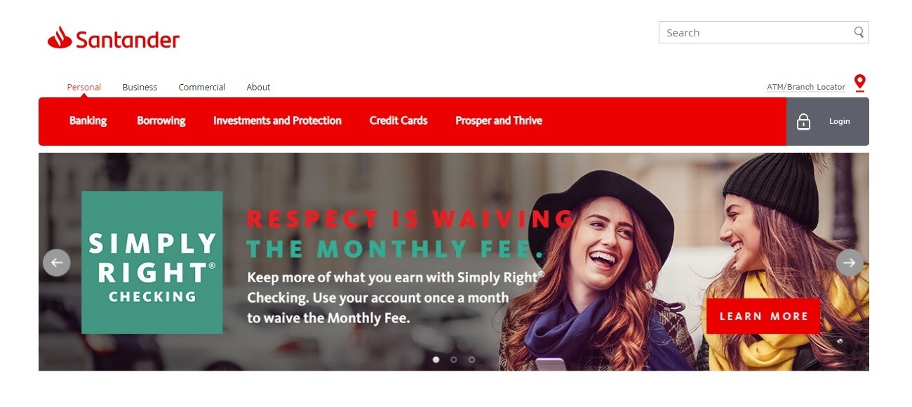
Being one of the greatest banks in the Eurozone, Santander has created a web platform that easily integrates with the existing software, offering a great space for new features and content.
The website contains several retail banking features and the possibility to create accounts, managing your everyday banking operations.
Audio/Video Website
Audio/video resources are in high demand among users, they get promoted very quickly – in a few months, you can attract good traffic, which will constantly increase.
The number of pages/structure:
such types of web pages have the average size but due to the huge number of categories and subcategories, the navigation is quite complex. You should carefully think through your website’s navigation: for example, the movies can be divided not only into categories but also by country, genre, year of release, etc.
Design:
there are no hard rules for the design of a video/audio website, however, the design of such a site should be modern, pleasant and clean.
Benefits:
- multiple monetization options;
- high demand and popularity among the various categories of users.
Must-have pages and elements:
- Homepage with an attention-grabbing headline;
- Audio/Video library, divided by categories;
- Website search (+ advanced search);
- Newest Audios/Videos page;
- Popular page;
- «The booking desk» (the system automatically publishes the cartoons, series, games or films added by visitors to the wishlist);
- Blog;
- Social Sharing Buttons;
- User Voting and Comments;
- Expert Support.
- Signup/Login form
- Contacts.
Video website type example: Dailymotion
Visit the website: https://www.dailymotion.com/
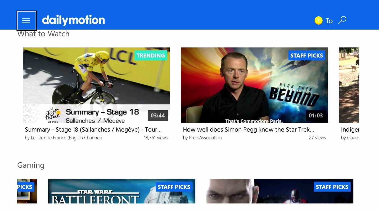
This French video-sharing site lets you watching, uploading, browsing multiple videos by searching tags, channels, categories, or groups, created by the users.
The website offers an almost unlimited range of random videos, from funny clips about the animals to the greatest political reports.
The restrictions for the size and quality of uploaded videos don’t seem real trouble, and Dailymotion can be a great alternative to YouTube.
Community Forums: Type of Website
Community Forum may be part of the website or an independent project. There are forums of the «about everything» category and the ones that are dedicated to a specific topic. They are created to give people a specific space to discuss topics that interest them, give or get a piece of expert advice, seek and hire freelancers, etc. The moderator only intervenes in the discussions if there’s a need in that.
The number of pages/structure:
the classical structure of the forum consists of 5-10 sections on the forum with the specific topics for discussion (forums and subforums), created in them. But the large forum may contain there much more sections.
Design:
the design of the forum should be convenient for reading and adding messages. If you want users to read topics and add posts as often as possible, you should avoid colorful and eyesore contrasts, heavy and bright design elements. The design of the pots also matters a lot as this is an important website element: Letters should not be tiny, while paragraphs should not be too long. You can add images or videos to text blocks if needed.
Benefits:
- a perfect way for your readers to interact with each other;
- auto content generation and website scale-up.
- a simple way to quickly answer reader questions or respond to many readers at once;
- the forum builds a strong sense of community among your website visitors;
- a great way to attract plenty of new readers;
- an excellent way to exchange links with other online communities to increase your user base.
- The forum gives readers a reason to keep coming back!
Must-have pages and elements:
- About page;
- Support service;
- Games section;
- Contests;
- Surveys;
- Ratings, number of post views and other counters;
- Share/like buttons;
- Auto-Subscriptions;
- forum’s built-in email engine;
- search engine;
- Content Magnets (free books, distributions of exclusive software builds, legal keys to computer programs, links to useful resources).
- Analytics;
- Favorites;
- Limited Access for partners;
- Terms of Use.
Community forum example: Avelry
Visit the website: https://www.ravelry.com/account/login
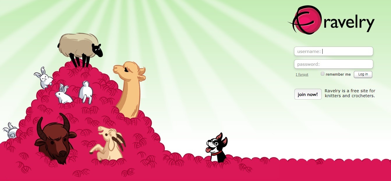
This forum proves that the best forum websites should target a specific niche.
The high website’s responsiveness and ease of usability are astonishing!
The forum policy is quite loyal («just don’t be a jerk»), each forum group has a different guideline. You can always join another group if you want.
Resume Websites
Resume website is the best modern alternative to your classic .docx resume! Such websites immediately attract attention, but they need to be compiled correctly.
The number of pages/structure:
your resume website should not be large: you have to provide the most important information in summary form. A good way of learning how to organize a resume is to view the information as you were an employer. Ask yourself: «What information about me does a potential employer or client need to know?».
Design:
your website’s attractive appearance is half the battle. You can create a resume website in almost any style – conservative or informal.
Basic tips for creating a resume site: create a clean layout, use columns to maximize the space, separate the information into logical parts, use eye-catching infographics, add introduction video, add some light animation effects.
Benefits:
- A wide range of the ways the information is given;
- the perfect tool to start a career, a great marketing tool for many job seekers;
- a great way to improve your image and increase credibility.
Must-have pages and elements:
- The first and the second name, that BEST photo of you that you have got;
- Short bio (experience and education);
- The position you are applying for;
- Elevator Pitch;
- Skills;
- References (3-5 people);
- Testimonials;
- Awards;
- Activities/Hobbies;
- Portfolio;
- Personal Branding;
- Links to your social media accounts;
- A great, professional blog;
- Meeting schedule;
- Live chat;
- Contact information.
Resume website example: Grant Baldwin
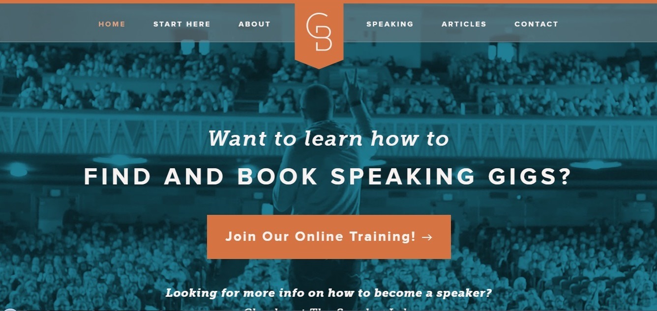
Visit the website: http://grantbaldwin.com/
This guy is a professional speaker, and he has used his great experience to create online training.
The main thing about this website is its clear navigation – this is how you should promote a huge variety of your services without overwhelming website visitors. The homepage successfully promotes Grant’s current offer while giving a useful link for the ones who are interested in learning how to get started speaking for the first time!
Educational Website
An educational website is created to popularize an educational institution (or directory of institutions) and contains comprehensive information about an institution, its life, teaching staff, opportunities for students, and achievements. A modern educational site should adhere to the criteria that allow maximizing the visitor’s awareness of the institution.
The number of pages/structure:
with crazy volumes of data, it’s essential to organize it better than anywhere else. The best university website design is the one that provides access to well-structured information. Make sure that all-important sections and types of web pages are accessible from the homepage. It’s essential not to overload, but at the same time, you need to provide potential customers with all they really need.
Design:
the educational website should be colorful and not too bright at the same time, it should be made with taste. Such a website should have up-to-date responsive design (mobile-first, as the modern mobile device websites are), the endless scroll, it should be customized and personalized. It is a good idea to use videos to present important information and some eye-catching interactive elements.
Benefits:
- A successful educational website builds credibility;
- It is a great way to promote educational institution all over the world;
- online learning accommodates everyone’s needs;
- students can take lectures for any number of times;
- people get access to constantly updated educational content;
- scalability;
- consistency.
Must-have pages and elements:
- interactive and engaging Home page;
- Story (use video to tell a story);
- List of faculties and classes;
- Teaching staff with short bios;
- Engaging News & Events page;
- Robust search function;
- Blog or News Feed;
- Guestbooks and surveys;
- Conditions for entry and lists of exams;
- Training materials;
- Social Media buttons;
- Student Testimonials;
- Detailed List of FAQs;
- Certificates and awards;
- Students’ achievements;
- Contact Us page.
Educational website example: the University of Chicago
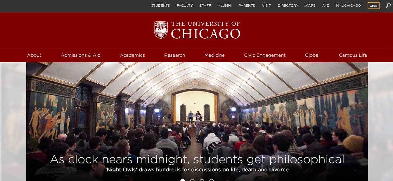
Visit the website: https://www.uchicago.edu/
The University of Chicago easily sets a precedent in higher education with this website’s seamless design, well-structured and dosed content, and perfectly clean layout.
Affiliate Marketing Websites
Affiliate marketing is one of the marketing tools that specialize in web promotion. It is an entire network of strategies and tricks with partnership programs, discount systems, and similar client-oriented approaches. Website design and usability are among the most important features of affiliate marketing.
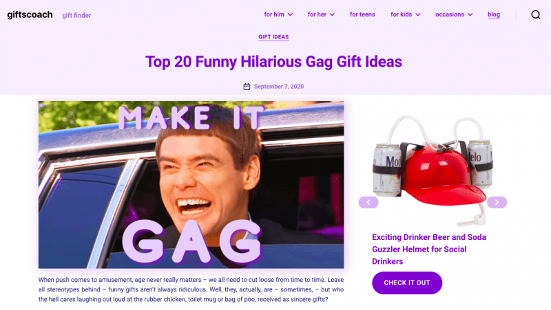
Giftscoach is a cool example of an affiliate website with gift ideas for anyone on any occasion. This webpage is devoted to gag gift ideas on the blog. The website owners take part in Amazon Associates program and make commission every time someone buys a gift. What makes a really appealing and user-friendly design is a sidebar slider with the top ideas. Each of them is represented as a clickable card with an affiliate link. A cool meme with Jim Carrey as a cover image makes this webpage really trendy and may well make it viral. Because all folks love memes. That’s how the website attracts more traffic and gets really viral.
Summary
We bet that you need some time to think over the things you have read about! Though you don’t need to bother that much about creating your perfect website: rely on Weblium team and you will get your website done using ready-made templates!

